Bootstrap Button Groups
In this tutorial you will learn how to use Bootstrap button group component.
Creating Button Groups with Bootstrap
In the previous chapter you've learnt how to create different types of individual buttons and modify them with predefined classes. Bootstrap however, also allows you to group a series of buttons together in a single line through the button group component.
To create a button group just wrap a series of buttons with .btn class in a <div> element and apply the class .btn-group on it. You can additionally apply the class .active on an individual button to indicate the active state. Let's take a look at the following example:
Example
Try this code »<div class="btn-group">
<button type="button" class="btn btn-primary">Home</button>
<button type="button" class="btn btn-primary active">About</button>
<button type="button" class="btn btn-primary">Services</button>
</div>— The output of the above example will look something like this:

Similarly, you can also create button groups using outline buttons, like this:
Example
Try this code »<div class="btn-group">
<button type="button" class="btn btn-outline-primary">Home</button>
<button type="button" class="btn btn-outline-primary active">About</button>
<button type="button" class="btn btn-outline-primary">Services</button>
</div>— The output of the above example will look something like this:

See the tutorial on Bootstrap stateful buttons to learn how to enable radio buttons and checkboxes like toggling on button groups without using any JavaScript code.
Mixed Styles Button Groups
You can also mix and match different button styles to create button groups like this:
Example
Try this code »<div class="btn-group">
<button type="button" class="btn btn-success">
<i class="bi-eye"></i> View
</button>
<button type="button" class="btn btn-warning">
<i class="bi-pencil"></i> Edit
</button>
<button type="button" class="btn btn-danger">
<i class="bi-trash"></i> Delete
</button>
</div>— The output of the above example will look something like this:

Creating Button Toolbar
You can also combine sets of button groups together for creating more complex components like button toolbar. To create button toolbar just wrap sets of button groups in a <div> element and apply the class .btn-toolbar on it, as shown in the following example:
<div class="btn-toolbar">
    <div class="btn-group me-2">
        <button type="button" class="btn btn-primary">
            <i class="bi-fonts"></i>
        </button>
        <button type="button" class="btn btn-primary">
            <i class="bi-type-bold"></i>
        </button>
        <button type="button" class="btn btn-primary">
            <i class="bi-type-italic"></i>
        </button>
        <button type="button" class="btn btn-primary">
            <i class="bi-type-underline"></i>
        </button>
    </div>
    <div class="btn-group me-2">
        <button type="button" class="btn btn-primary">
            <i class="bi-text-left"></i>
        </button>
        <button type="button" class="btn btn-primary">
            <i class="bi-text-center"></i>
        </button>
        <button type="button" class="btn btn-primary">
            <i class="bi-text-right"></i>
        </button>
        <button type="button" class="btn btn-primary">
            <i class="bi-justify"></i>
        </button>
    </div>
    <div class="btn-group">
        <button type="button" class="btn btn-primary">
            <i class="bi-code"></i>
        </button>
    </div>
</div>
— The output of the above example will look something like this:

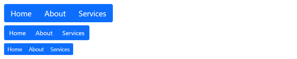
Height Sizing of Button Groups
Instead of applying button sizing classes to each button in a group, you can simply apply button group sizing classes like .btn-group-lg or .btn-group-sm directly to each .btn-group element to create larger or smaller button groups, as shown in the example below:
<!-- Large button group -->
<div class="btn-group mb-2 btn-group-lg">
    <button type="button" class="btn btn-primary">Home</button>
    <button type="button" class="btn btn-primary">About</button>
    <button type="button" class="btn btn-primary">Services</button>
</div>
<br>
<!-- Default button group -->
<div class="btn-group mb-2">
    <button type="button" class="btn btn-primary">Home</button>
    <button type="button" class="btn btn-primary">About</button>
    <button type="button" class="btn btn-primary">Services</button>
</div>
<br>
<!-- Small button group -->
<div class="btn-group btn-group-sm">
    <button type="button" class="btn btn-primary">Home</button>
    <button type="button" class="btn btn-primary">About</button>
    <button type="button" class="btn btn-primary">Services</button>
</div>
— The output of the above example will look something like this:
Nesting Button Groups
Button groups can also be nested. The following example demonstrates how to place a .btn-group within another .btn-group to create dropdown menus inside button groups.
Example
Try this code »<div class="btn-group">
<a href="#" class="btn btn-primary">Home</a>
<a href="#" class="btn btn-primary">About</a>
<div class="btn-group">
<a href="#" class="btn btn-primary dropdown-toggle" data-bs-toggle="dropdown">Services</a>
<div class="dropdown-menu">
<a class="dropdown-item" href="#">Web Design</a>
<a class="dropdown-item" href="#">Web Development</a>
</div>
</div>
</div>— The output of the above example will look something like this:

You will learn about Bootstrap dropdowns in detail in the advanced section.
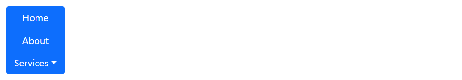
Vertically Stacked Button Groups
You can also make the button groups appear vertically stacked rather than horizontally. To do this just replace the class .btn-group with the class .btn-group-vertical, like this:
Example
Try this code »<div class="btn-group-vertical">
<a href="#" class="btn btn-primary">Home</a>
<a href="#" class="btn btn-primary">About</a>
<div class="btn-group">
<a href="#" class="btn btn-primary dropdown-toggle" data-bs-toggle="dropdown">Services</a>
<div class="dropdown-menu">
<a class="dropdown-item" href="#">Web Design</a>
<a class="dropdown-item" href="#">Web Development</a>
</div>
</div>
</div>— The output of the above example will look something like this:
Creating Justified Button Groups
You can also stretch your button groups to fill all the available width by applying the flex utility class .d-flex to the .btn-group element. Every button has equal width in this case.
Example
Try this code »<div class="btn-group d-flex">
<button type="button" class="btn btn-primary">Home</button>
<button type="button" class="btn btn-primary">About</button>
<button type="button" class="btn btn-primary">Services</button>
</div>— The output of the above example will look something like this:


