Bootstrap Progress Bars
In this tutorial you will learn how to create progress bars using Bootstrap.
Creating Progress Bar with Bootstrap
Progress bars can be used for showing the progress of a task or action to the users.
The following example will show you how to create a simple progress bar with vertical gradient.
Example
Try this code »<div class="progress">
<div class="progress-bar" style="width: 50%"></div>
</div>— The output of the above example will look something like this:
Note: The wrapper, i.e. the .progress element indicates the max value of the progress bar, whereas the inner .progress-bar element indicates the progress so far. Also, the .progress-bar requires an inline style, or custom CSS to set their width.
Creating Progress Bar with Label
You can also display the progress status as a percentage label just by placing the text within the .progress-bar element, as shown in the following example:
Example
Try this code »<div class="progress">
<div class="progress-bar" style="width: 60%">
60%
</div>
</div>— The output of the above example will look something like this:
If you are showing percentage label you should also apply a min-width to the progress bar to ensure that the label text remains readable even for low percentage, as shown here:
Example
Try this code »<div class="progress">
<div class="progress-bar" style="min-width: 20px;">
0%
</div>
</div>
<div class="progress">
<div class="progress-bar" style="min-width: 20px; width: 2%;">
2%
</div>
</div>Setting the Height of Progress Bars
The default height of the progress-bar is 16px, but you can also set its height according to your need by setting the CSS height property on the .progress element, like this:
Example
Try this code »<!-- Progress bar with 2px height -->
<div class="progress" style="height: 2px;">
<div class="progress-bar" style="width: 50%;"></div>
</div>
<!-- Progress bar with 20px height -->
<div class="progress" style="height: 20px;">
<div class="progress-bar" style="width: 50%;"></div>
</div>— The output of the above example will look something like this:

Creating Stripped Progress Bar
To create the stripped progress bar just add an extra class .progress-bar-striped to the .progress-bar element, as shown in the following example:
Example
Try this code »<div class="progress">
<div class="progress-bar progress-bar-striped" style="width: 60%;"></div>
</div>— The output of the above example will look something like this:
Tip: The stripe is generated via CSS gradient over the progress bar's background color. See the tutorial on CSS3 Gradients to learn how to create gradient colors using CSS.
Creating Animated Progress Bar
You can also animate the stripped progress-bar. Add the class .progress-bar-animated to the .progress-bar element, it will animate the stripes from right to left via CSS3 animations.
Example
Try this code »<div class="progress">
<div class="progress-bar progress-bar-striped progress-bar-animated" style="width: 60%"></div>
</div>— The output of the above example will look something like this:
Changing Progress Bar Value Dynamically
Static progress bars aren't very impressive. The following example will give you a rough idea of how to update the status of a Bootstrap progress bar dynamically using jQuery.
<script>
var i = 0;
function makeProgress(){
    if(i < 100){
        i = i + 1;
        $(".progress-bar").css("width", i + "%").text(i + "%");
    }

    // Wait for sometime before running this script again
    setTimeout("makeProgress()", 100);
}
makeProgress();
</script>Creating Stacked Progress Bar
You can also place multiple progress bars in a progress component to stack them.
Here's an example that demonstrates how it actually works.
Example
Try this code »<div class="progress">
<div class="progress-bar bg-success" style="width: 40%">
Program Files (40%)
</div>
<div class="progress-bar bg-warning" style="width: 25%">
Residual Files (25%)
</div>
<div class="progress-bar bg-danger" style="width: 15%">
Junk Files (15%)
</div>
</div>— The output of the above example will look something like this:
Creating Progress Bars of Different Colors
You can additionally use background color utility classes to create progress bars of various colors in order to convey meaning through color, as shown in the following example:
Example
Try this code »<div class="progress">
<div class="progress-bar bg-info" style="width: 20%"></div>
</div>
<div class="progress">
<div class="progress-bar bg-success" style="width: 40%"></div>
</div>
<div class="progress">
<div class="progress-bar bg-warning" style="width: 80%"></div>
</div>
<div class="progress">
<div class="progress-bar bg-danger" style="width: 90%"></div>
</div>— The output of the above example will look something like this:

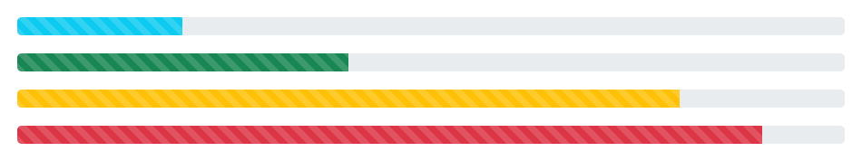
Making Striped Progress Bars of Different Colors
Similar to the solid colors, you can also create different colored striped progress bars using the same background color utility classes. Let's take a look at the following example:
Example
Try this code »<div class="progress">
<div class="progress-bar progress-bar-striped bg-info" style="width: 20%"></div>
</div>
<div class="progress">
<div class="progress-bar progress-bar-striped bg-success" style="width: 40%"></div>
</div>
<div class="progress">
<div class="progress-bar progress-bar-striped bg-warning" style="width: 80%"></div>
</div>
<div class="progress">
<div class="progress-bar progress-bar-striped bg-danger" style="width: 90%"></div>
</div>— The output of the above example will look something like this: