Twitter Bootstrap Tutorial — A Quick Start Guide for Beginners
In this tutorial you will learn how easily you can create an elegant and feature rich website with Twitter Bootstrap front-end framework.
Why Use Twitter Bootstrap
Twitter Bootstrap is emerged as a powerful front-end framework for faster and easier web development. It comes equipped with HTML and CSS based design templates as well as JavaScript plug-ins for creating common user interface components like Typography, Forms, Tables, Navs, Dropdowns, Tooltips, Alerts, Modals, Tabs, Accordion, Carousels, etc.
There are so many good reasons why anyone should use Twitter Bootstrap.
- It provides solutions for faster and easier web development.
- It's powerful grid system allows you to create fluid and responsive design very easily.
- It comes with typography and custom UI elements.
- It provides easy to use dynamic UI components like tabs and accordion.
- It is highly compatible across the browser.
- It is fully customizable.
And many others. In simple words, you can save a lot of time and efforts with twitter bootstrap. Let's consider a simple scenario — a web developer wants to implement some functionality or create a prototype as quickly as possible. To proceed further either he has to consult a web designer who creates front end design and markup or he has continue with his own designing skill that takes his precious time and finally ends up in a ugly design.
In such situation Twitter Bootstrap works like a magic. It is packed with commonly used user interface components that you might require to create a full-fledged dynamic website. Now you don't have to wait for design to implement or test certain functionality.
How to Create a Website with Twitter Bootstrap
In this tutorial we will create a simple and static Gadget Store website using the Twitter Bootstrap framework. Our gadget store website has four pages — Home, Product Details, Registration and User Agreement page.
We have tried to incorporate all the major Bootstrap components in these pages like navbar, dropdowns, tabs, accordion, carousels, modals and many others. All implementation followed by the sample code along with the complete description so that you can use it in your own project right away without any hassle.
Setting Up the Project with Twitter Bootstrap
There are two versions available for download, compiled Bootstrap and Bootstrap source files. Compiled download contain files in compiled and minified form for quick and easy implementation. Download Compiled Twitter Bootstrap from their official site.
When you unzip the downloaded Bootstrap folder you will see the three folder css, img and js as demonstrated in the image below.
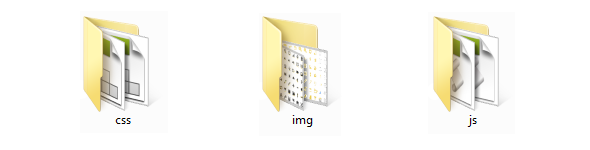
The css folder contains style sheets for both non-responsive (bootstrap.css) and responsive designs (bootstrap-responsive.css) as well as their minified version (bootstrap.min.css and bootstrap-responsive.min.css).
The img folder contains two images files, one is glyphicons-halflings.png (default black) and other is glyphicons-halflings-white.png (white). Both images files are exactly same except for their foreground color. These images files contain sets of icons combined in an image sprite form to minimize the HTTP request.
The last folder js folder contains the JavaScript file (bootstrap.js) as well as its minified version (bootstrap.min.js). These JavaScript files contain scripts for creating dynamic UI components like tabs, carousel, accordion, modals and so on. Ok, let's get straight into it.
In this tutorial we will use the minified versions of Twitter Bootstrap's CSS and JS files, because it will increase the performance of your website and saves the precious bandwidth when you decided to move your site to production.
Create Your First Web Page with Twitter Bootstrap
Open your text editor and create a new HTML file named "index.html" and save it in the root directory of your project. Now type the following code in your empty HTML file.
Example
Try this code »<html><head><meta charset="utf-8">
<title>Basic HTML File</title>
<meta name="viewport" content="width=device-width, initial-scale=1.0">
</head><body><h1>Hello, world!</h1>
</body></html>
Until now our index.html file is a simple HTML file and nothing special in it. To transform this into a Bootstrap template we need to include the appropriate Bootstrap files in our document.
Example
Try this code »<html><head><meta charset="utf-8">
<title>Basic Bootstrap Template</title>
<meta name="viewport" content="width=device-width, initial-scale=1.0">
<link rel="stylesheet" type="text/css" href="css/bootstrap.min.css">
</head><body><h1>Hello, world!</h1>
<script src="http://code.jquery.com/jquery.min.js"></script>
<script src="js/bootstrap.min.js"></script>
</body></html>
We have done with the basic structure in order to activate the Bootstrap framework.
Explanation of the above code:
The code in above example has the following meaning:
Line 01:HTML5 doctype declaration which is required for Bootstrap to work properly.Line 04:utf-8 character set declaration to parse the special character correctly.Line 06:Adding the viewport<meta>tag to ensure the proper rendering and touch zooming on mobile browsers.Line 07:Including the Bootstrap CSS library.Line 11:Including the jQuery library.Line 12:Including the Bootstrap JavaScript library.
Rest of the thing is self-explanatory. If you are new to the HTML and CSS please refer to HTML Tutorial and CSS Tutorial section.
Creating the Gadget Store Home page
According to the visual design of the home page, it can be divided into five major parts:
- Navbar or Header Section
- Banner or Slide Show
- Sidebar Navigation
- Product Gallery
- Footer Section
Step 1: Creating the Navbar
Twitter Bootstrap navbar component provides an easy and quick way to create navbars like we are using in our demo website. Also our navbar is fixed to top and cover the full width of the viewport. To do this just adds an extra class ".navbar-fixed-top" and you will get the desired result. Place the following code between the <body> tag.
<div class="navbar navbar-fixed-top navbar-inverse">
<div class="navbar-inner">
<div class="container">
<a href="#" class="brand">Gadget Store</a>
<div class="nav-collapse collapse navbar-responsive-collapse">
<ul class="nav">
<li><a href="#">Home</a></li>
<li><a href="#">Services</a></li>
<li class="dropdown">
<a href="#" data-toggle="dropdown" class="dropdown-toggle">Products <b class="caret"></b></a>
<ul class="dropdown-menu">
<li><a href="#">Gadgets</a></li>
<li><a href="#">Accessories</a></li>
<li class="divider"></li>
<li><a href="#">More »</a></li>
</ul></li></ul><form action="#" class="navbar-search pull-left">
<input type="text" placeholder="Search …" class="search-query">
</form><ul class="nav pull-right">
<li><a href="#myModal" data-toggle="modal">Login</a></li>
<li class="divider-vertical"></li>
<li><a href="#">Register</a></li>
</ul></div></div></div></div>
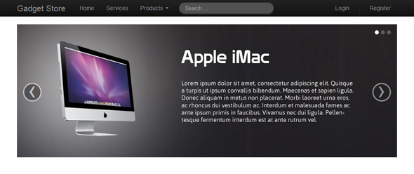
And the output of step one will look something like this:

Explanation of the above code:
Now the question arises how we got those markups, actually this is the standard markup for Twitter Bootstrap navbar that you have to follow every time while creating a navbar. However some classes and elements of are optional like, ".navbar-fixed-top" which is used to create navbar which is fixed to top of the viewport and doesn't scroll with the page.
The class ".navbar-inverse" is optional and used to create inverted variation of the navbar. The class ".container" is used to wrap the navbar inner content like links and search input. The main purpose of the Bootstrap ".container" class is to wrap the content in order to align them horizontally center with respect to the viewport, like you do in regular HTML and CSS. Inside the container you can create row or column like structure to place your content using the Twitter Bootstrap grid system.
Tip: Since navbar is fixed on top of the viewport, so we have to add some padding to top of the <body> in order to avoid the overlapping of navbar over content.
So let's create a custom style sheet "custom.css" and place it at the same location where other style sheets are located i.e. in the Bootstrap's css folder. After that add this custom style sheet to the document using the HTML <link> tag. We will use this style sheet to apply some custom styling in order to adjust the layout according to our visual design such as margin between sections, alignment of UI elements etc.
Now add the following style rule to the custom.css.
Example
Try this code »body {padding-top: 60px;
}
The above style rule prevents the contents form going underneath the navbar.
A Brief Introduction of Twitter Bootstrap Grid System
The Twitter Bootstrap default grid system is based on 12 column grid that makes 940px wide container without responsive features enabled. You can enable the responsive feature through adding the responsive CSS file; in that case the grid adapts to be 724px and 1170px wide depending on the size of the viewport. Viewports having size below 767px, the columns become fluid and stack vertically.
Now you might ask a question how to create row and columns using the Bootstrap grid system? The answer is pretty simple, to create row inside the container use the Bootstrap ".row" class and to create columns inside the row you can use the .span1, .span2, .span3 up to .span12 — for example if you want to create two column inside a row having the equal width simply use the following markup.
Example
Try this code »<div class="container">
<div class="row">
<div class="span6"><!--Content Area--></div>
<div class="span6"><!--Content Area--></div>
</div></div>
Where the ".span6" class will span to six column grids and the other ".span6" class will span across the remaining six column grids which resulting in two equal columns.
Similarly you can create layouts of more than one column and with varying width using the different .span* class combination. But keep in mind the sum of the span numbers cannot be greater than 12 for any row. Learn more about Twitter Bootstrap grid system.
Step 2: Creating the Slide Show
Ok, for now just create another container <div> and place it below the navbar to wrap rest of the thing on the page and align them horizontally center.
<html><head><meta charset="utf-8">
<title>The Gadget Store</title>
<meta name="viewport" content="width=device-width, initial-scale=1.0">
<link rel="stylesheet" type="text/css" href="css/bootstrap.min.css">
<link rel="stylesheet" type="text/css" href="css/custom.css">
</head><body><div class="navbar navbar-fixed-top navbar-inverse">
<div class="navbar-inner">
<div class="container">
<a href="#" class="brand">Gadget Store</a>
<div class="nav-collapse collapse navbar-responsive-collapse">
<ul class="nav">
<li><a href="#">Home</a></li>
<li><a href="#">Services</a></li>
<li class="dropdown">
<a href="#" data-toggle="dropdown" class="dropdown-toggle">Products <b class="caret"></b></a>
<ul class="dropdown-menu">
<li><a href="#">Gadgets</a></li>
<li><a href="#">Accessories</a></li>
<li class="divider"></li>
<li><a href="#">More »</a></li>
</ul></li></ul><form action="#" class="navbar-search pull-left">
<input type="text" placeholder="Search …" class="search-query">
</form><ul class="nav pull-right">
<li><a href="#myModal" data-toggle="modal">Login</a></li>
<li class="divider-vertical"></li>
<li><a href="#">Register</a></li>
</ul></div></div></div></div><div class="container"><!--Content Area--></div>
<script src="http://code.jquery.com/jquery.min.js"></script>
<script src="js/bootstrap.min.js"></script>
</body></html>
Let's consider our Gadget Store layout. The banner area has only one column and it covers the complete width of the container. So inside the container div write the following markup.
Example
Try this code »<div class="row">
<div class="span12"><!--Place carousel markup here--></div>
</div>
Now it's time to create our products carousel or slideshow. Go ahead and type the following markup inside our newly created column.
Example
Try this code »<div id="myCarousel" class="carousel slide">
<!-- Carousel indicators --><ol class="carousel-indicators">
<li data-target="#myCarousel" data-slide-to="0" class="active"></li>
<li data-target="#myCarousel" data-slide-to="1"></li>
<li data-target="#myCarousel" data-slide-to="2"></li>
</ol><!-- Carousel items --><div class="carousel-inner">
<div class="item active"><img src="slide1.jpg" alt="Slide 1"></div>
<div class="item"><img src="slide2.jpg" alt="Slide 2"></div>
<div class="item"><img src="slide3.jpg" alt="Slide 3"></div>
</div><!-- Carousel nav --><a class="carousel-control left" href="#myCarousel" data-slide="prev">«</a>
<a class="carousel-control right" href="#myCarousel" data-slide="next">»</a>
</div>
Again this is the standard markup for Twitter Bootstrap carousel that you have to follow while creating carousel. After combining the above steps our final code would be:
<html><head><meta charset="utf-8">
<title>The Gadget Store</title>
<meta name="viewport" content="width=device-width, initial-scale=1.0">
<link rel="stylesheet" type="text/css" href="css/bootstrap.min.css">
<link rel="stylesheet" type="text/css" href="css/custom.css">
</head><body><div class="navbar navbar-fixed-top navbar-inverse">
<div class="navbar-inner">
<div class="container">
<a href="#" class="brand">Gadget Store</a>
<div class="nav-collapse collapse navbar-responsive-collapse">
<ul class="nav">
<li><a href="#">Home</a></li>
<li><a href="#">Services</a></li>
<li class="dropdown">
<a href="#" data-toggle="dropdown" class="dropdown-toggle">Products <b class="caret"></b></a>
<ul class="dropdown-menu">
<li><a href="#">Gadgets</a></li>
<li><a href="#">Accessories</a></li>
<li class="divider"></li>
<li><a href="#">More »</a></li>
</ul></li></ul><form action="#" class="navbar-search pull-left">
<input type="text" placeholder="Search …" class="search-query">
</form><ul class="nav pull-right">
<li><a href="#myModal" data-toggle="modal">Login</a></li>
<li class="divider-vertical"></li>
<li><a href="#">Register</a></li>
</ul></div></div></div></div><div class="container">
<div class="row">
<div class="span12">
<div id="myCarousel" class="carousel slide">
<!-- Carousel indicators --><ol class="carousel-indicators">
<li data-target="#myCarousel" data-slide-to="0" class="active"></li>
<li data-target="#myCarousel" data-slide-to="1"></li>
<li data-target="#myCarousel" data-slide-to="2"></li>
</ol><!-- Carousel items --><div class="carousel-inner">
<div class="active item"><img src="img/slide-01.jpg" alt="" /></div>
<div class="item"><img src="img/slide-02.jpg" alt="" /></div>
<div class="item"><img src="img/slide-03.jpg" alt="" /></div>
</div><!-- Carousel nav --><a class="carousel-control left" href="#myCarousel" data-slide="prev">‹</a>
<a class="carousel-control right" href="#myCarousel" data-slide="next">›</a>
</div></div></div></div><script src="http://code.jquery.com/jquery.min.js"></script>
<script src="js/bootstrap.min.js"></script>
</body></html>
If you see the output of this example you will find the carousel controls are aligned slightly upward not in the middle. To fix this issue we have to overwrite the positioning of carousel controls. Also we need overwrite the margin-bottom property of the Bootstrap's ".carousel" class in order to create some extra space at the bottom of carousel.
Example
Try this code ».carousel-control {top: 50%;
}
.carousel {margin-bottom: 30px;
}
Type the above style rules inside "custom.css" file and save it. Now go to the browser and refresh the page you will see the output something like this:
Till now we have covered the navbar and carousel section. Let's get back to our Gadget Store layout and you will find the main content area has two separate columns standing side by side one is sidebar containing the list of categories and the other is content area having the list of gadgets. So we have to create two columns where right column is three times larger than the left column. Keeping that in mind our markup would be:
Example
Try this code »<div class="row">
<div class="span3"></div>
<div class="span9"></div>
</div>
Step 3: Creating the Nav List
To create the categories navigation list we will use the Twitter Bootstrap nav list component. It provides an easy and quick way to create groups of stacked navigation links with optional header as you can see in our Gadget Store layout.
Go ahead and type the following code inside the sidebar column.
Example
Try this code »<div class="well">
<ul class="nav nav-list">
<li class="nav-header">Gadgets</li>
<li class="active"><a href="#">Mobile</a></li>
<li><a href="#">Laptop</a></li>
<li><a href="#">Camera</a></li>
<li><a href="#">Tablet</a></li>
<li><a href="#">Music System</a></li>
<li><a href="#">Television</a></li>
<li><a href="#">Desktop</a></li>
<li class="nav-header">Accessories</li>
<li><a href="#">Mobile Cover</a></li>
<li><a href="#">Earphone</a></li>
<li><a href="#">Charger</a></li>
<li><a href="#">Batteries</a></li>
</ul></div>
Tip: The nav list is placed inside Twitter Bootstrap well component in order to apply some visual effect like background and inset effect.
Step 4: Creating the Products Gallery
Now its time to move on products gallery section. It contains the list of gadget's images and some other information like item name and price. You can easily create such grids of images or videos using the Twitter Bootstrap thumbnails component.
Go ahead and type the following code inside right column.
<ul class="thumbnails">
<li class="span3">
<div class="thumbnail">
<img src="img/desktop.jpg" alt="Desktop Image">
<div class="caption">
<h3>Desktop</h3>
<P>Starting at <span class="price">$499</span></P>
<p><a href="product-details.html" class="btn btn-success">View details »</a></p>
</div></div></li><li class="span3">
<div class="thumbnail">
<img src="img/camera.jpg" alt="Camera Image">
<div class="caption">
<h3>Camera</h3>
<P>Starting at <span class="price">$249</span></P>
<p><a href="#" class="btn btn-success">View details »</a></p>
</div></div></li><li class="span3">
<div class="thumbnail">
<img src="img/notebook.jpg" alt="Laptop Image">
<div class="caption">
<h3>Laptop</h3>
<P>Starting at <span class="price">$399</span></P>
<p><a href="#" class="btn btn-success">View details »</a></p>
</div></div></li><li class="span3">
<div class="thumbnail">
<img src="img/iphone.jpg" alt="iPhone Image">
<div class="caption">
<h3>iPhone</h3>
<P>Starting at <span class="price">$349</span></P>
<p><a href="#" class="btn btn-success">View details »</a></p>
</div></div></li><li class="span3">
<div class="thumbnail">
<img src="img/head-phone.jpg" alt="Head Phone Image">
<div class="caption">
<h3>Head Phone</h3>
<P>Starting at <span class="price">$199</span></P>
<p><a href="#" class="btn btn-success">View details »</a></p>
</div></div></li><li class="span3">
<div class="thumbnail">
<img src="img/ipad.jpg" alt="iPad Image">
<div class="caption">
<h3>iPad Mini</h3>
<P>Starting at <span class="price">$259</span></P>
<p><a href="#" class="btn btn-success">View details »</a></p>
</div></div></li></ul>
This is the standard markup for thumbnails components that you need to follow while creating grids of images or videos. Now according to the home page visual design thumbnail's contents are align to horizontally center, to achieve this effect we have to overwrite the thumbnail's text-align property. Also if you see the example code carefully you will find we have used the class ".price" to enlarge the gadget's price text.
So open the "custom.css" file and write following style rules.
Example
Try this code ».thumbnail {text-align: center;
}
.price {font-size: 21px;
margin-left: 10px;
vertical-align: middle;
}
Go and refresh the browser you will see something like this.
Step 5: Creating the Footer Section
As you can see, we are very close to finish our home page. We are just left with the footer section. For the footer section just create another container div and inside that div create a row with a single column that span across all the 12 columns grids. After that add the copyright text and terms and privacy links.
Example
Try this code »<div class="container">
<hr><div class="row">
<div class="span12">
<p class="pull-left">Copyright © 2013 Gadget Store, Inc. All Right Reserved</p>
<p class="pull-right"><a href="user-agreement.html">Privacy Policy</a> | <a href="user-agreement.html">Terms of Use</a></p>
</div></div></div>
As you can see in the code above we have used two class ".pull-left" and ".pull-right" on the paragraph. These are Twitter Bootstrap utility classes and very useful. The ".pull-left" class floats the elements to left while the ".pull-right" class floats the elements to right. We have also placed an <hr> tag before the footer row to create a horizontal divider. After combining the whole steps our final code would be.
<html><head><meta charset="utf-8">
<title>The Gadget Store</title>
<meta name="viewport" content="width=device-width, initial-scale=1.0">
<link rel="stylesheet" type="text/css" href="css/bootstrap.min.css">
<link rel="stylesheet" type="text/css" href="css/custom.css">
</head><body><div class="navbar navbar-fixed-top navbar-inverse">
<div class="navbar-inner">
<div class="container">
<a href="#" class="brand">Gadget Store</a>
<div class="nav-collapse collapse navbar-responsive-collapse">
<ul class="nav">
<li><a href="#">Home</a></li>
<li><a href="#">Services</a></li>
<li class="dropdown">
<a href="#" data-toggle="dropdown" class="dropdown-toggle">Products <b class="caret"></b></a>
<ul class="dropdown-menu">
<li><a href="#">Gadgets</a></li>
<li><a href="#">Accessories</a></li>
<li class="divider"></li>
<li><a href="#">More »</a></li>
</ul></li></ul><form action="#" class="navbar-search pull-left">
<input type="text" placeholder="Search …" class="search-query">
</form><ul class="nav pull-right">
<li><a href="#myModal" data-toggle="modal">Login</a></li>
<li class="divider-vertical"></li>
<li><a href="sign-up.html">Register</a></li>
</ul></div></div></div></div><div class="container">
<div class="row banner">
<div class="span12">
<div id="myCarousel" class="carousel slide">
<!-- Carousel indicators --><ol class="carousel-indicators">
<li data-target="#myCarousel" data-slide-to="0" class="active"></li>
<li data-target="#myCarousel" data-slide-to="1"></li>
<li data-target="#myCarousel" data-slide-to="2"></li>
</ol><!-- Carousel items --><div class="carousel-inner">
<div class="active item"><img src="img/slide-01.jpg" alt="Slide 1" /></div>
<div class="item"><img src="img/slide-02.jpg" alt="Slide 2" /></div>
<div class="item"><img src="img/slide-03.jpg" alt="Slide 3" /></div>
</div><!-- Carousel nav --><a class="carousel-control left" href="#myCarousel" data-slide="prev">‹</a>
<a class="carousel-control right" href="#myCarousel" data-slide="next">›</a>
</div></div></div><div class="row">
<div class="span3">
<div class="well">
<ul class="nav nav-list">
<li class="nav-header">Gadgets</li>
<li class="active"><a href="#">Mobile</a></li>
<li><a href="#">Laptop</a></li>
<li><a href="#">Camera</a></li>
<li><a href="#">Tablet</a></li>
<li><a href="#">Music System</a></li>
<li><a href="#">Television</a></li>
<li><a href="#">Desktop</a></li>
<li class="nav-header">Accessories</li>
<li><a href="#">Mobile Cover</a></li>
<li><a href="#">Earphone</a></li>
<li><a href="#">Charger</a></li>
<li><a href="#">Batteries</a></li>
</ul>
</div>
</div><div class="span9">
<ul class="thumbnails">
<li class="span3">
<div class="thumbnail">
<img src="img/desktop.jpg" alt="Desktop Image">
<div class="caption">
<h3>Desktop</h3>
<P>Starting at <span class="price">$499</span></P>
<p><a href="product-details.html" class="btn btn-success">View details »</a></p>
</div></div></li><li class="span3">
<div class="thumbnail">
<img src="img/camera.jpg" alt="Camera Image">
<div class="caption">
<h3>Camera</h3>
<P>Starting at <span class="price">$249</span></P>
<p><a href="#" class="btn btn-success">View details »</a></p>
</div></div></li><li class="span3">
<div class="thumbnail">
<img src="img/notebook.jpg" alt="Laptop Image">
<div class="caption">
<h3>Laptop</h3>
<P>Starting at <span class="price">$399</span></P>
<p><a href="#" class="btn btn-success">View details »</a></p>
</div></div></li><li class="span3">
<div class="thumbnail">
<img src="img/iphone.jpg" alt="iPhone Image">
<div class="caption">
<h3>iPhone</h3>
<P>Starting at <span class="price">$349</span></P>
<p><a href="#" class="btn btn-success">View details »</a></p>
</div></div></li><li class="span3">
<div class="thumbnail">
<img src="img/head-phone.jpg" alt="Head Phone Image">
<div class="caption">
<h3>Head Phone</h3>
<P>Starting at <span class="price">$199</span></P>
<p><a href="#" class="btn btn-success">View details »</a></p>
</div></div></li><li class="span3">
<div class="thumbnail">
<img src="img/ipad.jpg" alt="iPad Image">
<div class="caption">
<h3>iPad Mini</h3>
<P>Starting at <span class="price">$259</span></P>
<p><a href="#" class="btn btn-success">View details »</a></p>
</div></div></li></ul></div></div></div><!-- Footer section --><div class="container">
<hr><div class="row">
<div class="span12">
<p class="pull-left">Copyright © 2013 Gadget Store, Inc. All Right Reserved</p>
<p class="pull-right"><a href="user-agreement.html">Privacy Policy</a> | <a href="user-agreement.html">Terms of Use</a></p>
</div></div></div><script src="http://code.jquery.com/jquery.min.js"></script>
<script src="js/bootstrap.min.js"></script>
</body></html>
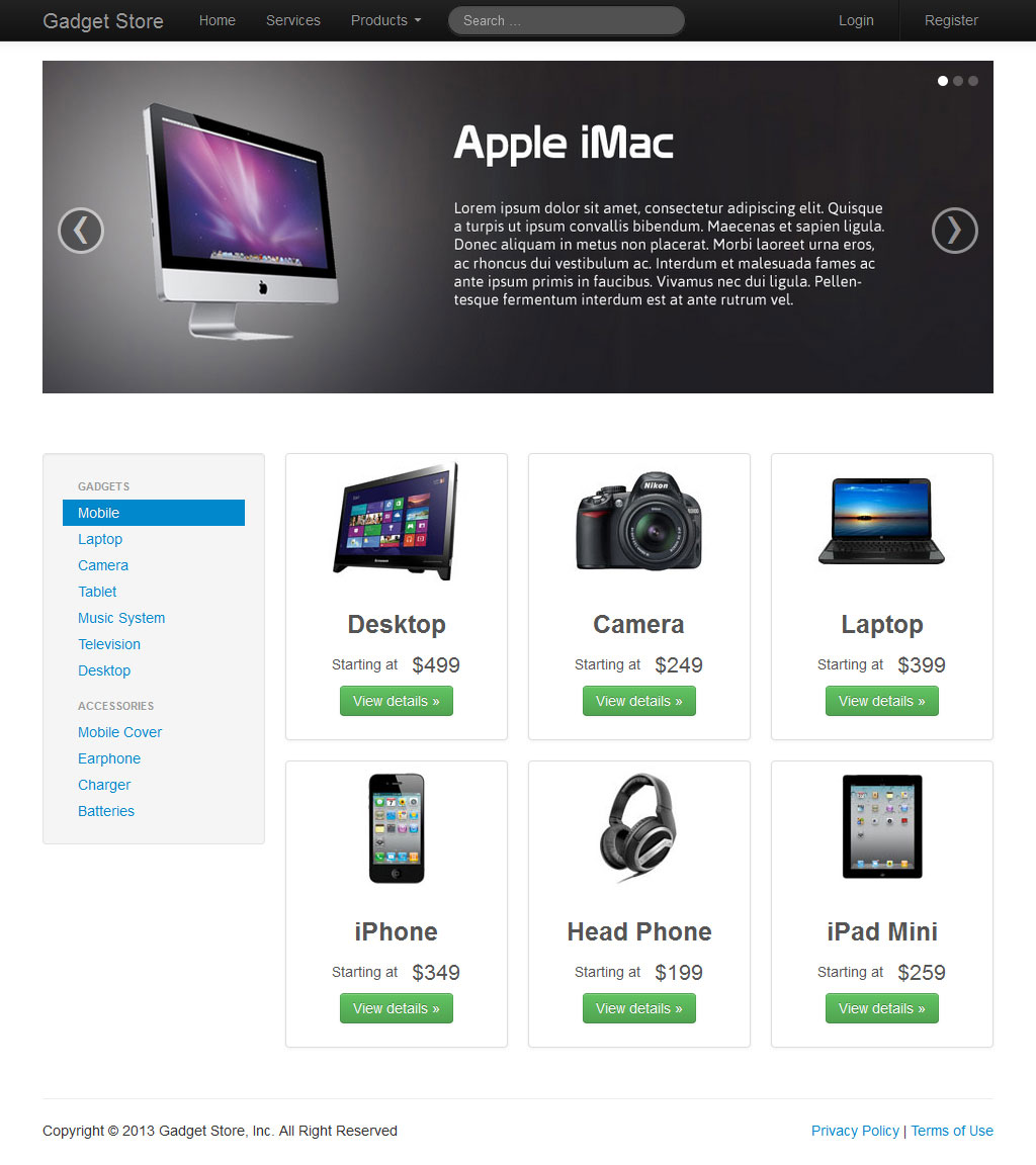
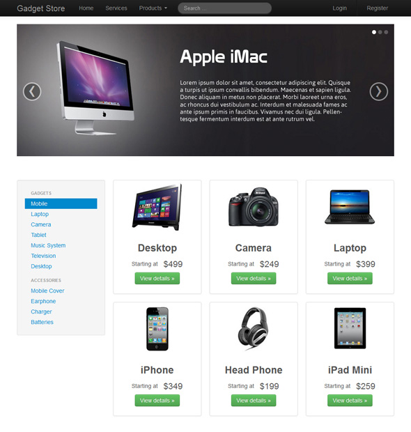
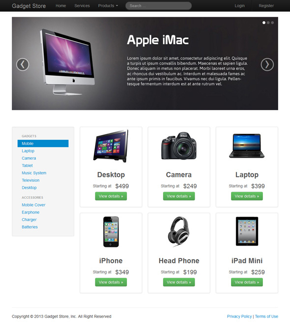
And the output will look something like this:
We have finished our home page, but just wait we will add one more feature to our home page which is a modal window (i.e. pop up). Our modal window with a login form will appear when a user click on login link in the navbar.
Ok, let's focus on our modal window, it won't take too much of time. The Twitter Bootstrap modal component provides an easy way to create and activate modal window without writing any JavaScript code. Type the following markup and place it before the closing tag of the body tag and (i.e. </body>) above the <script> tag.
Example
Try this code »<div id="myModal" class="modal hide fade">
<div class="modal-header">
<button type="button" class="close" data-dismiss="modal" aria-hidden="true">×</button>
<h3>Log In</h3>
</div><div class="modal-body">
<form><label>Email Address</label>
<input type="text" placeholder="Email" class="input-xlarge">
<label>Password</label>
<input type="password" placeholder="Password" class="input-xlarge">
<label class="checkbox"><input type="checkbox"> Remember me</label>
</form></div><div class="modal-footer">
<a href="#" class="btn btn-primary">Login</a>
<a href="#" class="btn">Cancel</a>
</div></div>
This is the standard markup for creating Twitter Bootstrap modals. We have added an additional attribute "id" with a unique value to track the modal window inside the document.
Our modal window is ready, but it doesn't solve our purpose if we cannot view it. To activate this modal window we need to add some additional attribute on the controller element which is the login link inside the navbar section.
Set data-toggle="modal" on the controller element whether it is a button or link, along with the data-target="#myModal" if you are using button element or href="#myModal" if you are using an anchor element to target a specific modal box. Here our controller element is an anchor element, so after adding these attribute it will look something like this:
Example
Try this code »<a href="#myModal" data-toggle="modal">Log in</a>
Refresh the browser and verify modal window in working properly or not through clicking on the login link. As you can see there is login form inside the modal window — we will learn about the form later in this tutorial while creating the sign up page.
After a long journey we have finally completed our home page. If you are facing any problem please read the above section carefully you will definitely get the solution.
Creating the Gadget Store Product Details Page
Let's focus on product detail page of our Gadget Store website. Make a copy of "index.html" file and name it "product-detials.html" and save it at the same location.
Since every page of our gadget store site shares the same header (i.e. navbar) and footer so remove everything inside the <body> tag except navbar, footer
and <script> markup. Also change the title of the page to "Product Details" inside the <title> tag.
Now, if you see the visual design of product detail page carefully you will find the top section has two columns. The left column contains the image of product and the right column contains the product description, price and buy now button, also right column is slightly larger than the left column. So keeping that in mind the markup of our column would be:
Example
Try this code »<div class="container">
<div class="row">
<div class="span5">
<!--product image--></div><div class="span7">
<!--product description--></div></div></div>
Step 1: Inserting the Product Image
Now it's time to display our gadget image. Insert the image using the <img> tag and specify the correct source URL in the src attribute. If you view this page in browser you will see the gadget image on the page but it looks very flat and no styles associated with it. So let's enhance the presentation of our image. Twitter Bootstrap image utility classes provides an easy and quick way to style images such as making the round corner, or give them Polaroid effect. Just apply the class ".img-polaroid" on the image and you will get the result as demonstrated in the visual design of this page.
Example
Try this code »<div class="container">
<div class="row">
<div class="span5">
<img src="img/desktop-large.jpg" class="img-polaroid" alt="Lenovo Desktop">
</div><div class="span7">
<!--product description--></div></div></div>
Step 2: Creating the Product Description Section
Let's move on right column. As you can see there are some headings followed by the paragraphs of text and a buy now button. Create headings, paragraph and buttons like you do in the regular HTML and place in the right column.
Example
Try this code »<div class="container">
<div class="row">
<div class="span5">
<img src="img/desktop-large.jpg" class="img-polaroid" alt="Lenovo Desktop">
</div><div class="span7">
<h2>Lenovo Desktop</h2>
<h4 class="muted">Thinner, Lighter, Faster. All in One Desktop</h4>
<p>Lorem ipsum dolor sit amet consectetur elit...</p>
<hr><h3>Price - <del class="text-error">$699</del> $499</h3>
<p class="muted">Inclusive of all taxes. Free home delivery.</p>
<br><p><a href="#" class="btn btn-success btn-large">Buy Online Now</a></p>
</div></div></div>
Now open this page in the browser you will the output something like this:
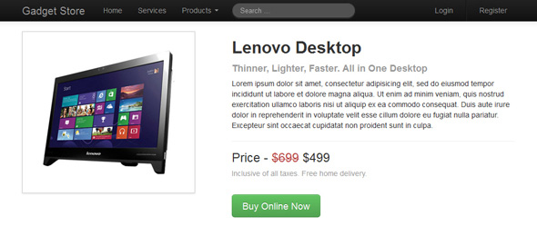
Explanation of the above code:
Twitter Bootstrap provides several text emphasis classes like ".muted", ".text-warning", ".text-error", ".text-info" and ".text-success" to emphasize the text content for example, the class ".muted" makes the text grayed out, ".text-success" highlights the text in green color, ".text-error" highlights the text in red color and so on.
In Twitter Bootstrap buttons can be created using the ".btn" class. Like the text emphasis classes there are several utility classes for buttons are available in the Twitter Bootstrap that can be used with the ".btn" base class to create different types of buttons such as the class ".btn-primary" can be used to create primary action button, the class ".btn-sucess" can be used to create button that indicate positive action, the class ".btn-danger" can be used to create negative action buttons etc. Rest of the thing is self explanatory. Learn more about Twitter Bootstrap buttons.
Step 3: Creating the Product Details Tabs
Now, focus on bottom section that contains product features and specification details. Create a new row inside the container and inside this row create a column that span across the entire 12 column grid.
Example
Try this code »<div class="row">
<div class="span12">
<!--product details--></div></div>
As you can see in the visual design the bottom contents are separated into different panes where only one pane is viewable at a time through clicking on the respective tabs. Using Twitter Bootstrap tab component you can easily create these dynamic tabs without writing any JavaScript code. Go ahead and type the following code in the bottom section.
Example
Try this code »<ul class="nav nav-tabs">
<li class="active"><a data-toggle="tab" href="#tab-1">Specification</a></li>
<li><a data-toggle="tab" href="#tab-2">Key Features</a></li>
</ul><div class="tab-content">
<div id="tab-1" class="tab-pane fade in active">
<!--Tab-1 content--></div><div id="tab-2" class="tab-pane fade">
<!--Tab-2 content--></div></div>
This is standard markup for Twitter Bootstrap dynamic tab that you have to follow every time. Also add the following style rule to the custom style sheet (i.e. "custom.css") in order to create some extra space before the tabs section.
Example
Try this code ».nav-tabs {margin-top: 40px;
}
Till now our tab content panes are empty, so let's fill it with the table containing features and specification data as demonstrated in the visual design.
<ul class="nav nav-tabs">
<li class="active"><a data-toggle="tab" href="#tab-1">Specification</a></li>
<li><a data-toggle="tab" href="#tab-2">Key Features</a></li>
</ul><div class="tab-content">
<div id="tab-1" class="tab-pane fade in active">
<table class="table table-striped">
<tbody><tr><th>Brand</th>
<td>Lenovo</td>
</tr><tr><th>OS</th>
<td>Windows 8</td>
</tr><tr><th>Processor</th>
<td>1.5 GHz Dual Core</td>
</tr><tr><th>Memory</th>
<td>2 GB RAM</td>
</tr></tbody></table></div><div id="tab-2" class="tab-pane fade">
<table class="table table-striped">
<tbody><tr><td>Windows 8 OS</td>
</tr><tr><td>Intel Dual Core Processor</td>
</tr><tr><td>18.5 Inch LED Screen</td>
</tr><tr><td>Integrated Graphics</td>
</tr></tbody></table></div></div>
Creating tables in Twitter Bootstrap is as simple as creating tables in regular HTML. Just create tables and apply the class ".table" on it, Twitter Bootstrap inbuilt style sheets will automatically applies some basic styling like horizontal dividers and padding on all table cells.
You can further add optional utility classes like ".table-stripped", ".table-bordered" and ".table-hover" to make it more elegant. Learn more about Twitter Bootstrap tables.
After combining the whole steps the final code of the product detail page would be.
<html><head><meta charset="utf-8">
<title>Product Details</title>
<meta name="viewport" content="width=device-width, initial-scale=1.0">
<link rel="stylesheet" type="text/css" href="css/bootstrap.min.css">
<link rel="stylesheet" type="text/css" href="css/custom.css">
</head><body><div class="navbar navbar-fixed-top navbar-inverse">
<div class="navbar-inner">
<div class="container">
<a href="#" class="brand">Gadget Store</a>
<div class="nav-collapse collapse navbar-responsive-collapse">
<ul class="nav">
<li><a href="#">Home</a></li>
<li><a href="#">Services</a></li>
<li class="dropdown">
<a href="#" data-toggle="dropdown" class="dropdown-toggle">Products <b class="caret"></b></a>
<ul class="dropdown-menu">
<li><a href="#">Gadgets</a></li>
<li><a href="#">Accessories</a></li>
<li class="divider"></li>
<li><a href="#">More »</a></li>
</ul></li></ul><form action="#" class="navbar-search pull-left">
<input type="text" placeholder="Search …" class="search-query">
</form><ul class="nav pull-right">
<li><a href="#">Login</a></li>
<li class="divider-vertical"></li>
<li><a href="sign-up.html">Register</a></li>
</ul></div></div></div></div><div class="container">
<div class="row">
<div class="span5">
<img src="img/desktop-large.jpg" class="img-polaroid" alt="Lenovo Desktop" style="width: 320px;height: 300px;">
</div><div class="span7">
<h2>Lenovo Desktop</h2>
<h4 class="muted">Thinner, Lighter, Faster. All in One Desktop</h4>
<p>Lorem ipsum dolor sit amet consectetur elit...</p>
<hr><h3>Price - <del class="text-error">$699</del> $499</h3>
<p class="muted">Inclusive of all taxes. Free home delivery.</p>
<br><p><a href="#" class="btn btn-success btn-large">Buy Online Now</a></p>
</div></div><div class="row">
<div class="span12">
<ul class="nav nav-tabs">
<li class="active"><a data-toggle="tab" href="#tab-1">Specification</a></li>
<li><a data-toggle="tab" href="#tab-2">Key Features</a></li>
</ul><div class="tab-content">
<div id="tab-1" class="tab-pane fade in active">
<table class="table table-striped">
<tbody><tr><th>Brand</th>
<td>Lenovo</td>
</tr><tr><th>OS</th>
<td>Windows 8</td>
</tr><tr><th>Processor</th>
<td>1.5 GHz Dual Core</td>
</tr><tr><th>Memory</th>
<td>2 GB RAM</td>
</tr></tbody></table></div><div id="tab-2" class="tab-pane fade">
<table class="table table-striped">
<tbody><tr><td>Windows 8 OS</td>
</tr><tr><td>Intel Dual Core Processor</td>
</tr><tr><td>18.5 Inch LED Screen</td>
</tr><tr><td>Integrated Graphics</td>
</tr></tbody></table></div></div></div></div></div><!-- Footer section --><div class="container">
<hr><div class="row">
<div class="span12">
<p class="pull-left">Copyright © 2013 Gadget Store, Inc. All Right Reserved</p>
<p class="pull-right"><a href="user-agreement.html">Privacy Policy</a> | <a href="user-agreement.html">Terms of Use</a></p>
</div></div></div><script src="http://code.jquery.com/jquery.min.js"></script>
<script src="js/bootstrap.min.js"></script>
</body></html>
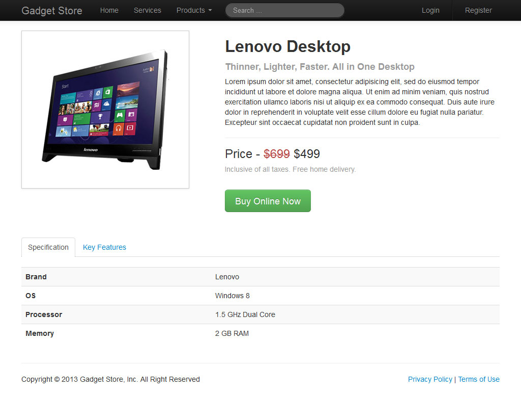
And the output will look something like this:

And we have finished with the Gadget Store product details page. In the next section we will create the "Sign Up" page for our Gadget Store website.
Creating the Gadget Store Sign Up Page
If you see the visual design of sign up page carefully you will find it will contain a registration form as well as the same header and footer section. Ok, let's create the sign up page for our Gadget Store website. Make a copy of "product-detial.html" file and name it "register.html" and save it at the same location. Since header and footer portion will remain same so remove everything inside the <body> tag except header, footer and <script> markup. Also change the title of this page to "Sign Up" inside the <title> tag.
Example
Try this code »<h1>Sign Up</h1>
<h4 class="muted">Fill in this form to register with us.</h4>
<hr>
The controls of this registration form are typical HTML form controls like input, textarea, button etc. However layout of this form is created using Twitter Bootstrap form layout. Twitter Bootstrap provides four different types of form layouts which are — vertical (default), horizontal, inline and search form layout.
The layout used for Gadget Store sign up form is horizontal form layout. So go ahead and type the following code at the bottom of horizontal rule.
<form class="form-horizontal">
<div class="control-group">
<label class="control-label">First Name</label>
<div class="controls">
<input type="text" placeholder="First Name">
</div></div><div class="control-group">
<label class="control-label">Last Name</label>
<div class="controls">
<input type="text" placeholder="Last Name">
</div></div><div class="control-group">
<label class="control-label">Your Email</label>
<div class="controls">
<input type="text" placeholder="Email">
</div></div><div class="control-group">
<label class="control-label">Mailing Address</label>
<div class="controls">
<textarea placeholder="Mailing Address"></textarea>
</div></div><div class="control-group">
<label class="control-label">Password</label>
<div class="controls">
<input type="password" placeholder="Password">
</div></div><div class="control-group">
<label class="control-label">Confirm Password</label>
<div class="controls">
<input type="password" placeholder="Confirm Password">
</div></div><div class="form-actions">
<button type="submit" class="btn btn-primary">Sign Up</button>
<button type="reset" class="btn">Reset</button>
</div></form>
This is the standard markup for creating Twitter Bootstrap horizontal form layout. It is little bit different as compared to the normal HTML form and requires the following markup changes.
- Add the class
".form-horizontal"to the form - Wrap labels and form controls in a div element and apply the class
".control-group" - Add the class
".control-label"to the label element - Wrap the associated form controls in div element and apply the class
".controls"on it for proper alignment
Rest of the thing is self explanatory. Learn more about Twitter Bootstrap form.
We have done! Here is our final code after combining the whole steps.
<html><head><meta charset="utf-8">
<title>Sign Up</title>
<meta name="viewport" content="width=device-width, initial-scale=1.0">
<link rel="stylesheet" type="text/css" href="css/bootstrap.min.css">
<link rel="stylesheet" type="text/css" href="css/custom.css">
</head><body><div class="navbar navbar-fixed-top navbar-inverse">
<div class="navbar-inner">
<div class="container">
<a href="#" class="brand">Gadget Store</a>
<div class="nav-collapse collapse navbar-responsive-collapse">
<ul class="nav">
<li><a href="#">Home</a></li>
<li><a href="#">Services</a></li>
<li class="dropdown">
<a href="#" data-toggle="dropdown" class="dropdown-toggle">Products <b class="caret"></b></a>
<ul class="dropdown-menu">
<li><a href="#">Gadgets</a></li>
<li><a href="#">Accessories</a></li>
<li class="divider"></li>
<li><a href="#">More »</a></li>
</ul></li></ul><form action="#" class="navbar-search pull-left">
<input type="text" placeholder="Search …" class="search-query">
</form><ul class="nav pull-right">
<li><a href="#">Login</a></li>
<li class="divider-vertical"></li>
<li><a href="sign-up.html">Register</a></li>
</ul></div></div></div></div><div class="container">
<div class="row">
<div class="span12">
<h1>Sign Up</h1>
<h4 class="muted">Fill in this form to register with us.</h4>
<hr><form class="form-horizontal">
<div class="control-group">
<label class="control-label">First Name</label>
<div class="controls">
<input type="text" placeholder="First Name">
</div></div><div class="control-group">
<label class="control-label">Last Name</label>
<div class="controls">
<input type="text" placeholder="Last Name">
</div></div><div class="control-group">
<label class="control-label">Your Email</label>
<div class="controls">
<input type="text" placeholder="Email">
</div></div><div class="control-group">
<label class="control-label">Mailing Address</label>
<div class="controls">
<textarea placeholder="Mailing Address"></textarea>
</div></div><div class="control-group">
<label class="control-label">Password</label>
<div class="controls">
<input type="password" placeholder="Password">
</div></div><div class="control-group">
<label class="control-label">Confirm Password</label>
<div class="controls">
<input type="password" placeholder="Confirm Password">
</div></div><div class="form-actions">
<button type="submit" class="btn btn-primary">Sign Up</button>
<button type="reset" class="btn">Reset</button>
</div></form></div></div></div><!-- Footer section --><div class="container">
<hr><div class="row">
<div class="span12">
<p class="pull-left">Copyright © 2013 Gadget Store, Inc. All Right Reserved</p>
<p class="pull-right"><a href="user-agreement.html">Privacy Policy</a> | <a href="user-agreement.html">Terms of Use</a></p>
</div></div></div><script src="http://code.jquery.com/jquery.min.js"></script>
<script src="js/bootstrap.min.js"></script>
</body></html>
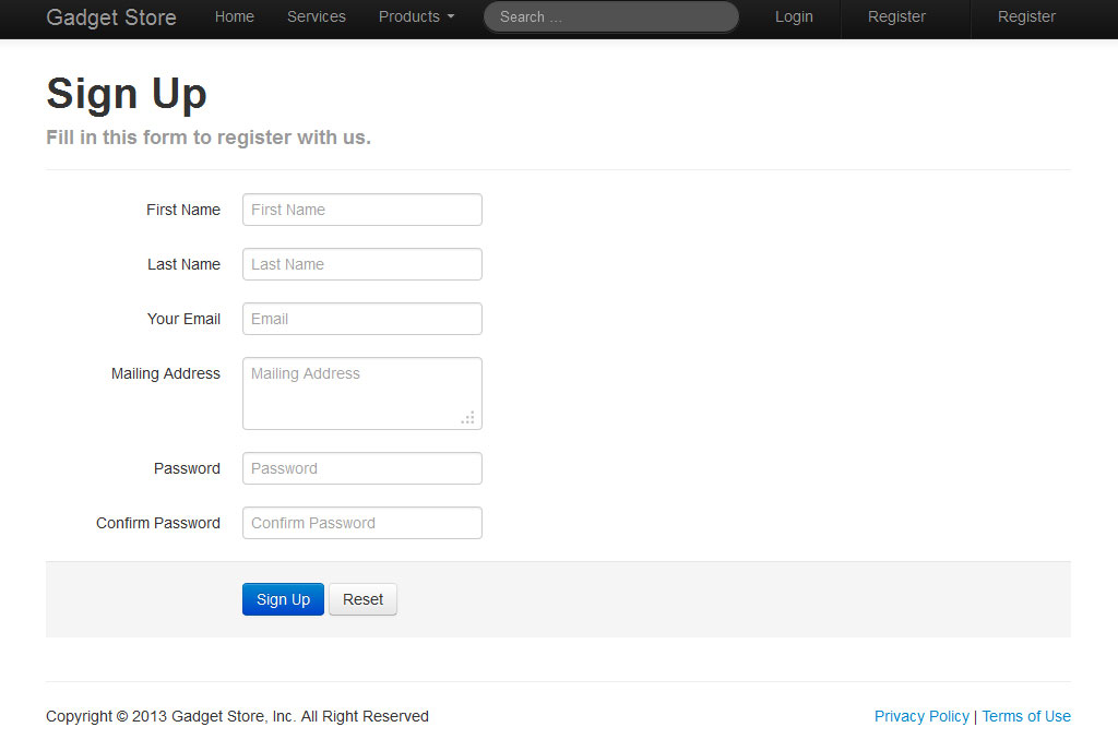
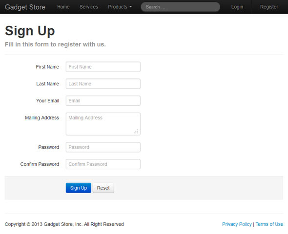
And the output will look something like this:
In the next section we will create the "User Agreement" page for our Gadget store website.
Creating the User Agreement Page
The user agreement page is pretty simple. Besides the navbar and footer section the main content area of this page contains only headings and the terms and privacy statements in an accordion widget. So creating this page won't take too much time.
First create this page through repeating the same process that we have used while creating the "Product Details" and "Sign Up" pages. After that create a new row inside the container and inside this row create a column that span across all the 12 column grid. So, go ahead and type the following code it will create the row, column and heading for this page.
Example
Try this code »<div class="container">
<div class="row">
<div class="span12">
<h1>User Agreement</h1>
<h4 class="muted">The following section describe the terms of use and privacy practices for this website.</h4>
<br></div></div></div>
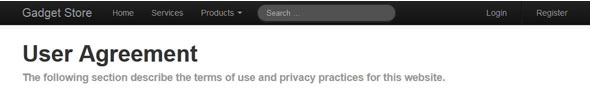
Open this page in your browser and you will see something like this.
Now move to the most important part of this page which is accordion widget. Using Twitter Bootstrap you can create accordion widget without writing a single line of JavaScript code. Type the following code at the bottom of sub heading.
Example
Try this code »<div class="accordion" id="myAccordion">
<div class="accordion-group">
<div class="accordion-heading">
<h3><a class="accordion-toggle" data-toggle="collapse" data-parent="#myAccordion" href="#collapseOne">Terms of Use</a></h3>
</div><div id="collapseOne" class="accordion-body in collapse">
<div class="accordion-inner">
<!--Dummy Text--></div></div></div><div class="accordion-group">
<div class="accordion-heading">
<h3><a class="accordion-toggle" data-toggle="collapse" data-parent="#myAccordion" href="#collapseTwo">Privacy Policy</a></h3>
</div><div id="collapseTwo" class="accordion-body collapse">
<div class="accordion-inner">
<!--Dummy Text--></div></div></div></div>
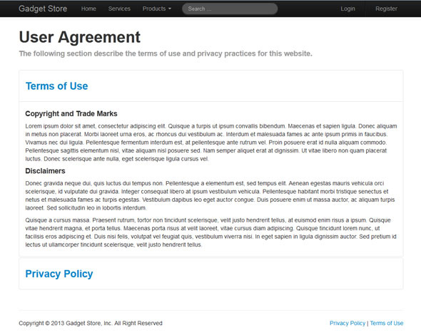
This is the standard markup for creating a Twitter Bootstrap accordion. Here we have created only two sections in our accordion widget however you can create as much as you can.
Explanation of the above code:
The data-toggle="collapse" along with a "href" attribute is applied on the controller element to automatically assign control of a collapsible element. The "href" attribute accepts a CSS selector to apply the collapse to a specific element.
The class ".collapse" is applied on the collapsible element to activate the Twitter Bootstrap collapsible component. The attribute "data-parent" is applied on the all controller element with the same value so that they work in a group like an accordion widget. The "data-parent" attribute accepts a css selector. Learn more about Twitter Bootstrap accordion.
After combining the both steps the final markup of our User Agreement page would be:
<html><head><meta charset="utf-8">
<title>User Agreement</title>
<meta name="viewport" content="width=device-width, initial-scale=1.0">
<link rel="stylesheet" type="text/css" href="css/bootstrap.min.css">
<link rel="stylesheet" type="text/css" href="css/custom.css">
</head><body><div class="navbar navbar-fixed-top navbar-inverse">
<div class="navbar-inner">
<div class="container">
<a href="#" class="brand">Gadget Store</a>
<div class="nav-collapse collapse navbar-responsive-collapse">
<ul class="nav">
<li><a href="#">Home</a></li>
<li><a href="#">Services</a></li>
<li class="dropdown">
<a href="#" data-toggle="dropdown" class="dropdown-toggle">Products <b class="caret"></b></a>
<ul class="dropdown-menu">
<li><a href="#">Gadgets</a></li>
<li><a href="#">Accessories</a></li>
<li class="divider"></li>
<li><a href="#">More »</a></li>
</ul></li></ul><form action="#" class="navbar-search pull-left">
<input type="text" placeholder="Search …" class="search-query">
</form><ul class="nav pull-right">
<li><a href="#">Login</a></li>
<li class="divider-vertical"></li>
<li><a href="sign-up.html">Register</a></li>
</ul></div></div></div></div><div class="container">
<div class="row">
<div class="span12">
<h1>User Agreement</h1>
<h4 class="muted">The following section describe the terms of use and privacy practices for this website.</h4>
<br><div id="myAccordion" class="accordion">
<div class="accordion-group">
<div class="accordion-heading">
<h3><a href="#collapseOne" data-parent="#myAccordion" data-toggle="collapse" class="accordion-toggle">Terms of Use</a></h3>
</div><div class="accordion-body collapse" id="collapseOne">
<div class="accordion-inner">
<h4>Copyright and Trade Marks</h4>
<p>Lorem ipsum dolor sit amet, consectetur adipiscing elit...</p>
<h4>Disclaimers</h4>
<p>Donec gravida neque dui, quis luctus dui tempus non...</p>
<p>Quisque a cursus massa. Praesent rutrum, tortor non tincidunt scelerisque...</p>
</div></div></div><div class="accordion-group">
<div class="accordion-heading">
<h3><a href="#collapseTwo" data-parent="#myAccordion" data-toggle="collapse" class="accordion-toggle">Privacy Policy</a></h3>
</div><div class="accordion-body collapse in" id="collapseTwo">
<div class="accordion-inner">
<h4>Collection of Personal Information</h4>
<p>Curabitur dapibus, mauris eget ultrices scelerisque, orci massa vulputate nunc...</p>
<p>Morbi laoreet urna eros, ac rhoncus dui vestibulum ac. Interdum et malesuada fames...</p>
<h4>Security of Personal Information</h4>
<p>Proin sollicitudin congue leo, vitae lobortis magna...</p>
</div></div></div></div></div></div></div><!-- Footer section --><div class="container">
<hr><div class="row">
<div class="span12">
<p class="pull-left">Copyright © 2013 Gadget Store, Inc. All Right Reserved</p>
<p class="pull-right"><a href="user-agreement.html">Privacy Policy</a> | <a href="user-agreement.html">Terms of Use</a></p>
</div></div></div><script src="http://code.jquery.com/jquery.min.js"></script>
<script src="js/bootstrap.min.js"></script>
</body></html>
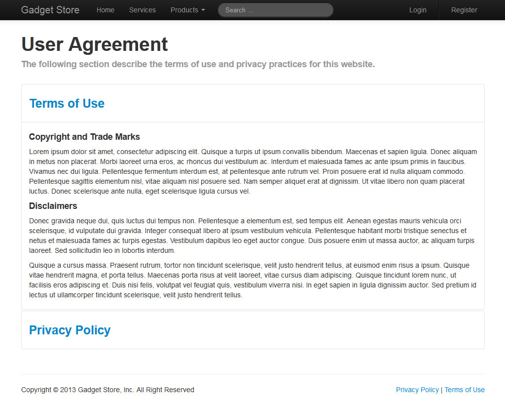
And the output will look something like this:
Tip: If you want a collapsible element should be open by default while using the Twitter Bootstrap collapsible component, add an extra class ".in" on it.
After a long journey finally we have finished our Gadget Store website. I recommend you to check out our step by step tutorial section for better understanding of each and every topic.


