Bootstrap Navbar
In this tutorial you will learn how to create static and fixed positioned responsive navigation headers using the Bootstrap navbar component.
Creating Navbar with Bootstrap
You can use the Bootstrap navbar component to create responsive navigation header for your website or application. These responsive navbar will be collapsed on devices having small viewports like mobile phones but expand when user click the toggle button. However, it will be horizontal as normal on the medium and large devices such as laptop or desktop.
You can also create different variations of the navbar such as navbars with dropdown menus and search boxes as well as fixed positioned navbar with much less effort. The following example will show you how to create a simple static navbar with navigation links.
Example
Try this code »<nav class="navbar navbar-expand-lg navbar-light bg-light">
<div class="container-fluid">
<a href="#" class="navbar-brand">Brand</a>
<button type="button" class="navbar-toggler" data-bs-toggle="collapse" data-bs-target="#navbarCollapse">
<span class="navbar-toggler-icon"></span>
</button>
<div class="collapse navbar-collapse" id="navbarCollapse">
<div class="navbar-nav">
<a href="#" class="nav-item nav-link active">Home</a>
<a href="#" class="nav-item nav-link">Profile</a>
<a href="#" class="nav-item nav-link">Messages</a>
<a href="#" class="nav-item nav-link disabled" tabindex="-1">Reports</a>
</div>
<div class="navbar-nav ms-auto">
<a href="#" class="nav-item nav-link">Login</a>
</div>
</div>
</div>
</nav>— The output of the above example will look something like this:

Tip: Navbars require a wrapping .navbar with .navbar-expand{-sm|-md|-lg|-xl|-xxl} for responsive collapsing, and color scheme classes for appearance. Also, use the spacing and flex utility classes for controlling spacing and alignment within navbars.
Note: Navbars and their contents are fluid by default. Change the container (e.g. .container{-sm|-md|-lg|-xl|-xxl}) to limit their horizontal width in different ways.
Adding Logo Images to Navbars
You can also place your logo image inside the navbar, instead of plain text. However, you need to set the logo height manually to fit it properly inside the navbar, as shown here:
Example
Try this code »<nav class="navbar navbar-expand-lg navbar-light bg-light">
<div class="container-fluid">
<a href="#" class="navbar-brand">
<img src="images/logo.svg" height="28" alt="CoolBrand">
</a>
<button type="button" class="navbar-toggler" data-bs-toggle="collapse" data-bs-target="#navbarCollapse">
<span class="navbar-toggler-icon"></span>
</button>
<div class="collapse navbar-collapse" id="navbarCollapse">
<div class="navbar-nav">
<a href="#" class="nav-item nav-link active">Home</a>
<a href="#" class="nav-item nav-link">Profile</a>
<a href="#" class="nav-item nav-link">Messages</a>
<a href="#" class="nav-item nav-link disabled" tabindex="-1">Reports</a>
</div>
<div class="navbar-nav ms-auto">
<a href="#" class="nav-item nav-link">Login</a>
</div>
</div>
</div>
</nav>— The output of the above example will look something like this:
Tip: Use the utility classes such as .ms-auto, .me-auto, .justify-content-between, etc. to align the nav links, forms, buttons or text inside the navbar.
Adding Dropdowns to Navbar
You can also include dropdowns and search box within the navbars, as shown here:
Example
Try this code »<nav class="navbar navbar-expand-lg navbar-light bg-light">
<div class="container-fluid">
<a href="#" class="navbar-brand">Brand</a>
<button type="button" class="navbar-toggler" data-bs-toggle="collapse" data-bs-target="#navbarCollapse">
<span class="navbar-toggler-icon"></span>
</button>
<div class="collapse navbar-collapse" id="navbarCollapse">
<div class="navbar-nav">
<a href="#" class="nav-item nav-link active">Home</a>
<a href="#" class="nav-item nav-link">Profile</a>
<div class="nav-item dropdown">
<a href="#" class="nav-link dropdown-toggle" data-bs-toggle="dropdown">Messages</a>
<div class="dropdown-menu">
<a href="#" class="dropdown-item">Inbox</a>
<a href="#" class="dropdown-item">Sent</a>
<a href="#" class="dropdown-item">Drafts</a>
</div>
</div>
<a href="#" class="nav-item nav-link disabled" tabindex="-1">Reports</a>
</div>
<div class="navbar-nav ms-auto">
<a href="#" class="nav-item nav-link">Login</a>
</div>
</div>
</div>
</nav>— The output of the above example will look something like this:

Check out the snippets section for examples of some beautifully designed Bootstrap navbars.
Placing Search Form inside Navbar
Search form is a very common component of the navbars and you have seen it on various website quite often. You can place various form controls within a navbar using the class .d-flex on the <form> element, as demonstrated in the following example:
Example
Try this code »<nav class="navbar navbar-expand-lg navbar-light bg-light">
<div class="container-fluid">
<a href="#" class="navbar-brand">Brand</a>
<button type="button" class="navbar-toggler" data-bs-toggle="collapse" data-bs-target="#navbarCollapse">
<span class="navbar-toggler-icon"></span>
</button>
<div class="collapse navbar-collapse justify-content-between" id="navbarCollapse">
<div class="navbar-nav">
<a href="#" class="nav-item nav-link active">Home</a>
<a href="#" class="nav-item nav-link">Profile</a>
<div class="nav-item dropdown">
<a href="#" class="nav-link dropdown-toggle" data-bs-toggle="dropdown">Messages</a>
<div class="dropdown-menu">
<a href="#" class="dropdown-item">Inbox</a>
<a href="#" class="dropdown-item">Sent</a>
<a href="#" class="dropdown-item">Drafts</a>
</div>
</div>
</div>
<form class="d-flex">
<div class="input-group">
<input type="text" class="form-control" placeholder="Search">
<button type="button" class="btn btn-secondary"><i class="bi-search"></i></button>
</div>
</form>
<div class="navbar-nav">
<a href="#" class="nav-item nav-link">Login</a>
</div>
</div>
</div>
</nav>— The output of the above example will look something like this:

Changing the Color Scheme of Navbars
You can also change the color scheme of the navbar by using the .navbar-light for the light background colors, or .navbar-dark for the dark background colors. Then, customize it with the background color utility classes, such as .bg-dark, .bg-primary, and so on.
Alternatively, you can also apply the CSS background-color property on the .navbar element yourself to customize the navbar theme, as shown in the following example:
Example
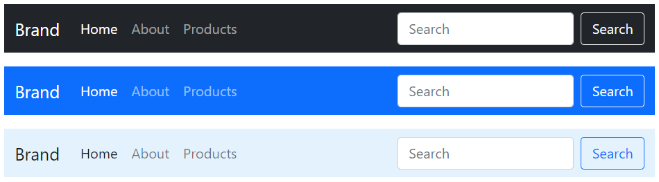
Try this code »<nav class="navbar navbar-dark bg-dark">
<!-- Navbar content -->
</nav>
<nav class="navbar navbar-dark bg-primary">
<!-- Navbar content -->
</nav>
<nav class="navbar navbar-light" style="background-color: #ddeeff;">
<!-- Navbar content -->
</nav>— The output of the above example will look something like this:
Bootstrap Fixed Navbars
Bootstrap also provides mechanism to create navbar that is fixed to the top, fixed to the bottom, or stickied to the top (i.e. scrolls with the page until it reaches the top, then stays there).
Navbar Fixed to the Top
Apply the position utility class .fixed-top to the .navbar element to fix the navbar at the top of the viewport, so that it won't scroll with the page. Here's an example:
Example
Try this code »<nav class="navbar fixed-top navbar-expand-lg navbar-dark bg-dark">
<!-- Navbar content -->
</nav>Navbar Fixed to the Bottom
Similarly, add the class .fixed-bottom to the .navbar element to fix the navbar at the bottom of the viewport. It also won't scroll with the page. Let's see how it works:
Example
Try this code »<nav class="navbar fixed-bottom navbar-expand-lg navbar-dark bg-dark">
<!-- Navbar content -->
</nav>Navbar Stickied to the Top
You can also create sticky top navbar that scrolls with the page until it reaches the top, then stays there, by simply using the .sticky-top class on the .navbar element, like this:
Example
Try this code »<nav class="navbar sticky-top navbar-expand-lg navbar-dark bg-dark">
<!-- Navbar content -->
</nav>Note: Remember to add padding (at least 70px) to the top or bottom of the <body> element to prevent the content to go underneath the navbar while implementing the fixed top or fixed bottom navbar. Also, be sure to add your custom style sheet after the Bootstrap's CSS file, otherwise style rules in your style sheet may be overridden by the Bootstrap's one.
Tip: Place .navbar content inside the .container, .container-fluid or .container{-sm|-md|-lg|-xl|-xxl} for proper padding and alignment with the rest of the content.


