Bootstrap Tables
In this tutorial you will learn how to create elegant tables with Bootstrap.
What is Table?
The HTML tables are used to present data in grid manner like row and columns. Using Bootstrap you can greatly improve the appearance of table in a quick and easy way.
See the tutorial on HTML tables to learn more about tables.
Creating a Simple Table with Bootstrap
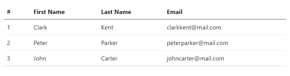
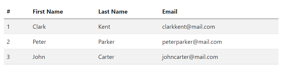
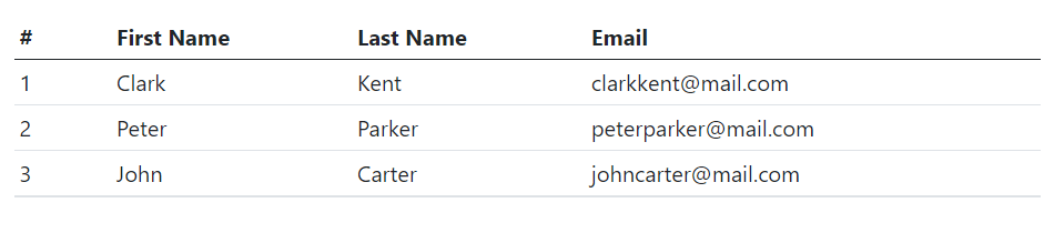
You can create tables with basic styling that has horizontal dividers and small cell padding (8px by default), by just adding the Bootstrap's class .table to the <table> element.
<table class="table">
    <thead>
        <tr>
            <th>#</th>
            <th>First Name</th>
            <th>Last Name</th>
            <th>Email</th>
        </tr>
    </thead>
    <tbody>
        <tr>
            <td>1</td>
            <td>Clark</td>
            <td>Kent</td>
            <td>clarkkent@mail.com</td>
        </tr>
        <tr>
            <td>2</td>
            <td>Peter</td>
            <td>Parker</td>
            <td>peterparker@mail.com</td>
        </tr>
        <tr>
            <td>3</td>
            <td>John</td>
            <td>Carter</td>
            <td>johncarter@mail.com</td>
        </tr>
    </tbody>
</table>
— The output of the above example will look something like this:
Creating Accented Tables
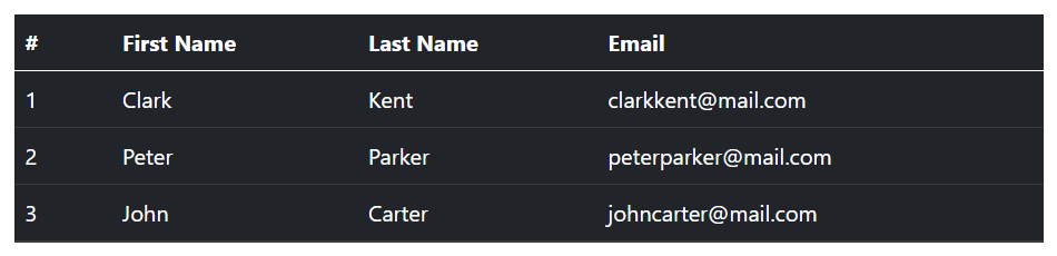
Bootstrap even provides a handful of contextual classes such as .table-primary, .table-secondary, .table-success, .table-danger, .table-warning, .table-info, .table-light and .table-dark to color tables, table rows or individual cells.
For example, you can create a dark version of the table (i.e. table with light text on dark backgrounds) by adding the contextual class .table-dark to the .table base class, like this:
<table class="table table-dark">
    <thead>
        <tr>
            <th>#</th>
            <th>First Name</th>
            <th>Last Name</th>
            <th>Email</th>
        </tr>
    </thead>
    <tbody>
        <tr>
            <td>1</td>
            <td>Clark</td>
            <td>Kent</td>
            <td>clarkkent@mail.com</td>
        </tr>
        <tr>
            <td>2</td>
            <td>Peter</td>
            <td>Parker</td>
            <td>peterparker@mail.com</td>
        </tr>
        <tr>
            <td>3</td>
            <td>John</td>
            <td>Carter</td>
            <td>johncarter@mail.com</td>
        </tr>
    </tbody>
</table>
— The output of the above example will look something like this:
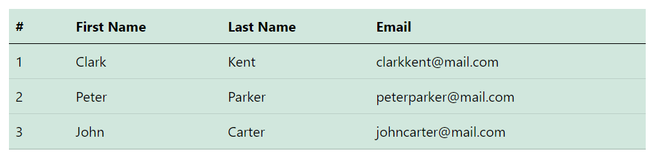
Similarly, you can use other contextual classes. For instance, the following example uses the class .table-success on the .table to create green colored variant of a table.
<table class="table table-success">
    <thead>
        <tr>
            <th>#</th>
            <th>First Name</th>
            <th>Last Name</th>
            <th>Email</th>
        </tr>
    </thead>
    <tbody>
        <tr>
            <td>1</td>
            <td>Clark</td>
            <td>Kent</td>
            <td>clarkkent@mail.com</td>
        </tr>
        <tr>
            <td>2</td>
            <td>Peter</td>
            <td>Parker</td>
            <td>peterparker@mail.com</td>
        </tr>
        <tr>
            <td>3</td>
            <td>John</td>
            <td>Carter</td>
            <td>johncarter@mail.com</td>
        </tr>
    </tbody>
</table>
— The output of the above example will look something like this:
Check out the snippets section for examples of some beautifully designed Bootstrap tables.
Tip: You can use these contextual classes on the .table base class to create colored version of any table such as stripped, hoverable, bordered, compact table, and so on.
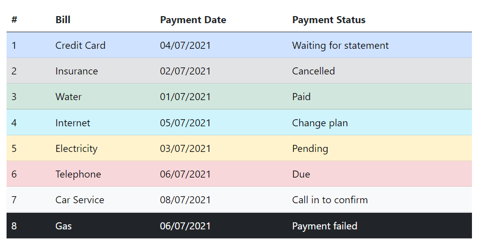
Similar to the tables you can also use these contextual classes to emphasize the rows within a table. Here's an example of a table with emphasized rows, let's take a look:
<table class="table">
    <thead>
        <tr>
            <th>#</th>
            <th>Bill</th>
            <th>Payment Date</th>
            <th>Payment Status</th>
        </tr>
    </thead>
    <tbody>
        <tr class="table-primary">
            <td>1</td>
            <td>Credit Card</td>
            <td>04/07/2021</td>
            <td>Waiting for statement</td>
        </tr>
        <tr class="table-secondary">
            <td>2</td>
            <td>Insurance</td>
            <td>02/07/2021</td>
            <td>Cancelled</td>
        </tr>
        <tr class="table-success">
            <td>3</td>
            <td>Water</td>
            <td>01/07/2021</td>
            <td>Paid</td>
        </tr>
        <tr class="table-info">
            <td>4</td>
            <td>Internet</td>
            <td>05/07/2021</td>
            <td>Change plan</td>
        </tr>
        <tr class="table-warning">
            <td>5</td>
            <td>Electricity</td>
            <td>03/07/2021</td>
            <td>Pending</td>
        </tr>
        <tr class="table-danger">
            <td>6</td>
            <td>Telephone</td>
            <td>06/07/2021</td>
            <td>Due</td>
        </tr>
        <tr class="table-light">
            <td>7</td>
            <td>Car Service</td>
            <td>08/07/2021</td>
            <td>Call in to confirm</td>
        </tr>
        <tr class="table-dark">
            <td>8</td>
            <td>Gas</td>
            <td>06/07/2021</td>
            <td>Payment failed</td>
        </tr>
    </tbody>
</table>
— The output of the above example will look something like this:
Creating Tables with Striped Rows
You can also add zebra-striping to the table rows within the <tbody> by simply adding an additional class .table-striped to the .table base class, as shown below:
<table class="table table-striped">
    <thead>
        <tr>
            <th>#</th>
            <th>First Name</th>
            <th>Last Name</th>
            <th>Email</th>
        </tr>
    </thead>
    <tbody>
        <tr>
            <td>1</td>
            <td>Clark</td>
            <td>Kent</td>
            <td>clarkkent@mail.com</td>
        </tr>
        <tr>
            <td>2</td>
            <td>Peter</td>
            <td>Parker</td>
            <td>peterparker@mail.com</td>
        </tr>
        <tr>
            <td>3</td>
            <td>John</td>
            <td>Carter</td>
            <td>johncarter@mail.com</td>
        </tr>
    </tbody>
</table>
— The output of the above example will look something like this:
Creating Bordered Tables
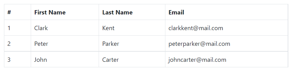
You can add borders on all sides of the table and cells by adding the modifier class .table-bordered to the .table base class, as shown in the following example:
<table class="table table-bordered">
    <thead>
        <tr>
            <th>#</th>
            <th>First Name</th>
            <th>Last Name</th>
            <th>Email</th>
        </tr>
    </thead>
    <tbody>
        <tr>
            <td>1</td>
            <td>Clark</td>
            <td>Kent</td>
            <td>clarkkent@mail.com</td>
        </tr>
        <tr>
            <td>2</td>
            <td>Peter</td>
            <td>Parker</td>
            <td>peterparker@mail.com</td>
        </tr>
        <tr>
            <td>3</td>
            <td>John</td>
            <td>Carter</td>
            <td>johncarter@mail.com</td>
        </tr>
    </tbody>
</table>
— The output of the above example will look something like this:
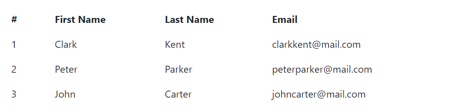
Creating Borderless Tables
You can also create borderless tables using the class .table-borderless on the .table element.
<table class="table table-borderless">
    <thead>
        <tr>
            <th>#</th>
            <th>First Name</th>
            <th>Last Name</th>
            <th>Email</th>
        </tr>
    </thead>
    <tbody>
        <tr>
            <td>1</td>
            <td>Clark</td>
            <td>Kent</td>
            <td>clarkkent@mail.com</td>
        </tr>
        <tr>
            <td>2</td>
            <td>Peter</td>
            <td>Parker</td>
            <td>peterparker@mail.com</td>
        </tr>
        <tr>
            <td>3</td>
            <td>John</td>
            <td>Carter</td>
            <td>johncarter@mail.com</td>
        </tr>
    </tbody>
</table>
— The output of the above example will look something like this:
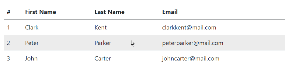
Enabling Hover State on Table Rows
You can also enable a hover state on table rows within a <tbody> element by adding the modifier class .table-hover to the .table base class. Let's try out the following example:
<table class="table table-hover">
    <thead>
        <tr>
            <th>#</th>
            <th>First Name</th>
            <th>Last Name</th>
            <th>Email</th>
        </tr>
    </thead>
    <tbody>
        <tr>
            <td>1</td>
            <td>Clark</td>
            <td>Kent</td>
            <td>clarkkent@mail.com</td>
        </tr>
        <tr>
            <td>2</td>
            <td>Peter</td>
            <td>Parker</td>
            <td>peterparker@mail.com</td>
        </tr>
        <tr>
            <td>3</td>
            <td>John</td>
            <td>Carter</td>
            <td>johncarter@mail.com</td>
        </tr>
    </tbody>
</table>
— The output of the above example will look something like this:
Creating Small or Compact Tables
You can also make your tables more compact and save the space through adding the modifier class .table-sm to the .table base class. The .table-sm class makes the table compact by cutting all cell padding in half. Let's take a look at the following example:
<table class="table table-sm">
    <thead>
        <tr>
            <th>#</th>
            <th>First Name</th>
            <th>Last Name</th>
            <th>Email</th>
        </tr>
    </thead>
    <tbody>
        <tr>
            <td>1</td>
            <td>Clark</td>
            <td>Kent</td>
            <td>clarkkent@mail.com</td>
        </tr>
        <tr>
            <td>2</td>
            <td>Peter</td>
            <td>Parker</td>
            <td>peterparker@mail.com</td>
        </tr>
        <tr>
            <td>3</td>
            <td>John</td>
            <td>Carter</td>
            <td>johncarter@mail.com</td>
        </tr>
    </tbody>
</table>
— The output of the above example will look something like this:
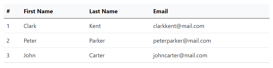
Setting Table Head Colors
Similar to light and dark tables, you can use the modifier classes .table-light or .table-dark on the <thead> element to make it appear in light or dark gray.
The following example will create a table with light gray background head.
<table class="table">
    <thead class="table-light">
        <tr>
            <th>#</th>
            <th>First Name</th>
            <th>Last Name</th>
            <th>Email</th>
        </tr>
    </thead>
    <tbody>
        <tr>
            <td>1</td>
            <td>Clark</td>
            <td>Kent</td>
            <td>clarkkent@mail.com</td>
        </tr>
        <tr>
            <td>2</td>
            <td>Peter</td>
            <td>Parker</td>
            <td>peterparker@mail.com</td>
        </tr>
        <tr>
            <td>3</td>
            <td>John</td>
            <td>Carter</td>
            <td>johncarter@mail.com</td>
        </tr>
    </tbody>
</table>
— The output of the above example will look something like this:
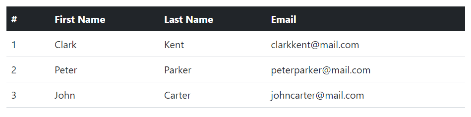
The following example will create a table with dark gray background head.
<table class="table">
    <thead class="table-dark">
        <tr>
            <th>#</th>
            <th>First Name</th>
            <th>Last Name</th>
            <th>Email</th>
        </tr>
    </thead>
    <tbody>
        <tr>
            <td>1</td>
            <td>Clark</td>
            <td>Kent</td>
            <td>clarkkent@mail.com</td>
        </tr>
        <tr>
            <td>2</td>
            <td>Peter</td>
            <td>Parker</td>
            <td>peterparker@mail.com</td>
        </tr>
        <tr>
            <td>3</td>
            <td>John</td>
            <td>Carter</td>
            <td>johncarter@mail.com</td>
        </tr>
    </tbody>
</table>
— The output of the above example will look something like this:
Creating Responsive Tables with Bootstrap
You can also create responsive tables to enable horizontal scrolling on small devices.
To make any table responsive just place it inside a <div> element and apply the .table-responsive class on it. You can also specify when the table should have a scrollbar, based on the viewport width (i.e. breakpoints), using the classes .table-responsive{-sm|-md|-lg|-xl}.
Let's try out the following example to understand how it basically works:
<div class="table-responsive">
    <table class="table">
        <thead>
            <tr>
                <th>#</th>
                <th>First Name</th>
                <th>Last Name</th>
                <th>Email</th>
                <th>Biography</th>
            </tr>
        </thead>
        <tbody>
            <tr>
                <td>1</td>
                <td>Clark</td>
                <td>Kent</td>
                <td>clarkkent@mail.com</td>
                <td>Lorem ipsum dolor sit amet...</td>
            </tr>
            <tr>
                <td>2</td>
                <td>Peter</td>
                <td>Parker</td>
                <td>peterparker@mail.com</td>
                <td>Integer pulvinar leo id risus...</td>
            </tr>
            <tr>
                <td>3</td>
                <td>John</td>
                <td>Carter</td>
                <td>johncarter@mail.com</td>
                <td>Vestibulum consectetur scelerisque...</td>
            </tr>
        </tbody>
    </table>
</div>
Tip: Text inside the cells of <thead> are always vertical aligned to the bottom. Whereas, text inside the cells of <tbody> inherit their alignment from <table> and are vertically aligned to the top by default. Use the vertical align classes to re-align text where needed.


