CSS Sprites
CSS sprites technique is a way to reduce the number of HTTP requests made for image resources, by combining images in a single file.
What is a Sprite
Sprites are two-dimensional images which are made up of combining small images into one larger image at defined X and Y coordinates.
To display a single image from the combined image, you could use the CSS background-position property, defining the exact position of the image to be displayed.
Advantage of Using CSS Image Sprite
A web page with many images, particularly many small images, such as icons, buttons, etc. can take a long time to load and generates multiple server requests.
Using the image sprites instead of separate images will significantly reduce the number of HTTP requests a browser makes to the server, which can be very effective for improving the loading time of web pages and overall site performance.
Note: Reducing the number of HTTP requests has the major impact on reducing response time that makes the web page more responsive for the user.
Checkout the following examples and you will see one visible difference; when you place the mouse pointer over the browser icons in non-sprite version for the first time the hover image will appear after some time, it happens because the hover image is loaded from the server on mouse hover, since the normal and hover images are two different images.
Whereas in sprite version, since all images are combined in a single image the hover image is displayed immediately on mouse hover that results in smooth hover effect.
 |
 |
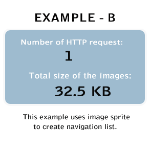
Using CSS sprite technique demonstrated in the: [EXAMPLE - B]; we were able to reduce the number of HTTP requests by 9 and the total file size of the image(s) by 38.2 KB as compared to the [EXAMPLE - A];. That's a pretty huge improvement for such a small example. Imagine what you could do on a complete website.
The whole process of creating this example is explained below.
Making the Image Sprite
We made this sprite image by combining 10 separate images in a single image (mySprite.png). You can create your own sprite using any image editing tool you like.
Tip: For the sake of simplicity, we have used all icons of same size, and place them closely to each other for easy offset calculation.
Display an Icon from Image Sprite
Finally, utilizing CSS, we can display just the part of an image sprite we need.
First of all, we will create the class .sprite that will load our sprite image. This is to avoid repetition, because all items share the same background-image.
Example
Try this code ».sprite {
background: url("images/mySprite.png") no-repeat;
}Now, we must define a class for each item we want to display. For example, to display Internet Explorer icon form the image sprite the CSS code would be.
Example
Try this code ».ie {
width: 50px; /* Icon width */
height: 50px; /* Icon height */
display: inline-block; /* Display icon as inline block */
background-position: 0 -200px; /* Icon background position in sprite */
}Now the question arises, how did we get those pixel values for background-position? Let's find out. The first value is the horizontal position, and second is the vertical position of background. As the upper-left corner of Internet Explorer icon touches the left edge so its horizontal distance from the starting point i.e. top-left corner of the image sprite is 0, and since it is placed on the 5th position so its vertical distance from the starting point of image sprite is 4 X 50px = 200px, because height of each icon is 50px.
To show the Internet Explorer icon we have to move its upper-left corner to the starting point i.e. top-left corner of image sprite (mySprite.png). Also, since this icon is placed at the vertical distance of 200px, we will need to shift the whole background-image (mySprite.png) vertically up by 200px, which requires us to apply the value as a negative number that is -200px, because the negative value makes it go vertically up whereas a positive value would move it down. However, it doesn't require a horizontal offset, since there are no pixels before the upper-left corner of the Internet Explorer icon.
Tip: Just play around with the value of background-position property in the upcoming examples and you will quickly learn how the offsets work.
Creating a Navigation Menu Using CSS Image Sprite
In the previous section we have learned, how to display an individual icon from an image sprite. This is the easiest way to use image sprites, now we are going one step ahead by building a navigation menu with rollover effect as demonstrated in [EXAMPLE - B].
Here we will use the same sprite image (mySprite.png) to create our navigation menu.
Foundation HTML for Navigation
We will start by creating our navigation menu with an HTML unordered list.
Example
Try this code »<ul class="menu">
<li class="firefox"><a href="#">Firefox</a></li>
<li class="chrome"><a href="#">Chrome</a></li>
<li class="ie"><a href="#">Explorer</a></li>
<li class="opera"><a href="#">Opera</a></li>
<li class="safari"><a href="#">Safari</a></li>
</ul>Applying the CSS on Navigation
The following sections will describes you how to convert the simple unordered list given in example above to a spite image based navigation using the CSS.
Step 1: Resetting the List Structure
By default, HTML unordered lists are displayed with bullets. We'll need to remove the default bullets by setting the list-style-type attribute to none.
Example
Try this code »ul.menu {
list-style-type: none;
}
ul.menu li {
padding: 5px;
font-size: 16px;
font-family: "Trebuchet MS", Arial, sans-serif;
}Step 2: Setting Common Properties for Each Links
In this step we will set all the common CSS properties that all links are going to share. Such as, color, background-image, display, padding, etc.
Example
Try this code »ul.menu li a {
height: 50px;
line-height: 50px;
display: inline-block;
padding-left: 60px; /* To sift text off the background-image */
color: #3E789F;
background: url("images/mySprite.png") no-repeat; /* As all link share the same background-image */
}Step 3: Setting Default State of Each Links
Now, we must define a class for each menu item, because every item in the image sprite has different background-position. For example, Firefox icon is placed at the starting point i.e. top-left corner of the image sprite, so there is no need to shift the background-image. Hence the vertical and horizontal position of the background in this case would be 0. Similarly, you can define background-position for other icons within the image sprite.
Example
Try this code »ul.menu li.firefox a {
background-position: 0 0;
}
ul.menu li.chrome a {
background-position: 0 -100px;
}
ul.menu li.ie a {
background-position: 0 -200px;
}
ul.menu li.safari a {
background-position: 0 -300px;
}
ul.menu li.opera a {
background-position: 0 -400px;
}Step 4: Adding Hover States of Links
Adding hover states owns the same principle as adding the above links. Just move their upper-left corner to the starting point (i.e. top-left corner) of the image sprite as we have done above. You can simply calculate the background-position using the following formula:
Vertical position of hover state = Vertical position of normal state - 50px
As rollover images are just below the default state and height of each icon is equal to 50px. The hover state of icons also doesn't require a horizontal offset, since there are no pixels before the upper-left corner of them.
Example
Try this code »ul.menu li.firefox a:hover {
background-position: 0 -50px;
}
ul.menu li.chrome a:hover {
background-position: 0 -150px;
}
ul.menu li.ie a:hover {
background-position: 0 -250px;
}
ul.menu li.safari a:hover {
background-position: 0 -350px;
}
ul.menu li.opera a:hover {
background-position: 0 -450px;
}Done! Here is our final HTML and CSS code after combining the whole process:
<!DOCTYPE html>
<html lang="en">
<head>
<meta charset="utf-8">
<title>Example of Sprite Navigation Menu</title>
<style>
ul.menu {
list-style-type: none;
}
ul.menu li {
padding: 5px;
font-size: 16px;
font-family: "Trebuchet MS", Arial, sans-serif;
}
ul.menu li a {
height: 50px;
line-height: 50px;
display: inline-block;
padding-left: 60px; /* To sift text off the background-image */
color: #3E789F;
background: url("images/mySprite.png") no-repeat; /* As all link share the same background-image */
}
ul.menu li.firefox a {
background-position: 0 0;
}
ul.menu li.chrome a {
background-position: 0 -100px;
}
ul.menu li.ie a {
background-position: 0 -200px;
}
ul.menu li.safari a {
background-position: 0 -300px;
}
ul.menu li.opera a {
background-position: 0 -400px;
}
ul.menu li.firefox a:hover {
background-position: 0 -50px;
}
ul.menu li.chrome a:hover {
background-position: 0 -150px;
}
ul.menu li.ie a:hover {
background-position: 0 -250px;
}
ul.menu li.safari a:hover {
background-position: 0 -350px;
}
ul.menu li.opera a:hover {
background-position: 0 -450px;
}
</style>
</head>
<body>
<ul class="menu">
    <li class="firefox"><a href="#">Firefox</a></li>
    <li class="chrome"><a href="#">Chrome</a></li>
    <li class="ie"><a href="#">Explorer</a></li>
    <li class="opera"><a href="#">Opera</a></li>
    <li class="safari"><a href="#">Safari</a></li>
</ul>
</body>
</html>


