CSS3 Filters
The CSS3 filter effects provide an easy way to apply the visual effect to the images.
Understanding the CSS3 Filter Functions
In this chapter we'll discuss about the filter effects introduced in CSS3 that you can use to perform visual effect operations like blur, balancing contrast or brightness, color saturation etc. on graphical elements like an image before it is drawn onto the web page.
The filter effects can be applied to the element using the CSS3 filter property, which accept one or more filter function in the order provided.
| filter: | blur() | brightness() | contrast() | drop-shadow() | grayscale() | hue-rotate() | invert() | opacity() | sepia() | saturate() | url(); |
Warning: The CSS3 filter effects currently not supported in any version of the Internet Explorer. Older versions of IE supported a non-standard filter property for creating effects like opacity, but this feature has been deprecated.
The Blur Effect
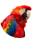
Photoshop like Gaussian blur effect can be applied to an element using the blur() function. This function accepts CSS length value as parameter which defines the blur radius. A larger value will create more blur. If no parameter is provided, then a value 0 is used.
Example
Try this code »img {
-webkit-filter: blur(5px); /* Chrome, Safari, Opera */
filter: blur(5px);
}— The output of the above example will look something like this:
|
|
|
blur(0) |
blur(2px) |
blur(5px) |
Setting the Image Brightness
The brightness() function can be used to set the brightness of an image. A value of 0% will create an image that is completely black. Whereas, a value of 100% or 1 leaves the images unchanged. Other values are linear multipliers on the effect.
You can also set the brightness higher than the 100% which results in brighter image. If the amount parameter is missing, a value of 1 is used. Negative values are not allowed.
Example
Try this code »img.bright {
-webkit-filter: brightness(200%); /* Chrome, Safari, Opera */
filter: brightness(200%);
}
img.dark {
-webkit-filter: brightness(50%); /* Chrome, Safari, Opera */
filter: brightness(50%);
}— The output of the above example will look something like this:
|
|
|
|
brightness(50%) |
brightness(100%) |
brightness(200%) |
Note: The filter functions that take a value expressed with a percent sign (e.g. 75%) also accept the value expressed as decimal (like, 0.75). If the value is invalid, the function returns none and no filter effect will be applied.
Adjusting the Image Contrast
The contrast() function is used to adjust the contrast on an image. A value of 0% will create an image that is completely black. Whereas, a value of 100% or 1 leaves the image unchanged. Values over 100% are also allowed which provide results with less contrast. If the amount parameter is missing or omitted, a value of 1 is used.
Example
Try this code »img.bright {
-webkit-filter: contrast(200%); /* Chrome, Safari, Opera */
filter: contrast(200%);
}
img.dim {
-webkit-filter: contrast(50%); /* Chrome, Safari, Opera */
filter: contrast(50%);
}— The output of the above example will look something like this:
|
|
|
|
contrast(50%) |
contrast(100%) |
contrast(200%) |
Adding Drop Shadow to Images
You can use the drop-shadow() function to apply the drop shadow effect to the images like Photoshop. This function is similar to the box-shadow property.
Example
Try this code »img {
-webkit-filter: drop-shadow(4px 4px 10px orange); /* Chrome, Safari, Opera */
filter: drop-shadow(4px 4px 10px orange);
}— The output of the above example will look something like this:
|
|
|
|
drop-shadow(0) |
drop-shadow(2px 2px 4px orange) |
drop-shadow(4px 4px 10px orange) |
Note: The first and second parameters of the drop-shadow() function specifies the horizontal and vertical offset of the shadow respectively, whereas the third parameter specify the blur radius and the last parameter specifies the shadow color, just like the box-shadow property, with one exception, the 'inset' keyword is not allowed.
Converting an Image to Grayscale
The images can be converted to grayscale using the grayscale() function. A value of 100% is completely grayscale. A value of 0% leaves the image unchanged. Values between 0% and 100% are linear multipliers on the effect. If the amount parameter is missing, a value of 0 is used.
Example
Try this code »img.complete-gray {
-webkit-filter: grayscale(100%); /* Chrome, Safari, Opera */
filter: grayscale(100%);
}
img.partial-gray {
-webkit-filter: grayscale(50%); /* Chrome, Safari, Opera */
filter: grayscale(50%);
}— The output of the above example will look something like this:
|
|
|
|
grayscale(0) |
grayscale(50%) |
grayscale(100%) |
Applying Hue Rotation on Image
The hue-rotate() function applies a hue rotation on the image. The passed parameter defines the number of degrees around the color circle the image samples will be adjusted. A value of 0deg leaves the image unchanged. If the 'angle' parameter is missing, a value of 0deg is used. There is no maximum value, the effect of values above 360deg wraps around.
Example
Try this code »img.hue-normal {
-webkit-filter: hue-rotate(150deg); /* Chrome, Safari, Opera */
filter: hue-rotate(150deg);
}
img.hue-wrap {
-webkit-filter: hue-rotate(480deg); /* Chrome, Safari, Opera */
filter: hue-rotate(480deg);
}— The output of the above example will look something like this:
|
|
|
|
hue-rotate(0) |
hue-rotate(150deg) |
hue-rotate(480deg) |
The Invert Effect
The invert effect like Photoshop can be applied to an image with the invert() function. A value of 100% or 1 is completely inverted. A value of 0% leaves the input unchanged. Values between 0% and 100% are linear multipliers on the effect. If the 'amount' parameter is missing, a value of 0 is used. Negative values are not allowed.
Example
Try this code »img.partially-inverted {
-webkit-filter: invert(80%); /* Chrome, Safari, Opera */
filter: invert(80%);
}
img.fully-inverted {
-webkit-filter: invert(100%); /* Chrome, Safari, Opera */
filter: invert(100%);
}— The output of the above example will look something like this:
|
|
|
|
invert(0) |
invert(80%) |
invert(100%) |
Applying Opacity to Images
The opacity() function can be used to apply transparency to the images. A value of 0% is completely transparent. A value of 100% or 1 leaves the image unchanged. Values between 0% and 100% are linear multipliers on the effect. If the 'amount' parameter is missing, a value of 1 is used. This function is similar to the opacity property.
Example
Try this code »img {
-webkit-filter: opacity(80%); /* Chrome, Safari, Opera */
filter: opacity(80%);
}— The output of the above example will look something like this:
|
|
|
|
opacity(100%) |
opacity(80%) |
opacity(30%) |
Applying Sepia Effect to Images
The sepia() function converts the image to sepia. A value of 100% or 1 is completely sepia. A value of 0% leaves the image unchanged. Values between 0% and 100% are linear multipliers on the effect. If the 'amount' parameter is missing, a value of 0 is used.
Example
Try this code »img.complete-sepia {
-webkit-filter: sepia(100%); /* Chrome, Safari, Opera */
filter: sepia(100%);
}
img.partial-sepia {
-webkit-filter: sepia(30%); /* Chrome, Safari, Opera */
filter: sepia(30%);
}— The output of the above example will look something like this:
|
|
|
|
sepia(0%) |
sepia(30%) |
sepia(100%) |
Tip: In photographic terms, sepia toning is a specialized treatment to give a black-and-white photograph a warmer tone (reddish-brown) to enhance its archival quality.
Adjusting the Saturation of Images
The saturate() function can be used to adjust the saturaion of an image. A value of 0% is completely un-saturated. A value of 100% leaves the image unchanged. Other values are linear multipliers on the effect. Values of amount over 100% are also allowed, providing super-saturated results. If the 'amount' parameter is missing, a value of 1 is used.
Example
Try this code »img.un-saturated {
-webkit-filter: saturate(0%); /* Chrome, Safari, Opera */
filter: saturate(0%);
}
img.super-saturated {
-webkit-filter: saturate(200%); /* Chrome, Safari, Opera */
filter: saturate(200%);
}— The output of the above example will look something like this:
|
|
|
|
saturate(100%) |
saturate(200%) |
saturate(0%) |
Note: The url() function specifies a filter reference to a specific filter element. For example, url(commonfilters.svg#foo). If the filter reference to an element that didn't exist or the referenced element is not a filter element, then the whole filter chain is ignored. No filter is applied to the element.


