CSS3 3D Transforms
The CSS3 3D transform feature allows elements to be transformed in 3D space.
3D Transformation of Elements
With CSS3 3D transform feature you can perform basic transform manipulations such as move, rotate, scale and skew on elements in a three-dimensional space.
A transformed element doesn't affect the surrounding elements, but can overlap them, just like the absolutely positioned elements. However, the transformed element still takes space in the layout at its default (un-transformed) location.
Using CSS Transform and Transform Functions
The CSS3 transform property uses the transform functions to manipulate the coordinate system used by an element in order to apply the transformation effect.
The following section describes the 3D transform functions:
The translate3d() Function
Moves the element from its current position to a new position along the X, Y and Z-axis. This can be written as translate(tx, ty, tz). Percentage values are not allowed for third translation-value parameter (i.e. tz).
Example
Try this code ».container {
width: 125px;
height: 125px;
perspective: 500px;
border: 4px solid #e5a043;
background: #fff2dd;
}
.transformed {
-webkit-transform: translate3d(25px, 25px, 50px); /* Chrome, Safari, Opera */
transform: translate3d(25px, 25px, 50px); /* Standard syntax */
}The function translate3d(25px, 25px, 50px) moves the image 25 pixels along the positive X and Y-axis, and the 50 pixels along the positive Z-axis.
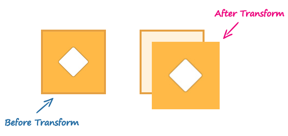
The 3D transform however uses the three-dimensional coordinate system, but movement along the Z-direction is not always noticeable because the elements exist on a two-dimensional plane (a flat surface) and have no depth.
The perspective and perspective-origin CSS properties can be used to add a feeling of depth to a scene by making the elements higher on the Z-axis i.e. closer to the viewer appear larger, and those further away to the viewer appear smaller.
Note: If you apply 3D transformation to an element without setting the perspective the resulting effect will not appear as three-dimensional.
The rotate3d() Function
The rotate3d() function rotates the element in 3D space by the specified angle around the [x,y,z] direction vector. This can be written as rotate(vx, vy, vz, angle).
Example
Try this code ».container{
width: 125px;
height: 125px;
perspective: 300px;
border: 4px solid #a2b058;
background: #f0f5d8;
}
.transformed {
-webkit-transform: rotate3d(0, 1, 0, 60deg); /* Chrome, Safari, Opera */
transform: rotate3d(0, 1, 0, 60deg); /* Standard syntax */
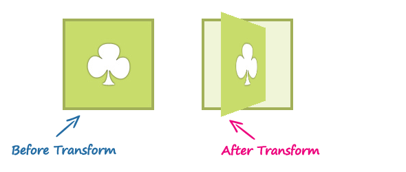
}The function rotate3d(0, 1, 0, 60deg) rotates the image along the Y-axis by the angle 60 degrees. You can use negative values to rotate the element in opposite direction.
The scale3d() Function
The scale3d() function changes the size of an element. It can be written as scale(sx, sy, sz). The effect of this function is not evident unless you use it in combination with other transform functions such as rotate and the perspective, as shown in the example below.
Example
Try this code ».container{
width: 125px;
height: 125px;
perspective: 300px;
border: 4px solid #6486ab;
background: #e9eef3;
}
.transformed {
-webkit-transform: scale3d(1, 1, 2) rotate3d(1, 0, 0, 60deg); /* Chrome, Safari, Opera */
transform: scale3d(1, 1, 2) rotate3d(1, 0, 0, 60deg); /* Standard syntax */
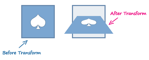
}The function scale3d(1, 1, 2) scales the elements along the Z-axis and the function rotate3d(1, 0, 0, 60deg) rotates the image along the X-axis by the angle 60 degrees.
The matrix3d() Function
The matrix3d() function can perform all of the 3D transformations such as translate, rotate, and scale at once. It takes 16 parameters in the form of a 4×4 transformation matrix.
Here is an example of performing the 3D transformation using the matrix3d() function.
Example
Try this code ».container{
width: 125px;
height: 125px;
perspective: 300px;
border: 4px solid #d14e46;
background: #fddddb;
}
.transformed {
-webkit-transform: matrix3d(0.359127, -0.469472, 0.806613, 0, 0.190951, 0.882948, 0.428884, 0, -0.913545, 0, 0.406737, 0, 0, 0, 0, 1); /* Chrome, Safari, Opera */
transform: matrix3d(0.359127, -0.469472, 0.806613, 0, 0.190951, 0.882948, 0.428884, 0, -0.913545, 0, 0.406737, 0, 0, 0, 0, 1); /* Standard syntax */
}However, when performing more than one transformation at once, it is more convenient to use the individual transformation function and list them in order, like this:
Example
Try this code ».container{
width: 125px;
height: 125px;
perspective: 300px;
border: 4px solid #a2b058;
background: #f0f5d8;
}
.transformed {
-webkit-transform: translate3d(0, 0, 60px) rotate3d(0, 1, 0, -60deg) scale3d(1, 1, 2); /* Chrome, Safari, Opera */
transform: translate3d(0, 0, 60px) rotate3d(0, 1, 0, -60deg) scale3d(1, 1, 2); /* Standard syntax */
}3D Transform Functions
The following table provides a brief overview of all the 3D transformation functions.
| Function | Description |
|---|---|
translate3d(tx,ty,tz) |
Moves the element by the given amount along the X, Y & Z-axis. |
translateX(tx) |
Moves the element by the given amount along the X-axis. |
translateY(ty) |
Moves the element by the given amount along the Y-axis. |
translateZ(tz) |
Moves the element by the given amount along the Z-axis. |
rotate3d(x,y,z, a) |
Rotates the element in 3D space by the angle specified in the last parameter, around the [x,y,z] direction vector. |
rotateX(a) |
Rotates the element by the given angle around the X-axis. |
rotateY(a) |
Rotates the element by the given angle around the Y-axis. |
rotateZ(a) |
Rotates the element by the given angle around the Z-axis. |
scale3d(sx,sy,sz) |
Scales the element by the given amount along the X, Y and Z-axis. The function scale3d(1,1,1) has no effect. |
scaleX(sx) |
Scales the element along the X-axis. |
scaleY(sy) |
Scales the element along the Y-axis. |
scaleZ(sz) |
Scales the element along the Z-axis. |
matrix3d(n,n,n,n,n,n, n,n,n,n,n,n,n,n,n,n) |
Specifies a 3D transformation in the form of a 4×4 transformation matrix of 16 values. |
perspective(length) |
Defines a perspective view for a 3D transformed element. In general, as the value of this function increases, the element will appear further away from the viewer. |


