CSS3 Flexible Box Layouts
CSS3 flexible Box, or flexbox is a new layout model for creating the more flexible user interface design.
Understanding the Flex Layout Model
Flexible box, commonly referred to as flexbox, is a new layout model introduced in CSS3 for creating the flexible user interface design with multiple rows and columns without using the percentage or fixed length values. The CSS3 flex layout model provides a simple and powerful mechanism for handling the distributing of space and alignment of content automatically through stylesheet without interfering the actual markup.
The following example demonstrate how to create a three column layout where each column has equal width and height using the flex layout model.
Example
Try this code »<!DOCTYPE html>
<html lang="en">
<head>
<meta charset="utf-8">
<title>CSS3 Three Equal Flex Column</title>
<style>
.flex-container {
width: 80%;
min-height: 300px;
display: -webkit-flex; /* Safari */
display: flex; /* Standard syntax */
border: 1px solid #808080;
}
.flex-container div {
background: #dbdfe5;
-webkit-flex: 1; /* Safari */
-ms-flex: 1; /* IE 10 */
flex: 1; /* Standard syntax */
}
</style>
</head>
<body>
<div class="flex-container">
<div class="item1">Item 1</div>
<div class="item2">Item 2</div>
<div class="item3">Item 3</div>
</div>
</body>
</html>If you notice the above example code carefully you'll find we didn't specify any width on the inner <div> of the .flex-container, but you can see in the output, every column has width which is exactly equal to the one third of the parent .flex-container element.
How Flex Layout Works
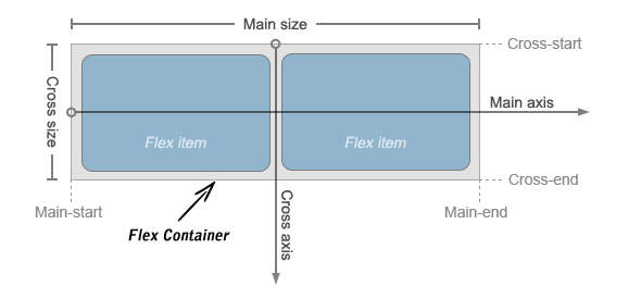
Flexbox consists of flex containers and flex items. A flex container can be created by setting the display property of an element to either flex (generate block-level flex container) or inline-flex (generate an inline flex container similar to inline-block). All child elements of flex container automatically become flex items and are laid out using the flex layout model. The float, clear, and vertical-align properties have no effect on flex items.
Flex items are positioned inside a flex container along a flex line controlled by the flex-direction property. By default, there is only one flex line per flex container which has the same orientation as the inline axis of the current writing mode or text direction. The following illustration will help you to understand the flex layout terminology.
Controlling Flow inside Flex Container
In the standard CSS box model, the elements normally displayed in the order as they appear in the underlying HTML markup. Flex layout lets you control the direction of the flow inside a flex container in such a way that the elements can be laid out in any flow direction leftwards, rightwards, downwards, or even upwards.
The flow of the flex items in a flex container can be specified using the flex-direction property. The default value of this property is row which is same as the document's current writing mode or text direction e.g. left-to-right in English language.
Example
Try this code ».flex-container {
width: 80%;
min-height: 300px;
/* Safari */
display: -webkit-flex;
-webkit-flex-direction: row-reverse;
/* Standard syntax */
display: flex;
flex-direction: row-reverse;
border: 1px solid #666;
}Similary, you can disply the flex items inside a flex container in columns instead of row using the value column for the flex-direction property, like this:
Example
Try this code ».flex-container {
width: 80%;
min-height: 300px;
/* Safari */
display: -webkit-flex;
-webkit-flex-direction: column;
/* Standard syntax */
display: flex;
flex-direction: column;
}Controlling the Dimensions of Flex Items
The most important aspect of the flex layout is the ability of flex items to alter their width or height to fill the available space. This is achieved with the flex property. It is shorthand property for flex-grow, flex-shrink and flex-basis properties.
A flex container distributes the free space to its items proportional to their flex grow factor, or shrinks them to prevent overflow proportional to their flex shrink factor.
Example
Try this code ».flex-container {
width: 80%;
min-height: 300px;
display: -webkit-flex; /* Safari */
display: flex; /* Standard syntax */
}
.flex-container div {
padding: 10px;
background: #dbdfe5;
}
.item1, .item3 {
-webkit-flex: 1; /* Safari */
flex: 1; /* Standard syntax */
}
.item2 {
-webkit-flex: 2; /* Safari */
flex: 2; /* Standard syntax */
}In the above example, the first and third flex items will occupy 1/4 i.e. 1/(1+1+2) of the free space each, whereas the second flex item will occupy 1/2 i.e. 2/(1+1+2) of the free space. Similarly, you can create other flexible layouts using this simple technique.
Note: It is strongly recommended to use the shorthand rather than the individual flex properties because it resets unspecified components correctly.
Aligning Flex Items within Flex Container
There are four properties justify-content, align-content, align-items and align-self which are designed to control the alignment of flex items within flex container. The first three of them apply to flex containers whereas the last one applies to the individual flex items.
Align Flex Items along Main Axis
Flex items can be aligned along the main axis (i.e. in the horizontal direction) of the flex container using the justify-content property. It is typically used when the flex items do not use all the space available along the main axis.
The justify-content property accepts the following values:
- flex-start — Default value. Flex items are placed at the start of the main axis.
- flex-end — Flex items are placed at the end of the main axis.
- center — Flex items are placed at the center of the main axis with equal amounts of free space at both ends. If the leftover free-space is negative i.e. if the items overflow, then the flex items will overflow equally in both directions.
- space-between — Flex items are distributed evenly along the main axis, where the first item placed at the main-start edge and the last one placed at the main-end. If items overflow or there's only one item, this value is equal to
flex-start. - space-around — Flex items are distributed evenly with half-size spaces on either end. If they overflow or there's only one item, this value is identical to
center.
The following example will show you the effect of the different values for justify-content property on a multiple-column flex container having fixed width.
Example
Try this code ».flex-container {
width: 500px;
min-height: 300px;
border: 1px solid #666;
/* Safari */
display: -webkit-flex;
-webkit-justify-content: space-around;
/* Standard syntax */
display: flex;
justify-content: space-around;
}
.item1 {
width: 75px;
background: #e84d51;
}
.item2 {
width: 125px;
background: #7ed636;
}
.item3 {
width: 175px;
background: #2f97ff;
}Align Flex Items along Cross Axis
Flex items can be aligned along the cross axis (i.e. in the perpendicular direction) of the flex container using the align-items or align-self property. However, where the align-items is applied to the flex container, the align-self property is applied to the individual flex items, and overrides align-items. Both properties accept the following values:
- flex-start — Flex items are placed at the start of the cross axis.
- flex-end — Flex items are placed at the end of the cross axis.
- center — Flex items are placed at the center of the cross axis with equal amounts of free space at both ends. If the leftover free-space is negative i.e. if the items overflow, then the flex items will overflow equally in both directions.
- baseline — The text baseline (or inline axis) of each flex item is aligned with the baseline of the flex item with the largest
font-size. - stretch — The flex item stretches to fill the current row or column unless prevented by the minimum and maximum width or height. Default value for
align-itemsproperty.
The following example will show you the effect of the different values for align-items property on a multiple-column flex container having fixed height.
Example
Try this code ».flex-container {
width: 500px;
min-height: 300px;
border: 1px solid #666;
/* Safari */
display: -webkit-flex;
-webkit-align-items: center;
/* Standard syntax */
display: flex;
align-items: center;
}
.item1 {
width: 75px;
height: 100px;
background: #e84d51;
}
.item2 {
width: 125px;
height: 200px;
background: #7ed636;
}
.item3 {
width: 175px;
height: 150px;
background: #2f97ff;
}You can also distribute free space on the cross axis of a multiple-row or multiple-column flex container. The property align-content is used to align the flex container's lines, for example, rows within the multiple-row flex container when there is extra space in the cross-axis, similar to how justify-content aligns individual items within the main-axis.
The align-content property accepts the same values as justify-content, but applies them to the cross axis rather than the main axis. It also accepts one more value:
- stretch The free space is split equally between all rows or columns increasing their cross size. If the leftover free-space is negative, this value is identical to
flex-start.
The following example will show you the effect of the different values for align-content property on a multiple-row flex container having fixed height.
Example
Try this code ».flex-container {
width: 500px;
min-height: 300px;
margin: 0 auto;
font-size: 32px;
border: 1px solid #666;
/* Safari */
display: -webkit-flex;
-webkit-flex-flow: row wrap;
-webkit-align-content: space-around;
/* Standard syntax */
display: flex;
flex-flow: row wrap;
align-content: space-around;
}
.flex-container div {
width: 150px;
height: 100px;
background: #dbdfe5;
}Reordering Individual Flex Items
In addition to altering the flow within a flex container, you can also change the order in which individual flex items are displayed using the order property. This property accepts positive or negative integer as value. By default, all flex items are displayed and laid out in the same order as they appear in the HTML markup as the default value of order is 0.
The following example will show you how to control the order of an individual flex item.
Example
Try this code ».flex-container {
width: 500px;
min-height: 300px;
border: 1px solid #666;
display: -webkit-flex; /* Safari 6.1+ */
display: flex;
}
.flex-container div {
padding: 10px;
width: 130px;
}
.item1 {
background: #e84d51;
-webkit-order: 2; /* Safari 6.1+ */
order: 2;
}
.item2 {
background: #7ed636;
-webkit-order: 1; /* Safari 6.1+ */
order: 1;
}
.item3 {
background: #2f97ff;
-webkit-order: -1; /* Safari 6.1+ */
order: -1;
}Note: Flex item with the lowest order value laid out first, whereas the item with highest order value laid out at the end. Items with the same order value are displayed in the same order a they appear in the source document.
Horizontal and Vertical Center Alignment with Flexbox
Normally vertical alignment of a content block involves the use of JavaScript or some ugly CSS tricks. But with flexbox you can easily do this without any adjustments.
The following example will show you how to align a content block vertically and horizontally in the middle easily with the CSS3 flexible box feature.
Example
Try this code ».flex-container {
width: 500px;
min-height: 300px;
border: 1px solid #666;
display: -webkit-flex; /* Safari 6.1+ */
display: flex; /* Standard syntax */
}
.item {
width: 300px;
padding: 25px;
margin: auto;
background: #f0e68c;
}Enable Wrapping of Flex Items
By default, flex containers display only a single row or column of flex items. However, you can use the flex-wrap property on the flex container to control whether its flex items will wrap into multiple lines or not, if there is not sufficient space for them on one flex line.
The flex-wrap property accept the following values:
- nowrap — Default value. The flex items are placed in a single line. It may cause overflow, if there is not enough space on the flex line.
- wrap — The flex container breaks its flex items across multiple lines, similar to how text is broken onto a new line when it is too wide to fit on the current line.
- wrap-reverse — The flex items will wrap, if necessary, but in reverse order i.e. the cross-start and cross-end directions are swapped.
The following example will show you how to display the flex items in a single or multiple lines within a flex container using the flex-wrap property.
Example
Try this code ».flex-container {
width: 500px;
min-height: 300px;
border: 1px solid #666;
/* Safari */
display: -webkit-flex;
-webkit-flex-wrap: wrap;
/* Standard syntax */
display: flex;
flex-wrap: wrap;
}
.flex-container div{
width: 130px;
padding: 10px;
background: #dbdfe5;
}Note: You can also use the shorthand CSS property flex-flow for setting both the flex-direction and flex-wrap in a single declaration. It accepts the same values as the individual properties and the values can be in any order.


