CSS Tables
In this tutorial you will learn how to style HTML tables with CSS.
Styling Tables with CSS
Tables are typically used to display tabular data, such as financial reports.
But when you create an HTML table without any styles or attributes, browsers display them without any border. With CSS you can greatly improve the appearance your tables.
CSS provides several properties that allow you to control the layout and presentation of the table elements. In the following section you will see how to use CSS to create elegant and consistent tables.
Adding Borders to Tables
The CSS border property is the best way to define the borders for the tables.
The following example will set a black border for the <table>, <th>, and <td> elements.
Example
Try this code »table, th, td {
border: 1px solid black;
}By default, browser draws a border around the table, as well as around all the cells, with some space in-between, which results in double border. To get rid of this double border problem you can simply collapse the adjoining table cell borders and create clean single line borders.
Let's take a look at the following illustration to understand how a border is applied to a table.
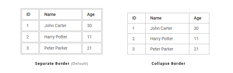
Collapsing Table Borders
There are two distinct models for setting borders on table cells in CSS: separate and collapse.
In the separate border model, which is the default, each table cell has its own distinct borders, whereas in the collapsed border model, adjacent table cells share a common border. You can set the border model for an HTML table by using the CSS border-collapse property.
The following style rules will collapse the table cell borders and apply one pixel black border.
Example
Try this code »table {
border-collapse: collapse;
}
th, td {
border: 1px solid black;
}Note: You can also remove the space between the table cell borders through setting the value of CSS border-spacing property to 0. However, it only removes the space but do not merge the borders like when you set the border-collapse to collapse.
Adjusting Space inside Tables
By default, the browser creates the table cells just large enough to contain the data in the cells.
To add more space between the table cell contents and the cell borders, you can simply use the CSS padding property. Let's try out the following example and see how it works:
Example
Try this code »th, td {
padding: 15px;
}You can also adjust the spacing between the borders of the cells using the CSS border-spacing property, if the borders of your table are separated (which is default).
The following style rules apply the spacing of 10 pixels between all borders within a table:
Example
Try this code »table {
border-spacing: 10px;
}Setting Table Width and Height
By default, a table will render just wide and tall enough to contain all of its contents.
However, you can also set the width and height of the table as well as its cells explicitly using the width and height CSS property. The style rules in the following example will sets the width of the table to 100%, and the height of the table header cells to 40px.
Example
Try this code »table {
width: 100%;
}
th {
height: 40px;
}Controlling the Table Layout
A table expands and contracts to accommodate the data contained inside it. This is the default behavior. As data fills inside the table, it continues to expand as long as there is space. Sometimes, however, it is necessary to set a fixed width for the table in order to manage the layout.
You can do this with the help of CSS table-layout property. This property defines the algorithm to be used to layout the table cells, rows, and columns. This property takes one of two values:
- auto — Uses an automatic table layout algorithm. With this algorithm, the widths of the table and its cells are adjusted to fit the content. This is the default value.
- fixed — Uses the fixed table layout algorithm. With this algorithm, the horizontal layout of the table does not depend on the contents of the cells; it only depends on the table's width, the width of the columns, and borders or cell spacing. It is normally faster than auto.
The style rules in the following example specify that the HTML table is laid out using the fixed layout algorithm and has a fixed width of 300 pixels. Let's try it out and see how it works:
Example
Try this code »table {
width: 300px;
table-layout: fixed;
}Tip: You can optimize the table rendering performance by specifying the value fixed for the table-layout property. Fixed value of this property causes the table to be rendered one row at a time, providing users with information at a faster pace.
Note: Without fixed value of the table-layout property on large tables, users won't see any part of the table until the browser has rendered the whole table.
Aligning the Text Inside Table Cells
You can align text content inside the table cells either horizontally or vertically.
Horizontal Alignment of Cell Contents
For horizontal alignment of text inside the table cells you can use the text-align property in the same way as you use with other elements. You align text to either left, right, center or justify.
The following style rules will left-align the text inside the <th> elements.
Example
Try this code »th {
text-align: left;
}Note: Text inside the <td> elements are left-aligned by default, whereas the text inside the <th> elements are center-aligned and rendered in bold font by default.
Vertical Alignment of Cell Contents
Similarly, you can vertically align the content inside the <th> and <td> elements to top, bottom, or middle using the CSS vertical-align property. The default vertical alignment is middle.
The following style rules will vertically bottom-align the text inside the <th> elements.
Example
Try this code »th {
height: 40px;
vertical-align: bottom;
}Controlling the Position of Table Caption
You can set the vertical position of a table caption using the CSS caption-side property.
The caption can be placed either at the top or bottom of the table. The default position is top.
Example
Try this code »caption {
caption-side: bottom;
}Tip: To change the horizontal alignment of the table's caption text (e.g. left or right), you can simply use the CSS text-align property, like you do with normal text.
Handling Empty Cells
In tables that uses separate border model, which is default, you can also control the rendering of the cells that have no visible content using the empty-cells CSS property.
This property accepts a value of either show or hide. The default value is show, which renders empty cells like normal cells, but if the value hide is specified no borders or backgrounds are drawn around the empty cells. Let's try out an example to understand how it really works:
Example
Try this code »table {
border-collapse: separate;
empty-cells: hide;
}Note: Placing a non-breaking space ( ) inside a table cell make it non-empty. Therefore, even if that cell looks empty the hide value will not hide the borders and backgrounds.
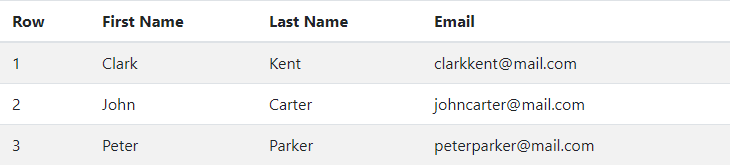
Creating Zebra-striped Tables
Setting different background colors for alternate rows is a popular technique to improve the readability of tables that has large amount of data. This is commonly known as zebra-striping a table.
You can simply achieve this effect by using the CSS :nth-child() pseudo-class selector.
The following style rules will highlight every odd rows within the table body.
Example
Try this code »tbody tr:nth-child(odd) {
background-color: #f2f2f2;
}A zebra-striped table typically looks something like the following picture.
Note: The :nth-child() pseudo-class select elements based on their position in a group of siblings. It can take a number, a keyword even or odd, or an expression of the form xn+y where x and y are integers (e.g. 1n, 2n, 2n+1, ...) as an argument.
Making a Table Responsive
Tables are not responsive in nature. However, to support mobile devices you can add responsiveness to your tables by enabling horizontal scrolling on small screens. To do this simply wrap your table with a <div> element and apply the style overflow-x: auto; as shown below:
Example
Try this code »<div style="overflow-x: auto;">
<table>
... table content ...
</table>
</div>

