Bootstrap Alerts
In this tutorial you will learn how to create alerts messages with Bootstrap.
Creating Alert Messages with Bootstrap
Alert boxes are used quite often to stand out the information that requires immediate attention of the end users such as warning, error or confirmation messages.
With Bootstrap you can easily create elegant alert messages for various purposes by adding the contextual classes (e.g., .alert-success, .alert-warning, .alert-info etc.) to the .alert base class. You can also add an optional close button to dismiss any alert.
Bootstrap provides total 8 different types of alerts. The following example will show you the most commonly used alerts, which are: success, error or danger, warning and info alerts.
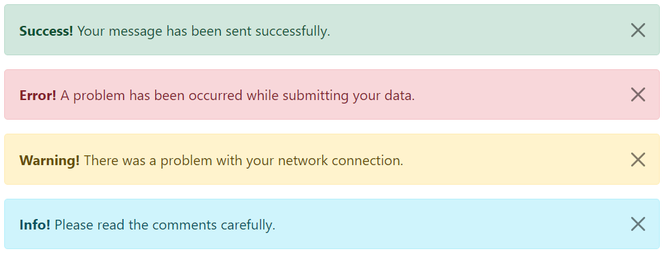
Example
Try this code »<!-- Success Alert -->
<div class="alert alert-success alert-dismissible fade show">
<strong>Success!</strong> Your message has been sent successfully.
<button type="button" class="btn-close" data-bs-dismiss="alert"></button>
</div>
<!-- Error Alert -->
<div class="alert alert-danger alert-dismissible fade show">
<strong>Error!</strong> A problem has been occurred while submitting your data.
<button type="button" class="btn-close" data-bs-dismiss="alert"></button>
</div>
<!-- Warning Alert -->
<div class="alert alert-warning alert-dismissible fade show">
<strong>Warning!</strong> There was a problem with your network connection.
<button type="button" class="btn-close" data-bs-dismiss="alert"></button>
</div>
<!-- Info Alert -->
<div class="alert alert-info alert-dismissible fade show">
<strong>Info!</strong> Please read the comments carefully.
<button type="button" class="btn-close" data-bs-dismiss="alert"></button>
</div>— The output of the above example will look something like this:
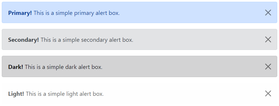
Here're the remaining four Bootstrap alerts that can be used for various purposes.
Example
Try this code »<!-- Primary Alert -->
<div class="alert alert-primary alert-dismissible fade show">
<strong>Primary!</strong> This is a simple primary alert box.
<button type="button" class="btn-close" data-bs-dismiss="alert"></button>
</div>
<!-- Secondary Alert -->
<div class="alert alert-secondary alert-dismissible fade show">
<strong>Secondary!</strong> This is a simple secondary alert box.
<button type="button" class="btn-close" data-bs-dismiss="alert"></button>
</div>
<!-- Dark Alert -->
<div class="alert alert-dark alert-dismissible fade show">
<strong>Dark!</strong> This is a simple dark alert box.
<button type="button" class="btn-close" data-bs-dismiss="alert"></button>
</div>
<!-- Light Alert -->
<div class="alert alert-light alert-dismissible fade show">
<strong>Light!</strong> This is a simple light alert box.
<button type="button" class="btn-close" data-bs-dismiss="alert"></button>
</div>— The output of the above example will look something like this:
Tip: The .fade and .show classes on the .alert element enable the fading transition effect while closing the alert boxes. If you don't want animation just removes these classes. Also, the class .alert-dismissible is required on the .alert element for proper positioning of the .btn-close. If your alert doesn't have a close button you can skip this class.
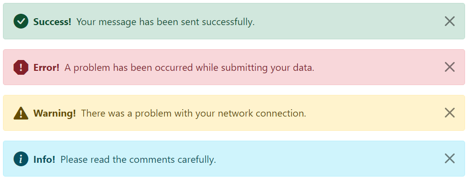
Adding Icons to Bootstrap Alerts
You can also place icons inside Bootstrap alerts. You can either use Bootstrap icons or third-party icons like Font Awesome. Let's take a look at the following example:
<!-- Success Alert -->
<div class="alert alert-success alert-dismissible d-flex align-items-center fade show">
    <i class="bi-check-circle-fill"></i>
    <strong class="mx-2">Success!</strong> Your message has been sent successfully.
    <button type="button" class="btn-close" data-bs-dismiss="alert"></button>
</div>

<!-- Error Alert -->
<div class="alert alert-danger alert-dismissible d-flex align-items-center fade show">
    <i class="bi-exclamation-octagon-fill"></i>
    <strong class="mx-2">Error!</strong> A problem has been occurred while submitting your data.
    <button type="button" class="btn-close" data-bs-dismiss="alert"></button>
</div>

<!-- Warning Alert -->
<div class="alert alert-warning alert-dismissible d-flex align-items-center fade show">
    <i class="bi-exclamation-triangle-fill"></i>
    <strong class="mx-2">Warning!</strong> There was a problem with your network connection.
    <button type="button" class="btn-close" data-bs-dismiss="alert"></button>
</div>

<!-- Info Alert -->
<div class="alert alert-info alert-dismissible d-flex align-items-center fade show">
    <i class="bi-info-circle-fill"></i>
    <strong class="mx-2">Info!</strong> Please read the comments carefully.
    <button type="button" class="btn-close" data-bs-dismiss="alert"></button>
</div>
— The output of the above example will look something like this:
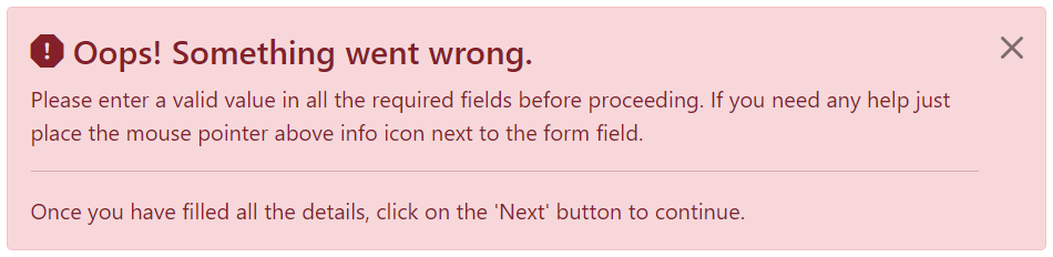
Additional Content inside Alerts
You can also place additional HTML elements like headings, paragraphs and dividers inside an alert. To manage spacing between the elements you can use margin utility classes, as here:
Example
Try this code »<div class="alert alert-danger alert-dismissible fade show">
<h4 class="alert-heading"><i class="bi-exclamation-octagon-fill"></i> Oops! Something went wrong.</h4>
<p>Please enter a valid value in all the required fields before proceeding. If you need any help just place the mouse pointer above info icon next to the form field.</p>
<hr>
<p class="mb-0">Once you have filled all the details, click on the 'Next' button to continue.</p>
<button type="button" class="btn-close" data-bs-dismiss="alert"></button>
</div>— The output of the above example will look something like this:
Matching Links Color inside Alerts
You can apply the utility class .alert-link to the links inside any alert boxes to quickly create matching colored links, as shown in the example below:
Example
Try this code »<div class="alert alert-warning alert-dismissible fade show">
<strong>Warning!</strong> A simple warning alert with <a href="#" class="alert-link">an example link</a>.
<button type="button" class="btn-close" data-bs-dismiss="alert"></button>
</div>— The output of the above example will look something like this:

Similarly, you can match links inside other alert boxes. Let's try out the following example:
<!-- Success Alert -->
<div class="alert alert-success alert-dismissible fade show">
<strong>Success!</strong> A simple success alert with <a href="#" class="alert-link">an example link</a>.
<button type="button" class="btn-close" data-bs-dismiss="alert"></button>
</div>
<!-- Error Alert -->
<div class="alert alert-danger alert-dismissible fade show">
<strong>Error!</strong> A simple danger alert with <a href="#" class="alert-link">an example link</a>.
<button type="button" class="btn-close" data-bs-dismiss="alert"></button>
</div>
<!-- Warning Alert -->
<div class="alert alert-warning alert-dismissible fade show">
    <strong>Warning!</strong> A simple warning alert with <a href="#" class="alert-link">an example link</a>.
    <button type="button" class="btn-close" data-bs-dismiss="alert"></button>
</div>
<!-- Info Alert -->
<div class="alert alert-info alert-dismissible fade show">
<strong>Info!</strong> A simple info alert with <a href="#" class="alert-link">an example link</a>.
<button type="button" class="btn-close" data-bs-dismiss="alert"></button>
</div>
<!-- Primary Alert -->
<div class="alert alert-primary alert-dismissible fade show">
<strong>Primary!</strong> A simple primary alert with <a href="#" class="alert-link">an example link</a>.
<button type="button" class="btn-close" data-bs-dismiss="alert"></button>
</div>
<!-- Secondary Alert -->
<div class="alert alert-secondary alert-dismissible fade show">
<strong>Secondary!</strong> A simple secondary alert with <a href="#" class="alert-link">an example link</a>.
<button type="button" class="btn-close" data-bs-dismiss="alert"></button>
</div>
<!-- Dark Alert -->
<div class="alert alert-dark alert-dismissible fade show">
<strong>Dark!</strong> A simple dark alert with <a href="#" class="alert-link">an example link</a>.
<button type="button" class="btn-close" data-bs-dismiss="alert"></button>
</div>
<!-- Light Alert -->
<div class="alert alert-light alert-dismissible fade show">
<strong>Light!</strong> A simple light alert with <a href="#" class="alert-link">an example link</a>.
<button type="button" class="btn-close" data-bs-dismiss="alert"></button>
</div>Closing Alerts via Data Attribute
Data attributes provides a simple and easy way to add close functionality to the alert boxes.
Just add the data-bs-dismiss="alert" to the close button and it will automatically enable the dismissal of the containing alert message box. Also, add the class .alert-dismissible to the .alert element for proper positioning of the .btn-close button.
Example
Try this code »<div class="alert alert-info alert-dismissible fade show">
<strong>Note!</strong> This is a simple example of dismissible alert.
<button type="button" class="btn-close" data-bs-dismiss="alert"></button>
</div>Use the <button> element for creating the close button for consistent behavior across all devices.
Closing Alerts via JavaScript
You may also dismiss an alert via JavaScript. Let's try out an example and see how it works:
<script>
$(document).ready(function(){
    $("#myBtn").click(function(){
        $("#myAlert").alert("close");
    });
});
</script>Methods
These are the standard bootstrap's alerts methods:
close
This method closes an alert by removing it from the DOM. If the .fade and .show classes are present on the element, the alert will fade out before it is removed.
<script>
$(document).ready(function(){
    $("#myBtn").click(function(){
        $("#myAlert").alert("close");
    });
});
</script>dispose
This method destroys an element's alert (i.e. removes stored data on the DOM element).
<script>
$(document).ready(function(){
    $("#myBtn").click(function(){
        $("#myAlert").alert("dispose");
    });
});
</script>getInstance
This is a static method which allows you to get the alert instance associated with a DOM element.
<script>
$(document).ready(function(){
    // Create alert instance
    $("#myAlert").alert();

    // Get alert instance on button click
    $("#myBtn").click(function(){
        var myAlert = bootstrap.Alert.getInstance($("#myAlert")[0]);
        console.log(myAlert);
        // {_element: div#myAlert.alert.alert-info.alert-dismissible.fade.show}
    });
});
</script>getOrCreateInstance
This is a static method which allows you to get the alert instance associated with a DOM element, or create a new one in case if the alert wasn't initialized.
<script>
$(document).ready(function(){
    $("#myBtn").click(function(){
        var myAlert = bootstrap.Alert.getOrCreateInstance($("#myAlert")[0]);
        console.log(myAlert);
        // {_element: div#myAlert.alert.alert-info.alert-dismissible.fade.show}
    });
});
</script>Events
Bootstrap's alert class includes few events for hooking into alert functionality.
| Event | Description |
|---|---|
| close.bs.alert | This event fires immediately when the close instance method is called. |
| closed.bs.alert | This event is fired when the alert has been closed and CSS transitions have completed. |
The following example displays an alert message to the user when fade out transition of an alert message box has been fully completed.
<script>
$(document).ready(function(){
    $("#myAlert").on("closed.bs.alert", function(){
        alert("Alert message box has been closed.");
    });
});
</script>

