Advertisements
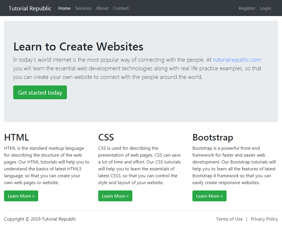
Bootstrap Fluid Layout
In this tutorial you will learn how to create fluid layouts with Bootstrap.
Creating Fluid Layout with Bootstrap
In Bootstrap you can use the class .container-fluid to create fluid layouts to utilize the 100% width of the viewport across all devices (extra small, small, medium, large, extra large, and extra-extra large).
The class .container-fluid simply applies the width: 100% instead of different width for different viewport sizes. However, the layout will still responsive and you can use the grid classes as usual. See the tutorial on Bootstrap grid system to learn more about grid classes.
The following example will create a fluid layout that covers 100% width of the screen.
<!DOCTYPE html>
<html lang="en">
<head>
<meta charset="utf-8">
<meta name="viewport" content="width=device-width, initial-scale=1">
<title>Bootstrap Fluid Layout Example</title>
<link rel="stylesheet" href="css/bootstrap.min.css">
<script src="js/bootstrap.bundle.min.js"></script>
</head>
<body>
<nav class="navbar navbar-expand-lg navbar-dark bg-dark">
<div class="container-fluid">
<a href="#" class="navbar-brand">Tutorial Republic</a>
<button type="button" class="navbar-toggler" data-bs-toggle="collapse" data-bs-target="#navbarCollapse">
<span class="navbar-toggler-icon"></span>
</button>
<div class="collapse navbar-collapse" id="navbarCollapse">
<div class="navbar-nav">
<a href="#" class="nav-item nav-link active">Home</a>
<a href="#" class="nav-item nav-link">Services</a>
<a href="#" class="nav-item nav-link">About</a>
<a href="#" class="nav-item nav-link">Contact</a>
</div>
<div class="navbar-nav ms-auto">
<a href="#" class="nav-item nav-link">Register</a>
<a href="#" class="nav-item nav-link">Login</a>
</div>
</div>
</div>
</nav>
<div class="container-fluid">
<div class="p-5 my-4 bg-light rounded-3">
<h1>Learn to Create Websites</h1>
<p class="lead">In today's world internet is the most popular way of connecting with the people. At <a href="https://www.tutorialrepublic.com" class="text-success" target="_blank">tutorialrepublic.com</a> you will learn the essential web development technologies along with real life practice examples, so that you can create your own website to connect with the people around the world.</p>
<p><a href="https://www.tutorialrepublic.com" target="_blank" class="btn btn-success btn-lg">Get started today</a></p>
</div>
<div class="row">
<div class="col-md-4">
<h2>HTML</h2>
<p>HTML is the standard markup language for describing the structure of the web pages. Our HTML tutorials will help you to understand the basics of latest HTML5 language, so that you can create your own web pages or website.</p>
<p><a href="https://www.tutorialrepublic.com/html-tutorial/" target="_blank" class="btn btn-success">Learn More »</a></p>
</div>
<div class="col-md-4">
<h2>CSS</h2>
<p>CSS is used for describing the presentation of web pages. CSS can save a lot of time and effort. Our CSS tutorials will help you to learn the essentials of latest CSS3, so that you can control the style and layout of your website.</p>
<p><a href="https://www.tutorialrepublic.com/css-tutorial/" target="_blank" class="btn btn-success">Learn More »</a></p>
</div>
<div class="col-md-4">
<h2>Bootstrap</h2>
<p>Bootstrap is a powerful front-end framework for faster and easier web development. Our Bootstrap tutorials will help you to learn all the features of latest Bootstrap 4 framework so that you can easily create responsive websites.</p>
<p><a href="https://www.tutorialrepublic.com/twitter-bootstrap-tutorial/" target="_blank" class="btn btn-success">Learn More »</a></p>
</div>
</div>
<hr>
<footer>
<div class="row">
<div class="col-md-6">
<p>Copyright © 2021 Tutorial Republic</p>
</div>
<div class="col-md-6 text-md-end">
<a href="#" class="text-dark">Terms of Use</a>
<span class="text-muted mx-2">|</span>
<a href="#" class="text-dark">Privacy Policy</a>
</div>
</div>
</footer>
</div>
</body>
</html>— The output of the above example will look something like this:
Advertisements


