Bootstrap Grid System
The Bootstrap grid system is the fastest and easy way to create responsive website layout.
What is Bootstrap Grid System?
Bootstrap grid system provides an easy and powerful way to create responsive layouts of all shapes and sizes. It is built with flexbox with mobile-first approach. Also, it is fully responsive and uses twelve column system (12 columns available per row) and six default responsive tiers.
You can use the Bootstrap's predefined grid classes for quickly making the layouts for different types of devices like mobile phones, tablets, laptops, desktops, and so on. For example, you can use the .col-* classes to create grid columns for extra small devices like mobile phones in portrait mode, and the .col-sm-* classes for mobile phones in landscape mode.
Similarly, you can use the .col-md-* classes to create grid columns for medium screen devices like tablets, the .col-lg-* classes for devices like small laptops, the .col-xl-* classes for laptops and desktops, and the .col-xxl-* classes for large desktop screens.
The following table summarizes the key features of the Bootstrap's grid system.
| Features Bootstrap Grid System |
X-Small (xs) <576px |
Small (sm) ≥576px |
Medium (md) ≥768px |
Large (lg) ≥992px |
X-Large (xl) ≥1200px |
XX-Large (xxl) ≥1400px |
|---|---|---|---|---|---|---|
| Container max-width | None (auto) | 540px | 720px | 960px | 1140px | 1320px |
| Class prefix | .col- |
.col-sm- |
.col-md- |
.col-lg- |
.col-xl- |
.col-xxl- |
| Number of columns | 12 | |||||
| Gutter width | 1.5rem (.75rem on left and right) | |||||
| Custom gutters | Yes | |||||
| Nestable | Yes | |||||
| Column ordering | Yes | |||||
Above table demonstrates one important thing, applying any .col-sm-* class to an element will not only have an effect on small devices, but also on medium, large and extra large devices (viewport width ≥768px), if a .col-md-*, .col-lg-*, .col-xl-*, or .col-xxl-* class is not present.
Similarly, the .col-md-* class will not only have an effect on medium devices, but also on large and extra large devices if a .col-lg-*, .col-xl-*, or .col-xxl-* class is not present.
Now the question arises how to create rows and columns using this 12 column responsive grid system. The answer is pretty simple, at first create a container that acts as a wrapper for your rows and columns using any container classes such as .container, after that create rows inside the container using the .row class, and to create columns inside any row you can use the .col-*, .col-sm-*, .col-md-*, .col-lg-*, .col-xl-* and .col-xxl-* classes.
The columns are actual content area where we will place our contents. In the following sections we will put all these things into real action and see how it actually works:
Creating Two Column Layouts
The following example will show you how to create two column layouts for medium, large and extra large devices like tables, laptops and desktops etc. However, on mobile phones (screen width less than 768px), the columns will automatically become horizontal (2 rows, 1 column).
Example
Try this code »<div class="container">
<!--Row with two equal columns-->
<div class="row">
<div class="col-md-6">Column left</div>
<div class="col-md-6">Column right</div>
</div>
<!--Row with two columns divided in 1:2 ratio-->
<div class="row">
<div class="col-md-4">Column left</div>
<div class="col-md-8">Column right</div>
</div>
<!--Row with two columns divided in 1:3 ratio-->
<div class="row">
<div class="col-md-3">Column left</div>
<div class="col-md-9">Column right</div>
</div>
</div>Note: In a grid layout, content must be placed inside the columns (.col and .col-*) and only columns may be the immediate children of rows (.row). Also, rows should be placed inside a container (either fixed or fluid) for proper padding and alignment.
Tip: Grid column widths are set in percentages, so they're always fluid and sized relative to their parent element. In addition, each column has horizontal padding (called a gutter) for controlling the space between individual columns.
Since the Bootstrap grid system is based on 12 columns, therefore to keep the columns in a one line (i.e. side by side), the sum of the grid column numbers within a single row should not be greater than 12. If you go through the above example code carefully you will find the numbers of grid columns (i.e. col-md-*) add up to twelve (6+6, 4+8 and 3+9) for every row.
Creating Three Column Layouts
Similarly, you can create other layouts based on the above principle. For instance, the following example will typically create three column layouts for laptops and desktops screens. It also works in tablets in landscape mode if screen resolution is more than or equal to 992 pixels (e.g. Apple iPad). However, in portrait mode the grid columns will be horizontal as usual.
Example
Try this code »<div class="container">
<!--Row with three equal columns-->
<div class="row">
<div class="col-lg-4">Column left</div>
<div class="col-lg-4">Column middle</div>
<div class="col-lg-4">Column right</div>
</div>
<!--Row with three columns divided in 1:4:1 ratio-->
<div class="row">
<div class="col-lg-2">Column left</div>
<div class="col-lg-8">Column middle</div>
<div class="col-lg-2">Column right</div>
</div>
<!--Row with three columns divided unevenly-->
<div class="row">
<div class="col-lg-3">Column left</div>
<div class="col-lg-7">Column middle</div>
<div class="col-lg-2">Column right</div>
</div>
</div>Note: If more than 12 grid columns are placed within a single row, then each group of extra columns, as a whole, will wrap onto a new line. See column wrapping behavior.
Bootstrap Auto-layout Columns
You can also create equal width columns for all devices (x-small, small, medium, large, x-large, and xx-large) through simply using the class .col, without specifying any column number.
Let's try out the following example to understand how it exactly works:
Example
Try this code »<div class="container">
<!--Row with two equal columns-->
<div class="row">
<div class="col">Column one</div>
<div class="col">Column two</div>
</div>
<!--Row with three equal columns-->
<div class="row">
<div class="col">Column one</div>
<div class="col">Column two</div>
<div class="col">Column three</div>
</div>
</div>Additionally, you can also set the width of one column and let the sibling columns automatically resize around it equally. You may use the predefined grid classes or inline widths.
If you try the following example you'll find columns in a row with class .col has equal width.
Example
Try this code »<div class="container">
<!--Row with two equal columns-->
<div class="row">
<div class="col">Column one</div>
<div class="col">Column two</div>
</div>
<!--Row with three columns divided in 1:2:1 ratio-->
<div class="row">
<div class="col">Column one</div>
<div class="col-sm-6">Column two</div>
<div class="col">Column three</div>
</div>
</div>Column Wrapping Behavior
Now we are going to create more flexible layouts that changes the column orientation based on the viewport size. The following example will create a three column layout on large devices like laptops and desktops, as well as on tablets (e.g. Apple iPad) in landscape mode, but on medium devices like tablets in portrait mode (768px ≤ screen width < 992px), it will change into a two column layout where the third column moves at the bottom of the first two columns.
Example
Try this code »<div class="container">
<div class="row">
<div class="col-md-4 col-lg-3">Column one</div>
<div class="col-md-8 col-lg-6">Column two</div>
<div class="col-md-12 col-lg-3">Column three</div>
</div>
</div>As you can see in the example above the sum of the medium grid column numbers (i.e. col-md-*) is 3 + 9 + 12 = 24 > 12, therefore the third <div> element with the class .col-md-12 that is adding the extra columns beyond the maximum 12 columns in a .row, gets wrapped onto a new line as one contiguous unit on the medium screen size devices.
Similarly, you can create even more adaptable layouts for your websites using the Bootstrap's grid column wrapping feature. Here're some ready to use Bootstrap grid examples.
Creating Multi-Column Layouts with Bootstrap
With the new Bootstrap mobile first flexbox grid system you can easily control how your website layout will render on different types of devices that have different screen or viewport sizes like mobile phones, tablets, desktops, etc. Let's consider the following illustration.
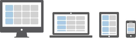
In the above illustration there are total 12 content boxes in all devices, but its placement varies according to the device screen size, like in mobile device the layout is rendered as one column grid layout which has 1 column and 12 rows placed above one another, whereas in tablet it is rendered as two column grid layout which has 2 columns and 6 rows.
Further, in large screen size devices like laptops and desktops it is rendered as three column grid layout which has 3 columns and 4 rows and finally in extra large screen devices like large desktops it is rendered as four column grid layout which has 4 columns and 3 rows.
Now the question is how we can create such responsive layouts using this Bootstrap flexbox grid system. Let's start with the primary target device. Suppose our primary target device is laptop or normal desktop. Since our laptop layout has 3 columns and 4 rows i.e. 3x4 grid layout, so the HTML code for making such grid structure would look something like this.
Example
Try this code »<div class="container-lg">
<div class="row">
<div class="col-xl-4"><p>Box 1</p></div>
<div class="col-xl-4"><p>Box 2</p></div>
<div class="col-xl-4"><p>Box 3</p></div>
<div class="col-xl-4"><p>Box 4</p></div>
<div class="col-xl-4"><p>Box 5</p></div>
<div class="col-xl-4"><p>Box 6</p></div>
<div class="col-xl-4"><p>Box 7</p></div>
<div class="col-xl-4"><p>Box 8</p></div>
<div class="col-xl-4"><p>Box 9</p></div>
<div class="col-xl-4"><p>Box 10</p></div>
<div class="col-xl-4"><p>Box 11</p></div>
<div class="col-xl-4"><p>Box 12</p></div>
</div>
</div>Tip: The .container-lg class makes the container 100% wide if the width of the viewport is less than 992px, thus utilizing the full available width on smaller screens.
If you see the output of the above example in a large device such as a laptop or desktop which has screen or viewport width greater than or equal to 1200px but less than 1400px, you will find the layout has 4 rows where each row has 3 equal columns resulting in 3x4 grid layout.
Now it's time to customize our layout for other devices. Let's first start by customizing it for medium devices like tablets (768px ≤ viewport width < 1200px). Since on tablet our layout rendered as 2x6 grids (i.e. 2 columns and 6 rows). So, go ahead and add the class .col-md-6 on every column.
Example
Try this code »<div class="container-lg">
<div class="row">
<div class="col-xl-4 col-md-6"><p>Box 1</p></div>
<div class="col-xl-4 col-md-6"><p>Box 2</p></div>
<div class="col-xl-4 col-md-6"><p>Box 3</p></div>
<div class="col-xl-4 col-md-6"><p>Box 4</p></div>
<div class="col-xl-4 col-md-6"><p>Box 5</p></div>
<div class="col-xl-4 col-md-6"><p>Box 6</p></div>
<div class="col-xl-4 col-md-6"><p>Box 7</p></div>
<div class="col-xl-4 col-md-6"><p>Box 8</p></div>
<div class="col-xl-4 col-md-6"><p>Box 9</p></div>
<div class="col-xl-4 col-md-6"><p>Box 10</p></div>
<div class="col-xl-4 col-md-6"><p>Box 11</p></div>
<div class="col-xl-4 col-md-6"><p>Box 12</p></div>
</div>
</div>Tip: For convenience choose your primary target device and create layout for that device first after that add classes to make it responsive for other devices.
Similarly, you can customize the layout for extra extra large devices such as a large desktop screen by adding the class .col-xxl-3 on each column, as every row in that layout contains 4 columns (i.e. 4x3 grids layout). Here's the final code after combining the whole process.
Example
Try this code »<div class="container-lg">
<div class="row">
<div class="col-xl-4 col-md-6 col-xxl-3"><p>Box 1</p></div>
<div class="col-xl-4 col-md-6 col-xxl-3"><p>Box 2</p></div>
<div class="col-xl-4 col-md-6 col-xxl-3"><p>Box 3</p></div>
<div class="col-xl-4 col-md-6 col-xxl-3"><p>Box 4</p></div>
<div class="col-xl-4 col-md-6 col-xxl-3"><p>Box 5</p></div>
<div class="col-xl-4 col-md-6 col-xxl-3"><p>Box 6</p></div>
<div class="col-xl-4 col-md-6 col-xxl-3"><p>Box 7</p></div>
<div class="col-xl-4 col-md-6 col-xxl-3"><p>Box 8</p></div>
<div class="col-xl-4 col-md-6 col-xxl-3"><p>Box 9</p></div>
<div class="col-xl-4 col-md-6 col-xxl-3"><p>Box 10</p></div>
<div class="col-xl-4 col-md-6 col-xxl-3"><p>Box 11</p></div>
<div class="col-xl-4 col-md-6 col-xxl-3"><p>Box 12</p></div>
</div>
</div>Tip: According to the above illustration there is no need to customize the layout for mobile phones; since columns on extra small devices will automatically become horizontal and rendered as 1x12 column grid layout in absence of .col-* or .col-sm-* classes.
Nesting of Grid Columns
The Bootstrap grid columns are also nestable, that means you can put rows and columns inside an existing column. However, the formula for placing the columns will be the same, i.e. the sum of column numbers should be equal to 12 or less within a single row.
Example
Try this code »<div class="container">
<div class="row">
<div class="col-sm-8">Column left</div>
<div class="col-sm-4">
<!--Column right with nested rows and columns-->
<div class="row">
<div class="col-12"></div>
</div>
<div class="row">
<div class="col-6"></div>
<div class="col-6"></div>
</div>
</div>
</div>
</div>Creating Variable Width Columns
You can use the col-{breakpoint}-auto classes to size columns based on the natural width of their content. Try out the following example to see how it works:
Example
Try this code »<div class="container">
<div class="row justify-content-md-center">
<div class="col-md-3">Column left</div>
<div class="col-md-auto">Variable width column</div>
<div class="col-md-3">Column right</div>
</div>
<div class="row">
<div class="col">Column left</div>
<div class="col-auto">Variable width column</div>
<div class="col">Column right</div>
</div>
</div>Alignment of Grid Columns
You can use the flexbox alignment utilities to vertically and horizontally align grid columns inside a container. Try out the following examples to understand how it works:
Vertical Alignment of Grid Columns
You can use the classes .align-items-start, .align-items-center, and .align-items-end to align the grid columns vertically at the top, middle and bottom of a container, respectively.
Example
Try this code »<div class="container">
<div class="row align-items-start">
<div class="col">Column one</div>
<div class="col">Column two</div>
<div class="col">Column three</div>
</div>
<div class="row align-items-center">
<div class="col">Column one</div>
<div class="col">Column two</div>
<div class="col">Column three</div>
</div>
<div class="row align-items-end">
<div class="col">Column one</div>
<div class="col">Column two</div>
<div class="col">Column three</div>
</div>
</div>Individual columns inside a row can also be aligned vertically. Here's an example:
Example
Try this code »<div class="container">
<div class="row">
<div class="col align-self-start">Column one</div>
<div class="col align-self-center">Column two</div>
<div class="col align-self-end">Column three</div>
</div>
</div>Note: You can skip the number in .col-* grid class and just use the .col class to create equal size columns for all devices (extra small, small, medium, large, and extra large).
Horizontal Alignment of Grid Columns
You can use the classes .justify-content-start, .justify-content-center, and .justify-content-end to align the grid columns horizontally at the left, center and right of a container, respectively. Let's check out the following example to see how it works:
Example
Try this code »<div class="container">
<div class="row justify-content-start">
<div class="col-4">Column one</div>
<div class="col-4">Column two</div>
</div>
<div class="row justify-content-center">
<div class="col-4">Column one</div>
<div class="col-4">Column two</div>
</div>
<div class="row justify-content-end">
<div class="col-4">Column one</div>
<div class="col-4">Column two</div>
</div>
</div>Alternatively, you can use the class .justify-content-around to distribute grid columns evenly with half-size spaces on either end, whereas you can use the class .justify-content-between to distribute the grid columns evenly where the first column placed at the start and the last column placed at the end. Try out the following example to see how it actually works:
Example
Try this code »<div class="container">
<div class="row justify-content-around">
<div class="col-4">Column one</div>
<div class="col-4">Column two</div>
</div>
<div class="row justify-content-between">
<div class="col-4">Column one</div>
<div class="col-4">Column two</div>
</div>
</div>Please check out the tutoiral on css3 flexbox to learn more about flex items alignment.
Reordering of Grid Columns
You can even change the visual order of your grid columns without changing their order in actual markup. Use the class .order-last to order the column in last, whereas use the class .order-first to order the column at first place. Let's checkout an example:
Example
Try this code »<div class="container">
<div class="row">
<div class="col order-last">First, but ordered at last</div>
<div class="col">Second, but unordered</div>
<div class="col order-first">Last, but ordered at first</div>
</div>
</div>You can also use the .order-* classes to order the grid columns depending on the order numbers. Grid column with higher order number comes after the grid column with lower order number or grid column with no order classes. It includes support for 1 through 12 across all five grid tiers.
Example
Try this code »<div class="container">
<div class="row">
<div class="col order-4">First, but ordered at last</div>
<div class="col">Second, but ordered at first</div>
<div class="col order-1">Last, but ordered at second</div>
</div>
</div>Offsetting the Grid Columns
You can also move grid columns to the right for alignment purpose using the column offset classes like .offset-sm-*, .offset-md-*, .offset-lg-*, and so on.
These classes offset the columns by simply increasing its left margin by specified number of columns. For example, the class .offset-md-4 on column .col-md-8 moves it to the right over four columns from its original position. Try out the following example to see how it works:
Example
Try this code »<div class="container">
<div class="row">
<div class="col-sm-4"></div>
<div class="col-sm-8"></div>
</div>
<div class="row">
<div class="col-sm-8 offset-sm-4"><!--Column with 4 columns offset--></div>
</div>
</div>You can also offset columns using the margin utility classes. These classes are useful in the situations where the width of the offset is not fixed. Here's an example:
Example
Try this code »<div class="container">
<div class="row">
<div class="col-md-4"></div>
<div class="col-md-4 ms-auto"><!--Offset this column to right--></div>
</div>
<div class="row">
<div class="col-auto me-auto"></div>
<div class="col-auto"><!--Move this column away from previous column--></div>
</div>
</div>Note: You can use the class .col-auto to create columns that only take up as much space as needed, i.e. the column sizes itself based on the contents.
Creating Compact Columns
You can remove the default gutters between columns to create compact layouts by adding the class .g-0 on .row. This class removes the negative margins from row and the horizontal padding from all immediate children columns. Here's an example:
Example
Try this code »<div class="row g-0">
<div class="col-4">Column one</div>
<div class="col-4">Column two</div>
<div class="col-4">Column three</div>
</div>Breaking Columns to a New Line
You can also create equal-width columns that span multiple rows by inserting a <div> with .w-100 class where you want the columns to break to a new line. Additionally, you can make these breaks responsive by combining the .w-100 class with responsive display utility classes.
Example
Try this code »<div class="container">
<!-- Break columns on all devices -->
<div class="row">
<div class="col">.col</div>
<div class="col">.col</div>
<div class="w-100"></div>
<div class="col">.col</div>
<div class="col">.col</div>
</div>
<!-- Break columns on all devices except extra large devices -->
<div class="row">
<div class="col">.col</div>
<div class="col">.col</div>
<div class="w-100 d-xl-none"></div>
<div class="col">.col</div>
<div class="col">.col</div>
</div>
</div>We hope you've understood the basics of new Bootstrap 5 grid system. In next few chapters you'll learn how to create basic web page layouts using this flexbox grid system.


