Bootstrap Media Objects
In this tutorial you will learn how to create the media objects in Bootstrap.
Using the Media Object in Bootstrap
Bootstrap media object has been discontinued from version 5. However, you can still create a layout that contains left- or right-aligned media object like images or video alongside the textual content such as blog comments, Tweets, etc. using the flex and spacing utility classes.
Example
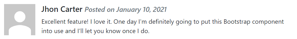
Try this code »<div class="d-flex">
<div class="flex-shrink-0">
<img src="images/avatar.svg" alt="Sample Image">
</div>
<div class="flex-grow-1 ms-3">
<h5>Jhon Carter <small class="text-muted"><i>Posted on January 10, 2021</i></small></h5>
<p>Excellent feature! I love it. One day I'm definitely going to put this Bootstrap component into use and I'll let you know once I do.</p>
</div>
</div>— The output of the above example will look something like this:
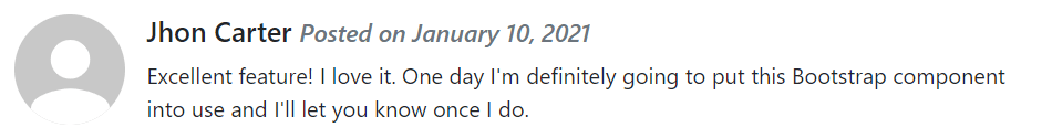
You can also create other variations of media object. Apply the image modifier classes like .rounded or .rounded-circle to the image to create rounded corner or circular image.
Example
Try this code »<div class="d-flex">
<div class="flex-shrink-0">
<img src="images/avatar.svg" class="rounded-circle" alt="Sample Image">
</div>
<div class="flex-grow-1 ms-3">
<h5>Jhon Carter <small class="text-muted"><i>Posted on January 10, 2021</i></small></h5>
<p>Excellent feature! I love it. One day I'm definitely going to put this Bootstrap component into use and I'll let you know once I do.</p>
</div>
</div>— The output of the above example will look something like this:
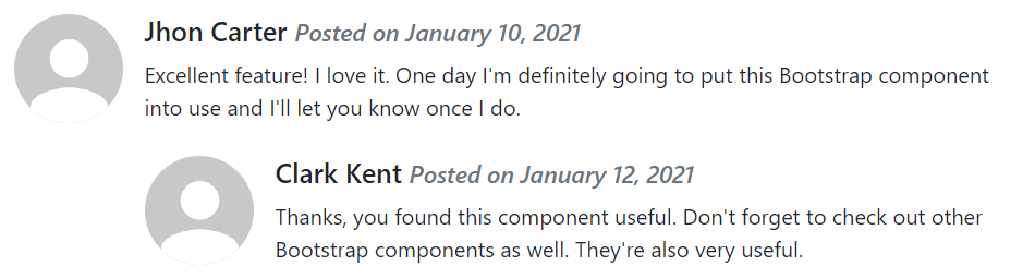
Creating Nested Media Objects
Media objects can also be nested inside other media object. It can be very useful for creating comment threads in a blog post. Let's check out an example:
Example
Try this code »<div class="d-flex">
<div class="flex-shrink-0">
<img src="images/avatar.svg" class="rounded-circle" alt="Sample Image">
</div>
<div class="flex-grow-1 ms-3">
<h5>Jhon Carter <small class="text-muted"><i>Posted on January 10, 2021</i></small></h5>
<p>Excellent feature! I love it. One day I'm definitely going to put this Bootstrap component into use and I'll let you know once I do.</p>
<!-- Nested media object -->
<div class="d-flex mt-4">
<div class="flex-shrink-0">
<img src="images/avatar.svg" class="rounded-circle" alt="Sample Image">
</div>
<div class="flex-grow-1 ms-3">
<h5>Clark Kent <small class="text-muted"><i>Posted on January 12, 2021</i></small></h5>
<p>Thanks, you found this component useful. Don't forget to check out other Bootstrap components as well. They're also very useful.</p>
</div>
</div>
</div>
</div>— The output of the above example will look something like this:
Alignment of Media Objects
You can also change the horizontal alignment of content and media by simply tweaking the HTML code itself, as demonstrated in the following example:
Example
Try this code »<div class="d-flex">
<div class="flex-grow-1 me-3">
<h5>Jhon Carter <small class="text-muted"><i>Posted on January 10, 2021</i></small></h5>
<p>Excellent feature! I love it. One day I'm definitely going to put this Bootstrap component into use and I'll let you know once I do.</p>
</div>
<div class="flex-shrink-0">
<img src="images/avatar.svg" alt="Sample Image">
</div>
</div>— The output of the above example will look something like this:

Besides that you can also align the images or other media at the middle or bottom of the content block using the flexbox utilities classes, for example, you can use the class .align-self-center for vertical center alignment, and the class .align-self-end for bottom alignment.
By default, the media inside a media object is top aligned. Here's an example:
<!--Top aligned media-->
<div class="d-flex">
    <div class="flex-shrink-0">
        <img src="images/avatar.svg" alt="Sample Image">
    </div>
    <div class="flex-grow-1 ms-3">
        <h5>Top aligned media <small class="text-muted"><i>This is Default</i></small></h5>
        <p>Lorem ipsum dolor sit amet, consectetur adipiscing elit...</p>
    </div>
</div>
<hr>

<!--Middle aligned media-->
<div class="d-flex">
    <div class="flex-shrink-0 align-self-center">
        <img src="images/avatar.svg" alt="Sample Image">
    </div>
    <div class="flex-grow-1 ms-3">
        <h5>Middle Aligned Media</h5>
        <p>Vestibulum quis quam ut magna consequat faucibus aleo...</p>
    </div>
</div>
<hr>

<!--Bottom aligned media-->
<div class="d-flex">
    <div class="flex-shrink-0 align-self-end">
        <img src="images/avatar.svg" alt="Sample Image">
    </div>
    <div class="flex-grow-1 ms-3">
        <h5>Bottom Aligned Media</h5>
        <p>Amet nibh libero, in gravida nulla. Nulla vel metus...</p>
    </div>
</div>

