Bootstrap List Groups
In this tutorial you will learn how to use Bootstrap list group component.
Creating List Groups with Bootstrap
The list groups are very useful and flexible component for displaying lists of elements in a beautiful manner. In most basic form a list group is simply an unordered list with the class .list-group whereas, the list items having the class .list-group-item.
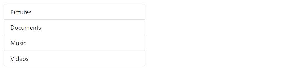
Example
Try this code »<ul class="list-group w-50">
<li class="list-group-item">Pictures</li>
<li class="list-group-item">Documents</li>
<li class="list-group-item">Music</li>
<li class="list-group-item">Videos</li>
</ul>— The output of the above example will look something like this:
Tip: List groups are 100% wide by default. To set their width explicitly you can either use the Bootstrap's width utility classes (e.g. w-25, w-50, etc.) or place them inside grid columns.
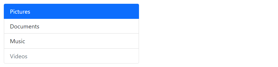
Indicate Disabled and Active Items
You can simply add the class .active to a .list-group-item to indicate the current active selection. Similarly, you can add .disabled to a .list-group-item to make it look like disabled.
Example
Try this code »<ul class="list-group w-50">
<li class="list-group-item active">Pictures</li>
<li class="list-group-item">Documents</li>
<li class="list-group-item">Music</li>
<li class="list-group-item disabled">Videos</li>
</ul>— The output of the above example will look something like this:
Tip: In case of list group with linked items, the .disabled class only make the link look like disabled, but the link is still clickable. To actually disable links you need to remove the anchor's href attribute either using the JavaScript or manually.
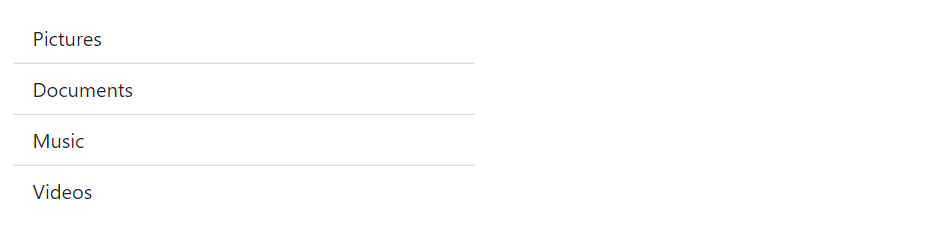
Edge-to-Edge List Groups
You can optionally add the class .list-group-flush to the list-group element to remove outer borders and rounded corners to create list groups that are edge-to-edge with their parent container.
Let's check out the following example to understand how it actually works:
Example
Try this code »<ul class="list-group list-group-flush w-50">
<li class="list-group-item">Pictures</li>
<li class="list-group-item">Documents</li>
<li class="list-group-item">Music</li>
<li class="list-group-item">Videos</li>
</ul>— The output of the above example will look something like this:
Creating Numbered List Groups
You can also create list groups where items are numbered through simply adding the modifier class .list-group-numbered on the .list-group element, like this:
Example
Try this code »<ol class="list-group list-group-numbered w-50">
<li class="list-group-item">An item</li>
<li class="list-group-item">A second item</li>
<li class="list-group-item">A third item</li>
<li class="list-group-item">A fourth item</li>
</ol>— The output of the above example will look something like this:
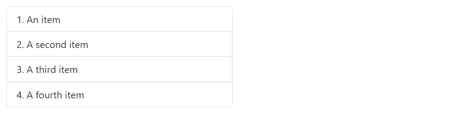
Note: Numbers are generated via CSS (as opposed to <ol> element's default browser styling) for better placement inside list group items and to allow for better customization. See the CSS counter-reset and counter-increment properties to learn more about it.
List Group with Checkboxes and Radios
You can also place Bootstrap's custom checkboxes and radio buttons within the list group items.
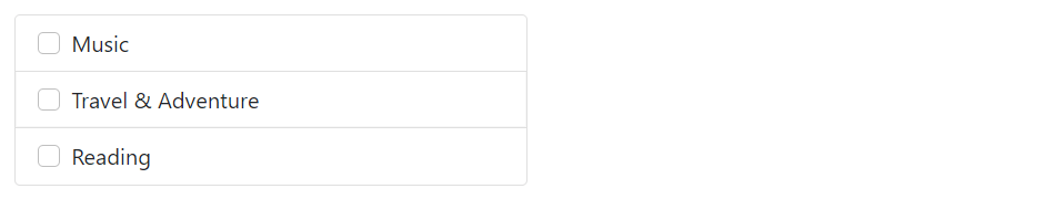
The following example will create a list group with custom checkboxes:
Example
Try this code »<div class="list-group w-50">
<label class="list-group-item">
<input type="checkbox" class="form-check-input me-1" name="hobbies"> Music
</label>
<label class="list-group-item">
<input type="checkbox" class="form-check-input me-1" name="hobbies"> Travel & Adventure
</label>
<label class="list-group-item">
<input type="checkbox" class="form-check-input me-1" name="hobbies"> Reading
</label>
</div>— The output of the above example will look something like this:
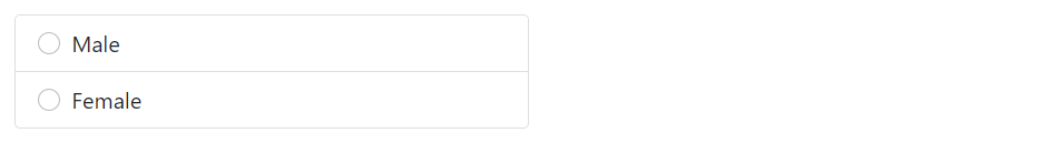
Similarly, you can place custom radio buttons within list group items, like this:
Example
Try this code »<div class="list-group w-50">
<label class="list-group-item">
<input type="radio" class="form-check-input me-1" name="gender"> Male
</label>
<label class="list-group-item">
<input type="radio" class="form-check-input me-1" name="gender"> Female
</label>
</div>— The output of the above example will look something like this:
You'll learn about custom checkboxes and radio buttons in the Bootstrap custom forms chapter.
List Group with Linked Items
You can also link list group items with the little change in HTML markup.
Just replace the <li> with <a> tag and use <div> element as a parent instead of <ul>. You can also add icons and badges to this list group to make it more elegant. Here's an example:
Example
Try this code »<div class="list-group w-50">
<a href="#" class="list-group-item list-group-item-action active">
<i class="bi-house-fill"></i> Home
</a>
<a href="#" class="list-group-item list-group-item-action">
<i class="bi-camera-fill"></i> Pictures
<span class="badge rounded-pill bg-primary float-end">145</span>
</a>
<a href="#" class="list-group-item list-group-item-action">
<i class="bi-music-note-beamed"></i> Music
<span class="badge rounded-pill bg-primary float-end">50</span>
</a>
<a href="#" class="list-group-item list-group-item-action">
<i class="bi-film"></i> Videos
<span class="badge rounded-pill bg-primary float-end">8</span>
</a>
</div>— The output of the above example will look something like this:
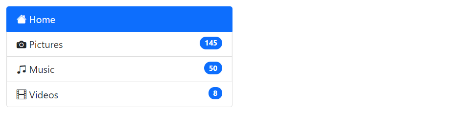
Tip: You can use the Bootstrap list group component for creating the sidebar navigation menu, e.g. displaying the list of products or categories on your website.
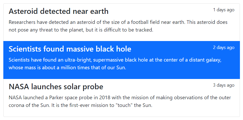
List Group with Custom Content
You can also add nearly any HTML within the list groups with the help of flexbox utilities.
Here's an example of a linked list group with headings and paragraph.
Example
Try this code »<div class="list-group">
<a href="#" class="list-group-item list-group-item-action">
<div class="d-flex w-100 justify-content-between">
<h4>Asteroid detected near earth</h4>
<small>1 days ago</small>
</div>
<p>Researchers have detected an asteroid of the size of a football field near earth. This asteroid does not pose any threat to the planet, but it is difficult to be tracked.</p>
</a>
<a href="#" class="list-group-item list-group-item-action active">
<div class="d-flex w-100 justify-content-between">
<h4>Scientists found massive black hole</h4>
<small>2 days ago</small>
</div>
<p>Scientists have found an ultra-bright, supermassive black hole at the center of a distant galaxy, whose mass is about a million times that of our Sun.</p>
</a>
<a href="#" class="list-group-item list-group-item-action">
<div class="d-flex w-100 justify-content-between">
<h4>NASA launches solar probe</h4>
<small>3 days ago</small>
</div>
<p>NASA launched a Parker space probe in 2018 with the mission of making observations of the outer corona of the Sun. It is the first-ever mission to "touch" the Sun.</p>
</a>
</div>— The output of the above example will look something like this:
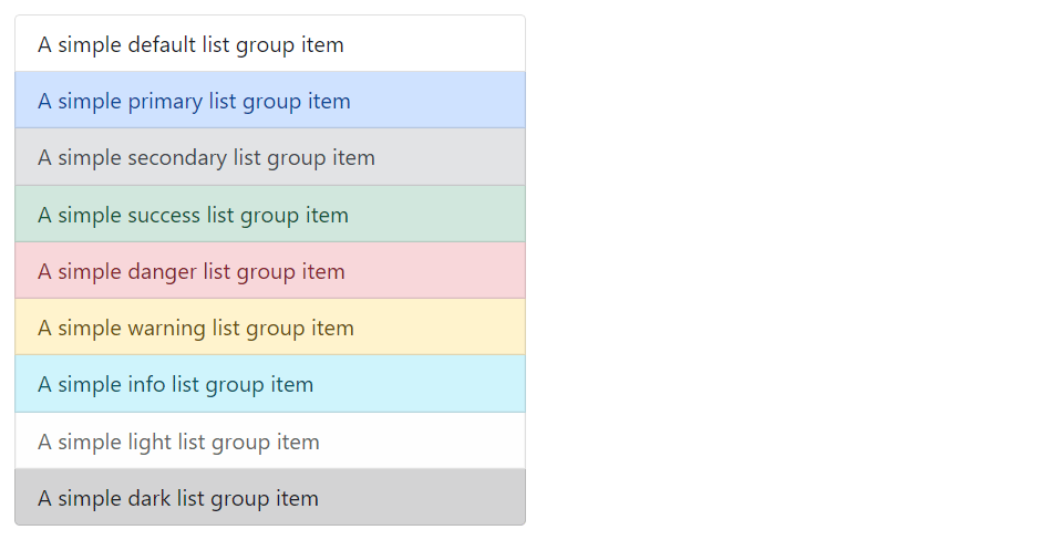
List Group with Contextual States
Like most of the other components you can also use contextual classes on the list group items to apply extra emphasis on them. Here's an example:
Example
Try this code »<ul class="list-group w-50">
<li class="list-group-item">A simple default list group item</li>
<li class="list-group-item list-group-item-primary">A simple primary list group item</li>
<li class="list-group-item list-group-item-secondary">A simple secondary list group item</li>
<li class="list-group-item list-group-item-success">A simple success list group item</li>
<li class="list-group-item list-group-item-danger">A simple danger list group item</li>
<li class="list-group-item list-group-item-warning">A simple warning list group item</li>
<li class="list-group-item list-group-item-info">A simple info list group item</li>
<li class="list-group-item list-group-item-light">A simple light list group item</li>
<li class="list-group-item list-group-item-dark">A simple dark list group item</li>
</ul>— The output of the above example will look something like this:
Similarly, you can use these contextual classes to the linked list group items. You can also use the class .active to specify the active list group item. Here's an example:
Example
Try this code »<div class="list-group">
<a href="#" class="list-group-item list-group-item-action">A simple default list group item</a>
<a href="#" class="list-group-item list-group-item-action list-group-item-primary">A simple primary list group item</a>
<a href="#" class="list-group-item list-group-item-action list-group-item-secondary">A simple secondary list group item</a>
<a href="#" class="list-group-item list-group-item-action list-group-item-success">A simple success list group item</a>
<a href="#" class="list-group-item list-group-item-action list-group-item-danger">A simple danger list group item</a>
<a href="#" class="list-group-item list-group-item-action list-group-item-warning">A simple warning list group item</a>
<a href="#" class="list-group-item list-group-item-action list-group-item-info">A simple info list group item</a>
<a href="#" class="list-group-item list-group-item-action list-group-item-light">A simple light list group item</a>
<a href="#" class="list-group-item list-group-item-action list-group-item-dark">A simple dark list group item</a>
</div>Please, check out the Bootstrap tabs chapter to learn how to create dynamic vertical tabs using the Bootstrap list group component without using any JavaScript code.


