Bootstrap Modals
In this tutorial you will learn how to create modals with Bootstrap.
Creating Modals with Bootstrap
Modal is basically a dialog box or popup window that is used to provide important information to the user or prompt user to take necessary actions before moving on. Modals are widely used to warn users for situations like session time out or to receive their final confirmation before going to perform any critical actions such as saving or deleting important data.
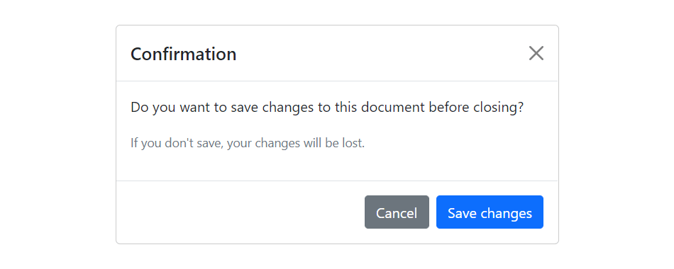
You can easily create very smart and flexible dialog boxes with the Bootstrap modal plugin. The following example oulines the basic structure to create a simple modal with a header, message body and the footer containing action buttons for the user.
<!-- jQuery Code (to Show Modal on Page Load) -->
<script>
$(document).ready(function() {
    $("#myModal").modal("show");
});
</script>

<!-- Modal HTML -->
<div id="myModal" class="modal fade" tabindex="-1">
    <div class="modal-dialog">
        <div class="modal-content">
            <div class="modal-header">
                <h5 class="modal-title">Confirmation</h5>
                <button type="button" class="btn-close" data-bs-dismiss="modal"></button>
            </div>
            <div class="modal-body">
                <p>Do you want to save changes to this document before closing?</p>
                <p class="text-secondary"><small>If you don't save, your changes will be lost.</small></p>
            </div>
            <div class="modal-footer">
                <button type="button" class="btn btn-secondary" data-bs-dismiss="modal">Cancel</button>
                <button type="button" class="btn btn-primary">Save changes</button>
            </div>
        </div>
    </div>
</div>— If you try out the above example, it will launches the modal window automatically when the DOM is fully loaded via JavaScript. The output will look something like this:
Tip: Always try to place your modal HTML in a top-level position in your document, preferably before closing of the <body> tag (i.e. </body>) to avoid interference from other elements, otherwise it may affect modal's appearance or functionality.
Check out the snippets section for examples of some beautifully designed Bootstrap modals.
Activate Modals via Data Attributes
You can activate a Bootstrap modal by clicking on the button or link via data attributes without writing any JavaScript code. Take a look at the following example to see how it works:
Example
Try this code »<!-- Button HTML (to Trigger Modal) -->
<a href="#myModal" class="btn btn-lg btn-primary" data-bs-toggle="modal">Launch Demo Modal</a>
<!-- Modal HTML -->
<div id="myModal" class="modal fade">
<div class="modal-dialog">
<div class="modal-content">
<div class="modal-header">
<h5 class="modal-title">Confirmation</h5>
<button type="button" class="btn-close" data-bs-dismiss="modal"></button>
</div>
<div class="modal-body">
<p>Do you want to save changes to this document before closing?</p>
<p class="text-secondary"><small>If you don't save, your changes will be lost.</small></p>
</div>
<div class="modal-footer">
<button type="button" class="btn btn-secondary" data-bs-dismiss="modal">Cancel</button>
<button type="button" class="btn btn-primary">Save changes</button>
</div>
</div>
</div>
</div>
The above example launches the modal window on click of the "Launch Demo Modal" button. Let's go through each part of this modal code one by one for a better understanding.
Explanation of Code
To activate a Bootstrap modal via data attributes we basically need two components — the controller element like a button or link, and the modal element itself.
- The outermost container of every modal in a document must have a unique id (in this case
id="myModal", line no-5), so that it can be targeted viadata-bs-target(for buttons) orhref(for hyperlinks) attribute of the controller element (line no-2). - The attribute
data-bs-toggle="modal"is required to add on the controller element (line no-2), like a button or an anchor, along with a attributedata-bs-target="#myModal"orhref="#myModal"to target a specific modal to toggle. - The
.modal-dialogclass (line no-6) sets the width as well as horizontal and vertical alignment of the modal box. Whereas the class.modal-contentsets the styles like text and background color, borders, rounded corners etc.
Rest of the thing is self explanatory, such as the .modal-header element defines a header for the modal that usually contains a modal title and a close button, whereas the .modal-body element contains the actual content like text, images, forms etc. and the .modal-footer element defines the footer that typically contains action buttons for the user.
Note: The .fade class on the .modal element adds a fading and sliding animation effect while showing and hiding the modal window. If you want the modal that simply appear without any effect you can just remove this class. Also, when modals become too long for the user's viewport or device, they scroll independent of the page itself.
Activate Modals via JavaScript
You may also activate a Bootstrap modal window via JavaScript — just call the modal() Bootstrap method with the modal id or class selector in your JavaScript code.
<script>
$(document).ready(function() {
    $("#myBtn").click(function() {
        $("#myModal").modal("show");
    });
});
</script>Changing the Size of Modals
Bootstrap gives you option further to scaling a modal up or down. You can create small, large, as well as extra-large modals by adding an extra class .modal-sm, .modal-lg, and .modal-xl class, respectively on the .modal-dialog. Here's an example:
<!-- Extra Large modal -->
<button class="btn btn-primary" data-bs-toggle="modal" data-bs-target="#extraLargeModal">Extra Large modal</button>

<div id="extraLargeModal" class="modal fade" tabindex="-1" role="dialog">
    <div class="modal-dialog modal-xl">
        <div class="modal-content">
            <div class="modal-header">
                <h5 class="modal-title">Extra Large Modal</h5>
                <button type="button" class="btn-close" data-bs-dismiss="modal"></button>
            </div>
            <div class="modal-body">
                <p>Add the <code>.modal-xl</code> class on <code>.modal-dialog</code> to create this extra large modal.</p>
            </div>
            <div class="modal-footer">
                <button type="button" class="btn btn-secondary" data-bs-dismiss="modal">Cancel</button>
                <button type="button" class="btn btn-primary">OK</button>
            </div>
        </div>
    </div>
</div>

<!-- Large modal -->
<button class="btn btn-primary" data-bs-toggle="modal" data-bs-target="#largeModal">Large modal</button>

<div id="largeModal" class="modal fade" tabindex="-1" role="dialog">
    <div class="modal-dialog modal-lg">
        <div class="modal-content">
            <div class="modal-header">
                <h5 class="modal-title">Large Modal</h5>
                <button type="button" class="btn-close" data-bs-dismiss="modal"></button>
            </div>
            <div class="modal-body">
                <p>Add the <code>.modal-lg</code> class on <code>.modal-dialog</code> to create this large modal.</p>
            </div>
            <div class="modal-footer">
                <button type="button" class="btn btn-secondary" data-bs-dismiss="modal">Cancel</button>
                <button type="button" class="btn btn-primary">OK</button>
            </div>
        </div>
    </div>
</div>

<!-- Small modal -->
<button class="btn btn-primary" data-bs-toggle="modal" data-bs-target="#smallModal">Small modal</button>

<div id="smallModal" class="modal fade" tabindex="-1" role="dialog">
    <div class="modal-dialog modal-sm">
        <div class="modal-content">
            <div class="modal-header">
                <h5 class="modal-title">Small Modal</h5>
                <button type="button" class="btn-close" data-bs-dismiss="modal"></button>
            </div>
            <div class="modal-body">
                <p>Add the <code>.modal-sm</code> class on <code>.modal-dialog</code> to create this small modal.</p>
            </div>
            <div class="modal-footer">
                <button type="button" class="btn btn-secondary" data-bs-dismiss="modal">Cancel</button>
                <button type="button" class="btn btn-primary">OK</button>
            </div>
        </div>
    </div>
</div>
Tip: The maximum width of the default modal will be 500px, whereas the maximum width of the small, large, and extra-large modal will be 300px, 800px, 1140px, respectivley.
Changing Modal Content Based on Trigger Button
Often several modal on a web page has almost same content with minor differences.
You can use the modal events to create slightly different modal windows based on the same modal HTML. The following example will show you how to change the title of the modal window according to the trigger button's data-title attribute value.
<script>
$(document).ready(function() {
    $("#myModal").on("show.bs.modal", function(event) {
        // Get the button that triggered the modal
        var button = $(event.relatedTarget);

        // Extract value from the custom data-* attribute
        var titleData = button.data("title");

        // Change modal title
        $(this).find(".modal-title").text(titleData);
    });
});
</script>Creating Vertically Centered Modal
Simply add the class .modal-dialog-centered to .modal-dialog element to vertically center the modal. If modal has long content you can additionally apply the class .modal-dialog-scrollable on .modal-dialog to make the modal body scrollable. Here's an example:
<!-- Button HTML (to Trigger Modal) -->
<a href="#modalCenter" role="button" class="btn btn-primary" data-bs-toggle="modal">Vertically Centered Modal</a>

<!-- Modal HTML -->
<div id="modalCenter" class="modal fade" tabindex="-1">
    <div class="modal-dialog modal-dialog-centered">
        <div class="modal-content">
            <div class="modal-header">
                <h5 class="modal-title">Vertical Alignment Demo</h5>
                <button type="button" class="btn-close" data-bs-dismiss="modal"></button>
            </div>
            <div class="modal-body">
                <p>Lorem ipsum dolor sit amet, consectetur elit...</p>
            </div>
            <div class="modal-footer">
                <button type="button" class="btn btn-secondary" data-bs-dismiss="modal">Close</button>
                <button type="button" class="btn btn-primary">OK, Got it!</button>
            </div>
        </div>
    </div>
</div>
Using the Grid inside Modals
You can also utilize the Bootstrap grid system to create grid layouts within a modal. Simply, use the .row class to create rows and use .col-*, .col-sm-*, .col-md-*, .col-lg-* and .col-xl-* classes to create columns within the .modal-body. Let's check out an example:
<div id="myModal" class="modal fade" tabindex="-1">
    <div class="modal-dialog">
        <div class="modal-content">
            <div class="modal-header">
                <h5 class="modal-title">Send Us a Message</h5>
                <button type="button" class="btn-close" data-bs-dismiss="modal"></button>
            </div>
            <div class="modal-body">
                <div class="row">
                    <div class="col-6">
                        <div class="form-group">
                            <label>First Name</label>
                            <input type="text" class="form-control">
                        </div>
                    </div>
                    <div class="col-6">
                        <div class="form-group">
                            <label>Last Name</label>
                            <input type="text" class="form-control">
                        </div>
                    </div>
                </div>
                <div class="row">
                    <div class="col-12">
                        <div class="form-group">
                            <label>Email</label>
                            <input type="email" class="form-control">
                        </div>
                    </div>
                </div>
                <div class="row">
                    <div class="col-12">
                        <div class="form-group">
                            <label>Comments</label>
                            <textarea class="form-control"></textarea>
                        </div>
                    </div>
                </div>
            </div>
            <div class="modal-footer">
                <button type="button" class="btn btn-secondary" data-bs-dismiss="modal">Cancel</button>
                <button type="button" class="btn btn-primary">Send Email</button>
            </div>
        </div>
    </div>
</div>
Loading Content in Modal via Ajax
You can also load remote content inside the Bootstrap modal via Ajax.
In the following example content inside the modal body will be inserted from a remote file upon activation using the jQuery load() method and Bootstrap show.bs.modal event.
<!-- jQuery Code (to Load Content via Ajax) -->
<script>
$(document).ready(function() {
    $("#myModal").on("show.bs.modal", function() {
        // Place the returned HTML into the selected element
        $(this).find(".modal-body").load("remote.php");
    });
});
</script>

<!-- Button HTML (to Trigger Modal) -->
<button type="button" class="btn btn-lg btn-primary" data-bs-toggle="modal" data-bs-target="#myModal">Launch Demo Modal</button>

<!-- Modal HTML -->
<div id="myModal" class="modal fade" tabindex="-1">
    <div class="modal-dialog">
        <div class="modal-content">
            <div class="modal-header">
                <h5 class="modal-title">Ajax Loading Demo</h5>
                <button type="button" class="btn-close" data-bs-dismiss="modal"></button>
            </div>
            <div class="modal-body">
                <!-- Content will be loaded here from "remote.php" file -->
            </div>
            <div class="modal-footer">
                <button type="button" class="btn btn-secondary" data-bs-dismiss="modal">Close</button>
                <button type="button" class="btn btn-primary">OK, Got it!</button>
            </div>
        </div>
    </div>
</div>Options
There are certain options which can be passed to modal() Bootstrap method to customize the functionality of a modal. Options can be passed via data attributes or JavaScript.
For setting the modals options via data attributes, just append the option name to data-bs-, such as data-bs-backdrop="static", data-bs-keyboard="false", and so on.
| Name | Type | Default Value | Description |
|---|---|---|---|
| backdrop | boolean or the string 'static' |
true | Includes a modal-backdrop (black overlay area) element. Alternatively, you may specify static for a backdrop which doesn't close the modal on click. |
| keyboard | boolean | true | Closes the modal window on press of escape key. |
| focus | boolean | true | Puts the focus on the modal when initialized. |
| show | boolean | true | Shows the modal when initialized or activate. |
Data attributes provides an easy way for setting the modal options, however JavaScript is the more preferable way as it prevents you from repetitive work. See the passing options examples in the methods section below to know how to set the options for modals using JavaScript.
In the following example we've set the backdrop option to static (line no-5) which prevents the modal from closing when clicking outside of the modal i.e. the black overlay area.
Example
Try this code »<!-- Button HTML (to Trigger Modal) -->
<button type="button" class="btn btn-lg btn-primary" data-bs-target="#myModal" data-bs-toggle="modal">Launch Demo Modal</button>
<!-- Modal HTML -->
<div id="myModal" class="modal fade" data-bs-backdrop="static" tabindex="-1">
<div class="modal-dialog">
<div class="modal-content">
<div class="modal-header">
<h5 class="modal-title">Confirmation</h5>
<button type="button" class="btn-close" data-bs-dismiss="modal"></button>
</div>
<div class="modal-body">
<p>Do you want to save changes to this document before closing?</p>
<p class="text-secondary"><small>If you don't save, your changes will be lost.</small></p>
</div>
<div class="modal-footer">
<button type="button" class="btn btn-secondary" data-bs-dismiss="modal">Cancel</button>
<button type="button" class="btn btn-primary">Save changes</button>
</div>
</div>
</div>
</div>Methods
These are the standard bootstrap's modals methods:
Passing options
You can additionally pass options to the modal using options object.
Let's try out the following example which will prevent the modal from closing when a user clicks on the backdrop (i.e. the black overlay area behind the modal).
<script>
$(document).ready(function() {
    $("#myModal").modal({
        backdrop: "static"
    });
});
</script>The following example will prevent the modal from closing on press of the escape key.
<script>
$(document).ready(function() {
    $("#myModal").modal({
        keyboard: false
    });
});
</script>toggle
This method can be used to toggle a modal window manually.
<script>
$(document).ready(function() {
    $("#myBtn").click(function() {
        $("#myModal").modal("toggle");
    });
});
</script>show
This method can be used to open a modal window manually.
<script>
$(document).ready(function() {
    $("#myBtn").click(function() {
        $("#myModal").modal("show");
    });
});
</script>hide
This method can be used to hide a modal window manually.
<script>
$(document).ready(function() {
    $("#myBtn").click(function() {
        $("#myModal").modal("hide");
    });
});
</script>handleUpdate
This method readjusts the modal's position to counter the jerk that is occurring due to the appearance of the viewport scrollbar in case if the modal height changes in such a way that it becomes higher than the viewport height while it is open.
A common example of this scenario is showing the hidden elements inside the modal via JavaScript or loading content inside the modal using Ajax after activation.
<script>
$(document).ready(function() {
    $("#showText").click(function() {
        $("#textBlock").show();
        $("#myModal").modal("handleUpdate");
    });
});
</script>dispose
This method destroys an element's modal (i.e. removes stored data on the DOM element).
<script>
$(document).ready(function() {
    $("#myBtn").click(function() {
        var myModal = bootstrap.Modal.getInstance($("#myModal")[0]);
        console.log(myModal);
        // {_element: div#myModal.modal.fade, _config: {…}, _dialog: div.modal-dialog, _backdrop: ke, _isShown: false, …}

        $("#myModal").modal("dispose");
        console.log(myModal);
        // {_element: null, _config: null, _dialog: null, _backdrop: null, _isShown: null, …}
    });
});
</script>getInstance
This is a static method which allows you to get the modal instance associated with a DOM element.
<script>
$(document).ready(function() {
    $("#myBtn").click(function() {
        var modal = bootstrap.Modal.getInstance($("#myModal")[0]);
        console.log(modal);
        // {_element: div#myModal.modal.fade, _config: {…}, _dialog: div.modal-dialog, _backdrop: ke, _isShown: false, …}
    });
});
</script>getOrCreateInstance
This is a static method which allows you to get the modal instance associated with a DOM element, or create a new one in case if the modal wasn't initialized.
<script>
$(document).ready(function() {
    $("#myBtn").click(function() {
        var modal = bootstrap.Modal.getOrCreateInstance($("#myModal")[0]);
        console.log(modal);
        // {_element: div#myModal.modal.fade, _config: {…}, _dialog: div.modal-dialog, _backdrop: ke, _isShown: false, …}
    });
});
</script>Tip: Static methods cannot be called on instances of the class (i.e. objects). They're called on the class itself. The keyword static is used to define a static method for a class.
Events
Bootstrap's modal class includes few events for hooking into modal functionality.
| Event | Description |
|---|---|
| show.bs.modal | This event fires immediately when the show instance method is called. |
| shown.bs.modal | This event is fired when the modal has been made visible to the user. It will wait until the CSS transition process has been fully completed before getting fired. |
| hide.bs.modal | This event is fired immediately when the hide instance method has been called. |
| hidden.bs.modal | This event is fired when the modal has finished being hidden from the user. It will wait until the CSS transition process has been fully completed before getting fired. |
| hidePrevented.bs.modal | This event is fired when the modal is shown, its backdrop option is set to static and a click outside the modal performed, or keyboard option is set to false and an escape key press is performed. |
The following example displays an alert message to the user when fade out transition of the modal window has been fully completed.
<script>
$(document).ready(function() {
    $("#myModal").on("hidden.bs.modal", function() {
        alert("Modal window has been completely closed.");
    });
});
</script>The following example displays an alert message if you try to close the modal by clicking the dark area.
<script>
$(document).ready(function(){
    $("#myModal").on("hidePrevented.bs.modal", function(){
        alert("Modal can't be closed by clicking outside, because the backdrop option is set to static.");
    });
});
</script>Tip: See also the Bootstrap FAQ section for more examples on modals, like setting vertical alignment, changing default width, embedding YouTube videos, etc.


