Bootstrap Cards
In this tutorial you will learn how to use Bootstrap card component.
Using the Bootstrap Cards
Bootstrap card is a flexible and extensible content container. It includes options for headers and footers, a wide variety of content, contextual background colors, and powerful display options. Card replaces panel, well, and thumbnail components in old Bootstrap 3 version.
In the following sections, you will see what you can do with the card component.
Creating a Basic Card
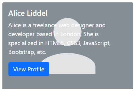
The card markup is pretty straight forward. The outer wrapper require the base class .card, whereas content can be placed inside the .card-body element. The following example will show you how to create a card with a picture, mixed with some text content and a button.
Example
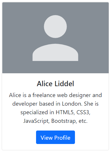
Try this code »<div class="card" style="width: 300px;">
<img src="images/sample.svg" class="card-img-top" alt="...">
<div class="card-body text-center">
<h5 class="card-title">Alice Liddel</h5>
<p class="card-text">Alice is a freelance web designer and developer based in London. She is specialized in HTML5, CSS3, JavaScript, Bootstrap, etc.</p>
<a href="#" class="btn btn-primary">View Profile</a>
</div>
</div>— The output of the above example will look something like this:
Note: Card doesn't have fixed width, they'll occupy the full width of its parent element. So, if you need a fixed width card you need to apply the width property on card yourself. Also, card have no margin by default, use spacing utility classes if needed.
Content Types for Card Component
The card component support a wide variety of content, including images, text, list groups, links, navs, and more. Here are the examples of what's supported by the card.
Body Only Card
You can simply use .card with .card-body within, whenever you need to create a padded box.
Example
Try this code »<div class="card">
<div class="card-body">This is some text within a padded box.</div>
</div>— The output of the above example will look something like this:

Card with Titles, Text, and Links
Further, you can also place title and links inside the card along with text, like this:
Example
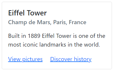
Try this code »<div class="card" style="width: 300px;">
<div class="card-body">
<h5 class="card-title">Eiffel Tower</h5>
<h6 class="card-subtitle mb-3 text-muted">Champ de Mars, Paris, France</h6>
<p class="card-text">Built in 1889 Eiffel Tower is one of the most iconic landmarks in the world.</p>
<a href="#" class="card-link">View pictures</a>
<a href="#" class="card-link">Discover history</a>
</div>
</div>— The output of the above example will look something like this:
Card with Header and Footer
You can also add header and footer within your cards using the .card-header and .card-footer class, respectively. Let's take a look at the following example:
Example
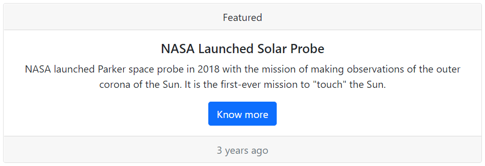
Try this code »<div class="card text-center">
<div class="card-header">Featured</div>
<div class="card-body">
<h5 class="card-title">NASA Launched Solar Probe</h5>
<p class="card-text">NASA launched Parker space probe in 2018 with the mission of making observations of the outer corona of the Sun. It is the first-ever mission to "touch" the Sun.</p>
<a href="#" class="btn btn-primary">Know more</a>
</div>
<div class="card-footer text-muted">3 years ago</div>
</div>— The output of the above example will look something like this:
Tip: You can use text align utility classes such as .text-center and .text-end to align card's content to the center and right end, respectively. By default they're left aligned.
Placing List Groups within Card
You can also place list groups inside the card along with other content types, as shown here.
Example
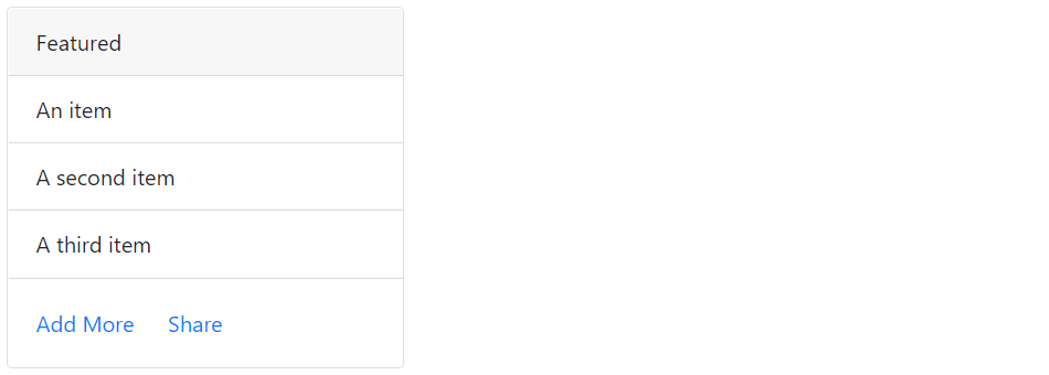
Try this code »<div class="card" style="width: 300px;">
<div class="card-header">Featured</div>
<ul class="list-group list-group-flush">
<li class="list-group-item">An item</li>
<li class="list-group-item">A second item</li>
<li class="list-group-item">A third item</li>
</ul>
<div class="card-body">
<a href="#" class="card-link">Add More</a>
<a href="#" class="card-link">Share</a>
</div>
</div>— The output of the above example will look something like this:
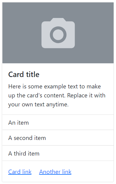
Mix and Match Multiple Content Types within Card
Feel free to mix and match multiple content types to create the card you need. The following example will create a fixed-width card with an image, text, list group, and hyperlinks.
Example
Try this code »<div class="card" style="width: 300px;">
<img src="images/thumbnail.svg" class="w-100 border-bottom" alt="...">
<div class="card-body">
<h5 class="card-title">Card title</h5>
<p class="card-text">Here is some example text to make up the card's content. Replace it with your own text anytime.</p>
</div>
<ul class="list-group list-group-flush">
<li class="list-group-item">An item</li>
<li class="list-group-item">A second item</li>
<li class="list-group-item">A third item</li>
</ul>
<div class="card-body">
<a href="#" class="card-link">Card link</a>
<a href="#" class="card-link">Another link</a>
</div>
</div>— The output of the above example will look something like this:
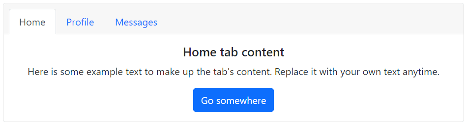
Adding Navigation to Cards
You can also add Bootstrap's nav components such as tabs and pills to the card header.
To add tabs navigation to a card simply place the tabs markup inside the card header, and the tabs content inside the card body. You are also required to use an additional class .card-header-tabs on the .nav element along with the class .nav-tabs for proper alignment.
Let's try out the following example which creates an elegant tabbed navigation.
<div class="card text-center">
    <div class="card-header">
        <ul class="nav nav-tabs card-header-tabs">
            <li class="nav-item">
                <a href="#home" class="nav-link active" data-bs-toggle="tab">Home</a>
            </li>
            <li class="nav-item">
                <a href="#profile" class="nav-link" data-bs-toggle="tab">Profile</a>
            </li>
            <li class="nav-item">
                <a href="#messages" class="nav-link" data-bs-toggle="tab">Messages</a>
            </li>
        </ul>
    </div>
    <div class="card-body">
        <div class="tab-content">
            <div class="tab-pane fade show active" id="home">
                <h5 class="card-title">Home tab content</h5>
                <p class="card-text">Here is some example text to make up the tab's content. Replace it with your own text anytime.</p>
                <a href="#" class="btn btn-primary">Go somewhere</a>
            </div>
            <div class="tab-pane fade" id="profile">
                <h5 class="card-title">Profile tab content</h5>
                <p class="card-text">Here is some example text to make up the tab's content. Replace it with your own text anytime.</p>
                <a href="#" class="btn btn-primary">Go somewhere</a>
            </div>
            <div class="tab-pane fade" id="messages">
                <h5 class="card-title">Messages tab content</h5>
                <p class="card-text">Here is some example text to make up the tab's content. Replace it with your own text anytime.</p>
                <a href="#" class="btn btn-primary">Go somewhere</a>
            </div>
        </div>
    </div>
</div>
— The output of the above example will look something like this:
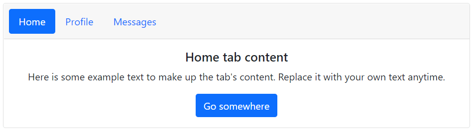
Similarly, you can add pills nav to the card by using an additional class .card-header-pills along with the class .nav-pills on the .nav element, as shown below:
<div class="card text-center">
    <div class="card-header">
        <ul class="nav nav-pills card-header-pills">
            <li class="nav-item">
                <a href="#home" class="nav-link active" data-bs-toggle="tab">Home</a>
            </li>
            <li class="nav-item">
                <a href="#profile" class="nav-link" data-bs-toggle="tab">Profile</a>
            </li>
            <li class="nav-item">
                <a href="#messages" class="nav-link" data-bs-toggle="tab">Messages</a>
            </li>
        </ul>
    </div>
    <div class="card-body">
        <div class="tab-content">
            <div class="tab-pane fade show active" id="home">
                <h5 class="card-title">Home tab content</h5>
                <p class="card-text">Here is some example text to make up the tab's content. Replace it with your own text anytime.</p>
                <a href="#" class="btn btn-primary">Go somewhere</a>
            </div>
            <div class="tab-pane fade" id="profile">
                <h5 class="card-title">Profile tab content</h5>
                <p class="card-text">Here is some example text to make up the tab's content. Replace it with your own text anytime.</p>
                <a href="#" class="btn btn-primary">Go somewhere</a>
            </div>
            <div class="tab-pane fade" id="messages">
                <h5 class="card-title">Messages tab content</h5>
                <p class="card-text">Here is some example text to make up the tab's content. Replace it with your own text anytime.</p>
                <a href="#" class="btn btn-primary">Go somewhere</a>
            </div>
        </div>
    </div>
</div>
— The output of the above example will look something like this:
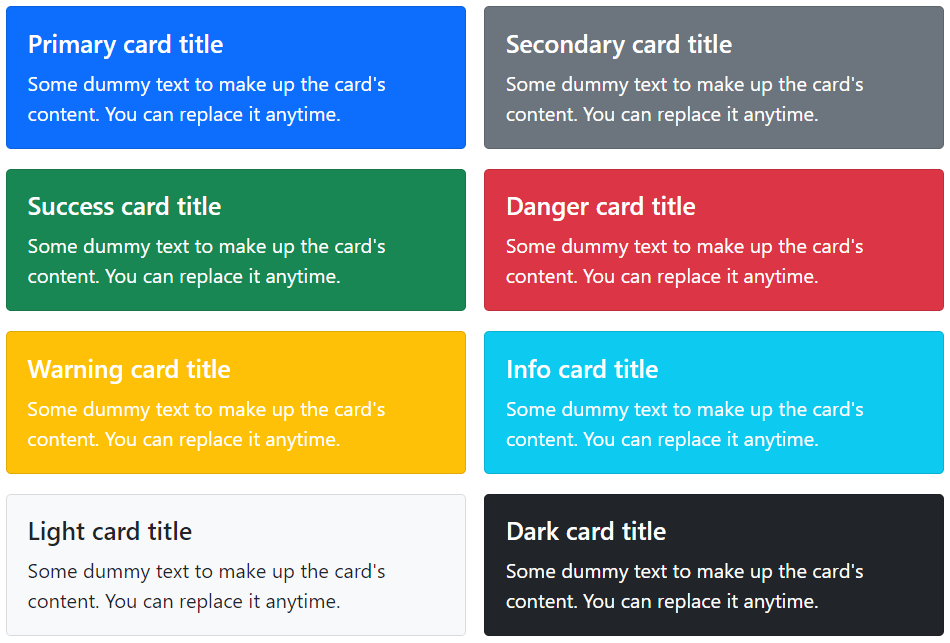
Customizing the Card Styles
There are several options available for customizing the card's backgrounds, borders, and color.
Customizing Background and Color
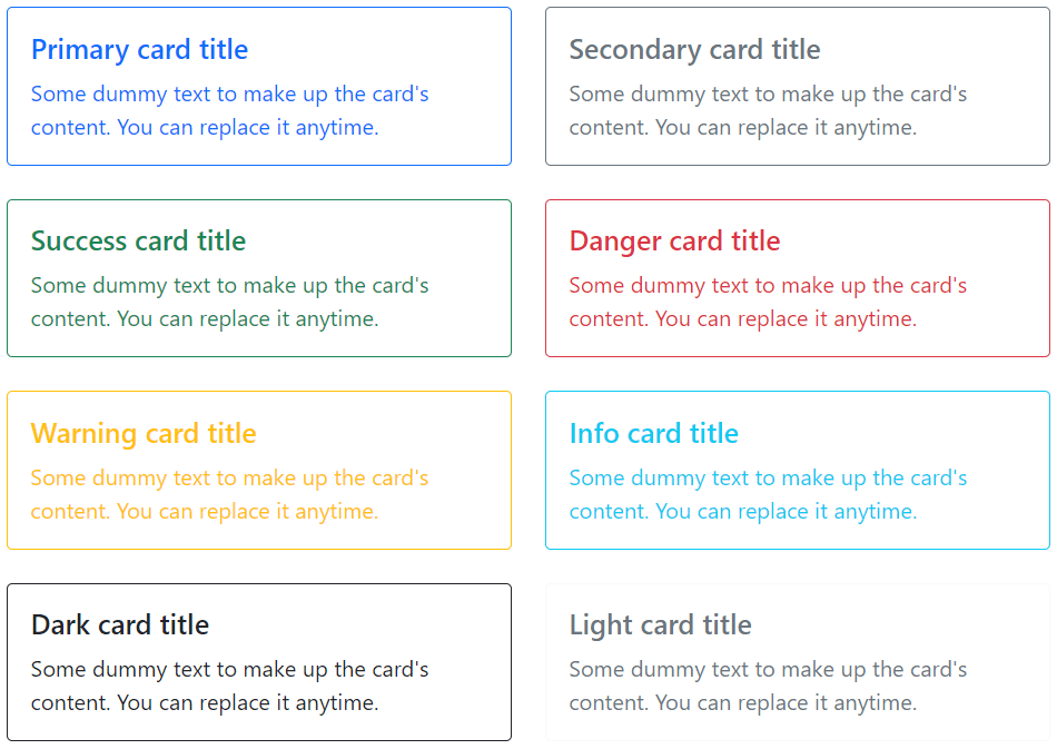
You can simply use the background and color utility classes to change the appearance of a card. Let's try out the following example to understand how it basically works:
<div class="row">
    <div class="col-6">
        <div class="card text-white bg-primary mb-4">
            <div class="card-body">
                <h5 class="card-title">Primary card title</h5>
                <p class="card-text">Some dummy text to make up the card's content. You can replace it anytime.</p>
            </div>
        </div>
    </div>
    <div class="col-6">
        <div class="card text-white bg-secondary mb-4">
            <div class="card-body">
                <h5 class="card-title">Secondary card title</h5>
                <p class="card-text">Some dummy text to make up the card's content. You can replace it anytime.</p>
            </div>
        </div>
    </div>
    <div class="col-6">
        <div class="card text-white bg-success mb-4">
            <div class="card-body">
                <h5 class="card-title">Success card title</h5>
                <p class="card-text">Some dummy text to make up the card's content. You can replace it anytime.</p>
            </div>
        </div>
    </div>
    <div class="col-6">
        <div class="card text-white bg-danger mb-4">
            <div class="card-body">
                <h5 class="card-title">Danger card title</h5>
                <p class="card-text">Some dummy text to make up the card's content. You can replace it anytime.</p>
            </div>
        </div>
    </div>
    <div class="col-6">
        <div class="card text-white bg-warning mb-4">
            <div class="card-body">
                <h5 class="card-title">Warning card title</h5>
                <p class="card-text">Some dummy text to make up the card's content. You can replace it anytime.</p>
            </div>
        </div>
    </div>
    <div class="col-6">
        <div class="card text-white bg-info mb-4">
            <div class="card-body">
                <h5 class="card-title">Info card title</h5>
                <p class="card-text">Some dummy text to make up the card's content. You can replace it anytime.</p>
            </div>
        </div>
    </div>
    <div class="col-6">
        <div class="card text-white bg-dark">
            <div class="card-body">
                <h5 class="card-title">Dark card title</h5>
                <p class="card-text">Some dummy text to make up the card's content. You can replace it anytime.</p>
            </div>
        </div>
    </div>
    <div class="col-6">
        <div class="card bg-light">
            <div class="card-body">
                <h5 class="card-title">Light card title</h5>
                <p class="card-text">Some dummy text to make up the card's content. You can replace it anytime.</p>
            </div>
        </div>
    </div>
</div>
— The output of the above example will look something like this:
Customizing Border and Color
Similarly, you can customize the border and text color of any card using the text and border utility classes. Just apply these classes on the .card or its child elements, as shown below:
<div class="row">
    <div class="col-6">
        <div class="card border-primary mb-4">
            <div class="card-body text-primary">
                <h5 class="card-title">Primary card title</h5>
                <p class="card-text">Some dummy text to make up the card's content. You can replace it anytime.</p>
            </div>
        </div>
    </div>
    <div class="col-6">
        <div class="card border-secondary mb-4">
            <div class="card-body text-secondary">
                <h5 class="card-title">Secondary card title</h5>
                <p class="card-text">Some dummy text to make up the card's content. You can replace it anytime.</p>
            </div>
        </div>
    </div>
    <div class="col-6">
        <div class="card border-success mb-4">
            <div class="card-body text-success">
                <h5 class="card-title">Success card title</h5>
                <p class="card-text">Some dummy text to make up the card's content. You can replace it anytime.</p>
            </div>
        </div>
    </div>
    <div class="col-6">
        <div class="card border-danger mb-4">
            <div class="card-body text-danger">
                <h5 class="card-title">Danger card title</h5>
                <p class="card-text">Some dummy text to make up the card's content. You can replace it anytime.</p>
            </div>
        </div>
    </div>
    <div class="col-6">
        <div class="card border-warning mb-4">
            <div class="card-body text-warning">
                <h5 class="card-title">Warning card title</h5>
                <p class="card-text">Some dummy text to make up the card's content. You can replace it anytime.</p>
            </div>
        </div>
    </div>
    <div class="col-6">
        <div class="card border-info mb-4">
            <div class="card-body text-info">
                <h5 class="card-title">Info card title</h5>
                <p class="card-text">Some dummy text to make up the card's content. You can replace it anytime.</p>
            </div>
        </div>
    </div>
    <div class="col-6">
        <div class="card border-dark mb-4">
            <div class="card-body text-dark">
                <h5 class="card-title">Dark card title</h5>
                <p class="card-text">Some dummy text to make up the card's content. You can replace it anytime.</p>
            </div>
        </div>
    </div>
    <div class="col-6">
        <div class="card border-light mb-4">
            <div class="card-body text-muted">
                <h5 class="card-title">Light card title</h5>
                <p class="card-text">Some dummy text to make up the card's content. You can replace it anytime.</p>
            </div>
        </div>
    </div>
</div>
— The output of the above example will look something like this:
Card Layout Options
In addition to styling of the cards, Bootstrap also includes a few options for laying out the series of cards. However, these layouts are not responsive yet.
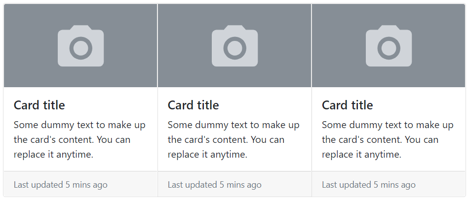
Creating the Card Groups
You can use card groups to render cards as a single, attached element with equal width and height columns. However, cards inside a card group become horizontally stacked on extra small devices (i.e. viewport width <576px). Let's try out an example and see how it actually works:
<div class="card-group">
    <div class="card">
        <img src="images/thumbnail.svg" class="card-img-top" alt="...">
        <div class="card-body">
            <h5 class="card-title">Card title</h5>
            <p class="card-text">Some dummy text to make up the card's content. You can replace it anytime.</p>
        </div>
        <div class="card-footer">
            <small class="text-muted">Last updated 5 mins ago</small>
        </div>
    </div>
</div>
— The output of the above example will look something like this:
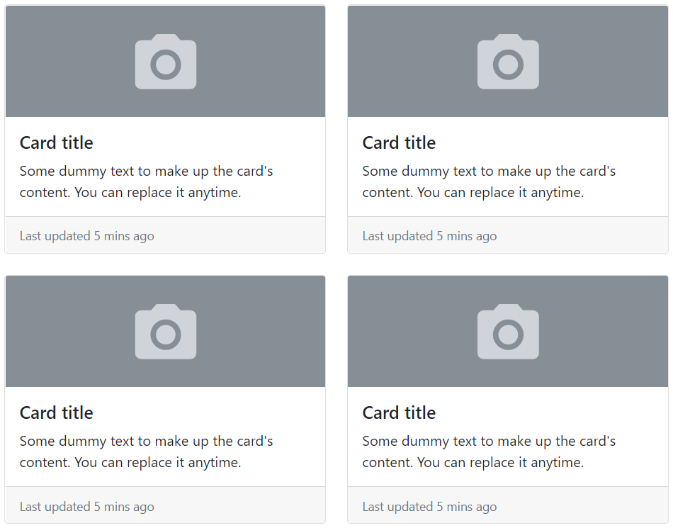
Creating the Card Grids
You can use the Bootstrap grid system and its .row-cols-* classes to control how many grid columns (wrapped around your cards) to show per row. For example, you can use the class .row-cols-1 to show one card per row, similarly you can use the class .row-cols-md-2 to show two cards per row, from the medium breakpoint up (i.e. viewport width ≥768px).
<div class="row row-cols-1 row-cols-md-2 g-4">
    <div class="col">
        <div class="card">
            <img src="images/thumbnail.svg" class="card-img-top" alt="...">
            <div class="card-body">
                <h5 class="card-title">Card title</h5>
                <p class="card-text">Some dummy text to make up the card's content. You can replace it anytime.</p>
            </div>
            <div class="card-footer">
                <small class="text-muted">Last updated 5 mins ago</small>
            </div>
        </div>
    </div>
</div>
— The output of the above example will look something like this:
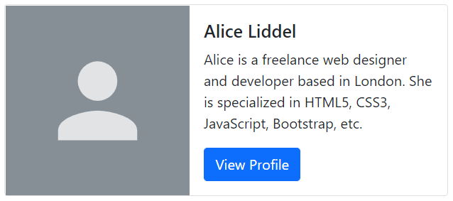
Creating Horizontal Cards
You can also create horizontal cards where image and text content are placed side-by-side using a combination of grid and utility classes, as shown in the following example:
Example
Try this code »<div class="card" style="max-width: 500px;">
<div class="row g-0">
<div class="col-sm-5">
<img src="images/sample.svg" class="card-img-top h-100" alt="...">
</div>
<div class="col-sm-7">
<div class="card-body">
<h5 class="card-title">Alice Liddel</h5>
<p class="card-text">Alice is a freelance web designer and developer based in London. She is specialized in HTML5, CSS3, JavaScript, Bootstrap, etc.</p>
<a href="#" class="btn btn-primary stretched-link">View Profile</a>
</div>
</div>
</div>
</div>— The output of the above example will look something like this:
Card Image Overlays
You can even turn an image into a card background and place the card's text on the top it using the class .card-img-overlay in place of .card-body. Depending on the image, you may need additional styles for better adjustments. Let's check out an example:
Example
Try this code »<div class="card text-white" style="width: 350px;">
<img src="images/sample.svg" class="card-img-top" alt="...">
<div class="card-img-overlay">
<h5 class="card-title">Alice Liddel</h5>
<p class="card-text">Alice is a freelance web designer and developer based in London. She is specialized in HTML5, CSS3, JavaScript, Bootstrap, etc.</p>
<a href="#" class="btn btn-primary stretched-link">View Profile</a>
</div>
</div>— The output of the above example will look something like this:
Note: The card content should not be larger than the height of the image. If content is larger than the image the content will be displayed outside the image.
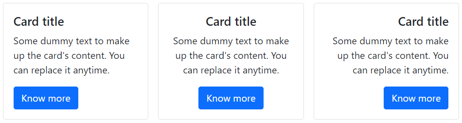
Text Alignment inside Card
You can easily change the text alignment of any card—entirely or specific parts—with the text alignment utility classes. For example, you can use the class .text-center and .text-end to align the card's text content to the center and to the right end, respectively.
<div class="row row-cols-1 row-cols-md-3 g-3">
    <div class="col">
        <!-- Card with default left text alignment -->
        <div class="card">
            <div class="card-body">
                <h5 class="card-title">Card title</h5>
                <p class="card-text">Some dummy text to make up the card's content. You can replace it anytime.</p>
                <a href="#" class="btn btn-primary">Know more</a>
            </div>
        </div>
    </div>
    <div class="col">
        <!-- Card with center text alignment -->
        <div class="card text-center">
            <div class="card-body">
                <h5 class="card-title">Card title</h5>
                <p class="card-text">Some dummy text to make up the card's content. You can replace it anytime.</p>
                <a href="#" class="btn btn-primary">Know more</a>
            </div>
        </div>
    </div>
    <div class="col">
    <!-- Card with right text alignment -->
        <div class="card text-end">
            <div class="card-body">
                <h5 class="card-title">Card title</h5>
                <p class="card-text">Some dummy text to make up the card's content. You can replace it anytime.</p>
                <a href="#" class="btn btn-primary">Know more</a>
            </div>
        </div>
    </div>
</div>
— The output of the above example will look something like this:
Specifying Card Size
Cards have no specific width, they are 100% wide by default. However, you can change this as needed with custom CSS, grid classes, or sizing utility classes.
Let's try out the following example to understand how it basically works:
<!-- Card sizing using grid markup -->
<div class="row">
    <div class="col-sm-6">
        <div class="card">
            <div class="card-body">
                <h5 class="card-title">Card title</h5>
                <p class="card-text">Some dummy text to make up the card's content. You can replace it anytime.</p>
                <a href="#" class="btn btn-primary">Know more</a>
            </div>
        </div>
    </div>
</div>

<!-- Card sizing using sizing utility classes -->
<div class="card w-75">
    <div class="card-body">
        <h5 class="card-title">Card title</h5>
        <p class="card-text">Some dummy text to make up the card's content. You can replace it anytime.</p>
        <a href="#" class="btn btn-primary">Know more</a>
    </div>
</div>

<!-- Card sizing using sizing utility classes -->
<div class="card" style="width: 15rem;">
    <div class="card-body">
        <h5 class="card-title">Card title</h5>
        <p class="card-text">Some dummy text to make up the card's content. You can replace it anytime.</p>
        <a href="#" class="btn btn-primary">Know more</a>
    </div>
</div>
Card with Stretched Link
You can add the class .stretched-link to a link inside the card to make the whole card clickable (i.e. whole card act like a link). Multiple links are not recommended with stretched links.
Try out the following example to see how this actually works:
Example
Try this code »<div class="card" style="width: 300px;">
<img src="images/sample.svg" class="card-img-top" alt="...">
<div class="card-body text-center">
<h5 class="card-title">Alice Liddel</h5>
<p class="card-text">Alice is a freelance web designer and developer based in London. She is specialized in HTML5, CSS3, JavaScript, Bootstrap, etc.</p>
<a href="#" class="btn btn-primary stretched-link">View Profile</a>
</div>
</div>

