Bootstrap Badges
In this tutorial you will learn how to create badges with Bootstrap.
Creating Badges with Bootstrap
Badges are generally used to indicate some valuable information on the web pages such as important heading, warning messages, notification counter, etc.
The following example will show you how to create inline badges using the Bootstrap.
Example
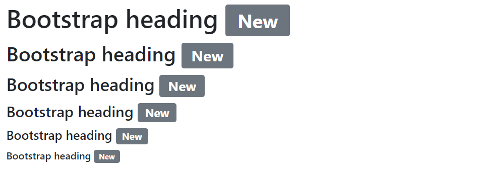
Try this code »<h1>Bootstrap heading <span class="badge bg-secondary">New</span></h1>
<h2>Bootstrap heading <span class="badge bg-secondary">New</span></h2>
<h3>Bootstrap heading <span class="badge bg-secondary">New</span></h3>
<h4>Bootstrap heading <span class="badge bg-secondary">New</span></h4>
<h5>Bootstrap heading <span class="badge bg-secondary">New</span></h5>
<h6>Bootstrap heading <span class="badge bg-secondary">New</span></h6>— The output of the above example will look something like this:
Tip: Bootstrap badges scale automatically to match the size of the immediate parent element by using the relative font sizing and em units.
Changing the Appearance of Badges
You can use the Bootstrap inbuilt background color utility classes to quickly change the appearance of the badges. Let's take a look at the following example.
Example
Try this code »<span class="badge bg-primary">Primary</span>
<span class="badge bg-secondary">Secondary</span>
<span class="badge bg-success">Success</span>
<span class="badge bg-danger">Danger</span>
<span class="badge bg-warning text-dark">Warning</span>
<span class="badge bg-info text-dark">Info</span>
<span class="badge bg-dark">Dark</span>
<span class="badge bg-light text-dark">Light</span>— The output of the above example will look something like this:
Note: When using the light background color, such as Bootstrap's .bg-light, you'll need to use a dark text color utility, like .text-dark for proper text visibility. This is because background color utility classes do not set anything except background-color.
Creating Pill Badges
Similarly, you can create pill shape badges (i.e. badges with more rounded corners) using the .rounded-pill modifier class, as shown in the following example:
Example
Try this code »<span class="badge rounded-pill bg-primary">Primary</span>
<span class="badge rounded-pill bg-secondary">Secondary</span>
<span class="badge rounded-pill bg-success">Success</span>
<span class="badge rounded-pill bg-danger">Danger</span>
<span class="badge rounded-pill bg-warning text-dark">Warning</span>
<span class="badge rounded-pill bg-info text-dark">Info</span>
<span class="badge rounded-pill bg-dark">Dark</span>
<span class="badge rounded-pill bg-light text-dark">Light</span>— The output of the above example will look something like this:
Showing Counter with Badges
You can also use badges as part of links or buttons to provide a counter, such as number of received or unread messages, number of notifications etc. They're most commonly found in email clients, application dashboards, social networking websites, etc. Here's an example:
Example
Try this code »<nav class="nav nav-pills">
<a href="#" class="nav-link">Home</a>
<a href="#" class="nav-link">Profile</a>
<a href="#" class="nav-link active">Messages <span class="badge bg-light text-primary">24</span></a>
<a href="#" class="nav-link">Notification <span class="badge bg-primary">5</span></a>
</nav>— The output of the above example will look something like this:

Creating Positioned Badges
You can use positioning utilities to modify a .badge and position it in the corner of a link or button.
Let's take a look at the following example to understand how it basically works:
Example
Try this code »<button type="button" class="btn btn-primary position-relative">
Inbox
<span class="position-absolute top-0 start-100 translate-middle badge rounded-pill bg-danger">50+</span>
</button>— The output of the above example will look something like this:


